Monotype reinvents Gill Sans for the 21st century
The type company explains how it's reimagined the classic typeface for the digital age.
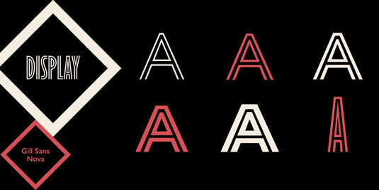
Since its creation in 1928, Gill Sans has become one of the most recognisable and popular typefaces of all time. Today you can still see it everywhere, from books to posters, signage to packaging and logo design from the BBC to Penguin Books.
The 100 best free fonts for designers to download today!
Originally designed for print, the Eric Gill series of fonts have now been remastered by Monotype, the global provider of typefaces with digital applications in mind.
Monotype has essentially reinvented these original classic typeface designs so designers can take advantage of more weights, more characters and more languages to meet the wider range of needs faced by 21st century designers.
New typefaces
Comprising 77 fonts in three typeface families – the Gill Sans Nova, Joanna Nova and Joanna Sans Nova designs – the series is a fresh take and expansion of one of the world's most popular typefaces of all time, Gill Sans, in addition to the book typeface, Joanna, originally designed in the 1920s and 30s by artist and typeface designer, Eric Gill.
James Fooks-Bale, creative director at Monotype, explains that the project was inspired by requests from the design comunity. "It remains important for to capture new suggestions from users and we've been doing this through the exhibitions since 2012 and in customer meetings," he says.
"In this particular case, several customers have requested elements of these Gill families which we've responded to with this release."
Get the Creative Bloq Newsletter
Daily design news, reviews, how-tos and more, as picked by the editors.
Touches of Gill
Many added touches in the series were influenced by Gill himself, thanks to a rich inventory of original drawings and materials Gill left behind, stored in Monotype's historical archive.
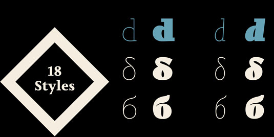
The series also features an original, Gill-inspired typeface by Monotype's Terrance Weinzierl, created specifically with digital applications in mind.
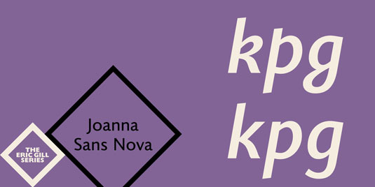
Joanna Sans Nova draws on the humanist qualities of Gill's Joanna but in a sans serif form, offering a crisp, comfortable look-and-feel, suitable for a wide range of digital reading environments.
A version of Joanna Sans ships with the NOOK GlowLight eReader from Barnes & Noble.
Public exhibition
From today, Monotype is holding a seven-day exhibition on the type designs of Eric Gill that will give designers, students and type fans the chance to interact with the new Eric Gill Series typefaces and learn about the past, present and future of type design.
The exhibition is taking place at Old Truman Brewery, 91 Brick Lane, T2, London E1 6QL. Register for free tickets here.
The exhibition will feature rarely seen materials from the Monotype Archive and its partners' private collections including hand-drawings documenting the development of the Gill Sans typeface, test prints for display fonts that were never digitized and copper plates revealing the production process of early letterpress typefaces.
In the meantime, here's a blow by blow account of the new typefaces...
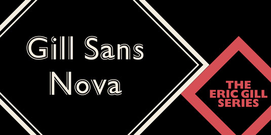
01. Gill Sans Nova
- Designer: George Ryan of Monotype
- Number of fonts: 43 (up from 18 in the original Gill Sans) from ultra light to ultra bold, in addition to a full suite of new condensed weights
- New display weights: a suite of six inline weights, as well as shadowed outline fonts revived from the original design that was never digitised, and the Gill Sans Nova Deco typeface, previously withdrawn from the Monotype library
- Language support: Latin-based, Greek and Cyrillic (Latin-based only for display weights)
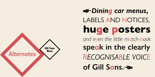
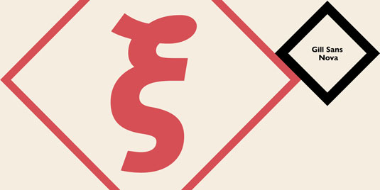
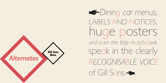
- OpenType® feature support for fine typography, as well as stylised characters from different points in Gill Sans's long history
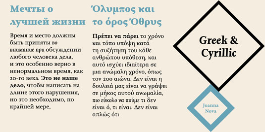
02. Joanna Nova
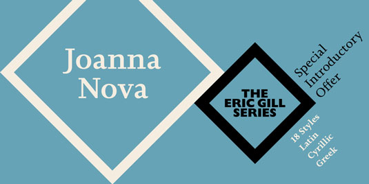
- Designer: Ben Jones of Monotype
- Number of fonts: 18 (up from six in the original Joanna), from thin to ultra black
- Language support: Latin-based languages, Greek and Cyrillic
- OpenType® feature support for fine typography, including small caps for all scripts, numeral options and context-sensitive ligatures
03. Joanna Sans Nova
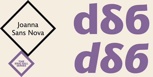
- Designer: Terrance Weinzierl of Monotype
- Number of fonts: 16, from thin to black
- Language support: Latin-based languages, Greek and Cyrillic
- OpenType® feature support for fine typography, such as small caps, ligatures, old style and proportional figures, fractions, superscript/subscript figures
What do you think of the new typefaces? Be sure to let us know in the comments...
Liked this? Read these!

Thank you for reading 5 articles this month* Join now for unlimited access
Enjoy your first month for just £1 / $1 / €1
*Read 5 free articles per month without a subscription

Join now for unlimited access
Try first month for just £1 / $1 / €1

The Creative Bloq team is made up of a group of art and design enthusiasts, and has changed and evolved since Creative Bloq began back in 2012. The current website team consists of eight full-time members of staff: Editor Georgia Coggan, Deputy Editor Rosie Hilder, Ecommerce Editor Beren Neale, Senior News Editor Daniel Piper, Editor, Digital Art and 3D Ian Dean, Tech Reviews Editor Erlingur Einarsson, Ecommerce Writer Beth Nicholls and Staff Writer Natalie Fear, as well as a roster of freelancers from around the world. The ImagineFX magazine team also pitch in, ensuring that content from leading digital art publication ImagineFX is represented on Creative Bloq.
