10 typographic mistakes everyone makes (including us...)
We are all making errors when we lay out text. Here's where you're going wrong.
06. Interpunct

Well, there’s no arguing with the sentiment there (and the price is correct at least at the time of writing), but there is a typographical faux pas in that sentence. We’ve lost the battle on this one, we know, but properly the decimal point shouldn’t be a full stop or period, but should be an interpunct, thus: £29·99.
This is only true in Britain – although possibly some other countries too, especially those that were British colonies in 1971 when decimalisation struck – but technically you were only supposed to use a full stop when technical limitations meant an interpunct was unavailable.
Happily, these days, should you wish to render prices correctly (as surely any good Brit would wish to do), you can easily get an interpunct by typing alt+shift+9.
07. Degrees

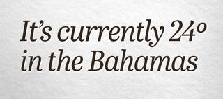
And it’s literally freezing in the UK as we write this, but the thing we’re specifically complaining about here is that degrees symbol, because it isn’t a degrees symbol at all. Now pay attention, 007: 24º is wrong, 24° is right. That first character is an ordinal indicator for masculine (the feminine variant is ª), and you can read about their use on Wikipedia.
In some fonts, it’s actually really obvious that it’s not a degrees symbol because the O will have an underline, but that’s not common and it’s easy to see that someone, mashing a keyboard till they find a degrees symbol, would think they’ve found it; you get it by typing alt+0, which makes some kind of sense.
In fact, the degree symbol’s shortcut is actually somewhat logical too. To get a bullet (that’s this character: •) on a Mac, you type alt+8, and to get a degrees symbol, it’s alt+shift+8. Conceptually, then, you can think of it a little like a ‘superscript bullet’.
08. Hyphens and dashes
Now, this is tricky, and depends very much on style, but the official line is that hyphens specifically should only be used in words like ‘anal-retentive’ and ‘super-annoying’ or for splitting words across lines in hyphenation; you shouldn’t even use them for a minus symbol, as there’s a specific, slightly longer Unicode character for that: −. (We’re not making this up, we promise.)
Get the Creative Bloq Newsletter
Daily design news, reviews, how-tos and more, as picked by the editors.
But while hyphens in the sentence above are definitely wrong, there is no definitely right. Convention would have it that in the UK you’d use en-dashes – like this – while in the US—where everything is bigger—the longer em-dashes are favoured. Note too that in the first example, there are spaces either side of the dashes, but not in the second; that’s deliberate.
In fact, thanks to the fractal nature of pedantry, you can also say that this is still wrong, since if you’re being super-correct there should be hairline spaces around the em-dashes. Or possibly thin spaces, which are technically thicker. But let’s not split hairs.
You type an en-dash with alt+- and em-dashes with alt+shift+-.
(Bonus: you should sometimes use an en-dash where you might think a hyphen is called for, when you’re dealing with attributive compounds.)
09. Asterisks and stars
The noble asterisk – at least as noble as Astérix – while technically being a star should nevertheless not be used as a star when you’re talking about ratings; its main purpose these days is to direct you to a caveat somewhere else on the page.
Happily, there are filled and empty – technically, black and white – stars in the Unicode table, and they’re pretty commonly supported. Thus you could say that this post is ★☆☆☆☆, even though of course you know in your heart it’s ★★★★★.
You can type these symbols easily by searching ‘star’ in the character pop-up, and to make them even easier to type, you can enter a range of them with shortcuts in the Text tab of the Keyboard pane in System Preferences. Thus typing [[3 autocorrects to ★★★☆☆. Best of all, these shortcuts should sync over iCloud to your iPhone and iPad, so you can use them there too.
10. Ellipses
Technically, there is a difference between three full stops and an ellipsis. Wrong: ... Right: …
To type an ellipsis, it’s alt+; – but of course, you could out-typography-nerd anyone by airily claiming you manually kern three periods each time because you think the default ellipses in your chosen font are badly set.
Does any of this matter?
Now look, we know that by making any of these ‘mistakes’ you probably won’t impair the sense of what you’re saying, that good grammar and clarity should take precedence, and that even with the broad acceptance of Unicode there are often good reasons to ignore these old traditions.
And honestly, this was just meant to be a ‘oh, I didn’t know that!’ post rather than an infuriating blend of a telling-off and a diktat. But maybe, just maybe, now that you’re aware of some of these established conventions, you can help honour the rich and beautiful history of typography in the next chunk of text you set.
Related articles:

Thank you for reading 5 articles this month* Join now for unlimited access
Enjoy your first month for just £1 / $1 / €1
*Read 5 free articles per month without a subscription

Join now for unlimited access
Try first month for just £1 / $1 / €1
Christopher has written and edited a range of publications, including Apple-specialist titles MacFormat, Mac|Life and iPad User. His work has also featured in the BBC, Computer Arts, Digital Camera Magazine, PhotoRadar, Practical Photoshop, Macworld and TechRadar. He is currently head of podcasts at DC Thomson and has spoken at various design and tech events.


