10 typographic mistakes everyone makes (including us...)
We are all making errors when we lay out text. Here's where you're going wrong.
In typography, as in grammar, there is no objective ‘right’ way to do things; there are just conventions, and these conventions change over time. And what's more, while we could argue that the examples we're about to give are indeed mistakes – that is, things that are wrong – it's also true that there are often technical or style reasons to make them deliberately (we do on Creative Bloq all the time). But enough with the caveats.
Bonus points if you can identify the problem with each example before we explain it. The more points you have at the end, the more fun you are at parties!
Note: Due to technical limitations (and to delicious irony) some characters in this post may not display properly depending on your browser and platform. Suggestions on how to type characters are confirmed correct for UK Mac keyboards.
01. Quote marks

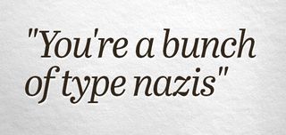
Yes, yes we are. For example, we’ll now point out that you should of course have used proper typographic quote marks above – “You’re a bunch of type nazis”.
Because supporting “, ”, ‘ and ’ would have added complexity to typewriters, we just decided to simplify with a single symbol for single and a single symbol for double quotes that could be used everywhere, and this ‘dumb quotes’ convention stuck. (If you ever doubt how influential typewriters are even today, not only could we point you to the persistent QWERTY layout, but you’ll also see on many keyboards that the staggered grid allows for a bar to lead straight up from each key, like on a typewriter.)
Bonus fact: you use «guillemets» (not ‘greater-than and less-than’ chevrons!) in French and Spanish, and „this style“ in German. As always, Wikipedia can out-pedant anyone on this topic.
To type proper typographic quotes on a Mac, press alt+[, alt+shift+[, alt+] and alt+shift+]. Of course, you could let your software convert from dumb to smart quotes for you (check under 'Edit > Substitutions') but be careful, as the next mistake shows.
Get the Creative Bloq Newsletter
Daily design news, reviews, how-tos and more, as picked by the editors.
02. Apostrophes
You might think that allowing your computer to make your dumb quotes smart absolves you of all responsibility, but the problem is that computers can sometimes be a bit too smart for their own good. One of the common mistakes computers make is to use an opening single quote where an apostrophe (or closing single quote; there’s really no difference) should be used.
If you’re talking about the ’80s (with a closing quote mark), say, many computers would be tempted to write ‘80s (with an opening quote mark) instead, because it thinks you’re starting to write a sentence ‘in quote marks’. To fix this, make sure you type ⌥⇧] manually. The opposite can be true too these days; start a sentence with a double-digit number and some systems will convert a single dumb quote to ’, even if you then end the sentence with another quote, such as in ’10 years ago’. Here, manually typing ⌥] is necessary.
‘Smart’ computer systems can land you in other trouble too. For example, once you’ve got your eye in, you might often see something like this online: “The point size for body copy wouldn’t normally be bigger than 11.5″. The problem there is that a smart CMS has decided that because that quotation ends with a number, it should convert the double dumb quote you typed into a double prime (″) rather than the closing quote marks (”), since it’s assumed you meant inches. What’s a double prime, you ask? We’re glad you did.
03. Double prime
You might be congratulating yourself because you knew that dumb quotes were wrong for enclosing quotations, and that the correct use of the straight ' and " is to denote feet and inches. Your smugness is misplaced, sadly. In fact, those glyphs really, typographically speaking, serve no purpose. Feet and inches should be represented by ‘primes’ – a single for feet, a double for inches. So 6' 6" is wrong, but 6′ 6″ is correct. Of course, not all fonts have primes characters, but all that means is that you should be using better fonts!
It’s easy to type primes if you’re running OS X 10.9 or later; just tap the spacebar while holding ctrl and cmd and a character palette will pop up. You don’t have to know where to look; start typing ‘primes’ and the characters will appear. On earlier systems, choose Special Characters from the Edit menu, and in apps such as InDesign, browse the Glyphs palette.
04. Fractions
Ah, so you got the primes right that time, but what the hell is with those fractions? Properly, fractions should be individually typeset – often using LaTeX formatting – but even if that’s not technically possible most fonts have dedicated glyphs for common vulgar fractions. (‘Vulgar’ is a technical term there, not a synonym for ‘common’; keep politics out of typography. Actually, technically, mathematically, ‘vulgar’ is a synonym for ‘common’ but we’re in danger of disappearing down the wrong rabbit hole entirely.)
By calling up the character palette again you can search for ‘fraction’ (or specifically ‘half’, ‘quarter’, ‘third’ and so on) and so correctly – or at least more correctly than using normal numbers separated by a slash, like an animal – render ‘3½″ and 5¼″ disks’.
05. Multiplication/by
This is a particularly subtle one in some fonts, but there is a proper glyph for the ‘x’ that stands in for ‘by’, so the above should read ‘5120×2880 pixels’ rather than ‘5120x2880 pixels’. The particular Unicode character we’re using there is the multiplication sign – and yes, you could argue we’re co-opting it here – so be sure to search for that in the character palette rather than ‘x’.
Searching for ‘x’ shows up many different variants, including multiple mathematical, algebraic ‘x’ symbols, but not the multiplication symbol you actually want.
Next page: 5 more typographic mistakes we all make

Thank you for reading 5 articles this month* Join now for unlimited access
Enjoy your first month for just £1 / $1 / €1
*Read 5 free articles per month without a subscription

Join now for unlimited access
Try first month for just £1 / $1 / €1
Christopher has written and edited a range of publications, including Apple-specialist titles MacFormat, Mac|Life and iPad User. His work has also featured in the BBC, Computer Arts, Digital Camera Magazine, PhotoRadar, Practical Photoshop, Macworld and TechRadar. He is currently head of podcasts at DC Thomson and has spoken at various design and tech events.


