Letterpress and hand-drawn type collide in this long-distance project
Two typographers from opposite ends of the Earth come together to create a typopairing project.
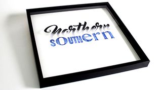
Craig Black and Nicole Phillips are two typographers from two different hemispheres who have worked together to create distance-defying artwork. Craig Black, a typographer and designer based in Glasgow, first met Nicole Phillips, and Australian typographer, via social channels. A friendship was quickly forged, and the next logical step was to collaborate. The result is Northern/Southern and Opposites/Attract.
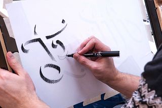
Black's typography style is recognisable by its high contrast, killer curves and big impact. Phillips, on the other hand, tends to favour an analogue approach and creates her handwriting fonts with pencil or ink. Her work philosophy is based around working together rather than competing and she champions the work of other typographers that she admires.
Thanks to the miracle of Skype, the two typographers were soon discussing options and firing across emails. Ideas were shared over Dropbox, where each iteration was amended and annotated. "We wanted to explore the juxtapositions in our relationship," says Black. "We may contrast in styles but we are cohesive in our passion and approach!"
"We settled on two ideas to get the collaboration underway," says Phillips. "We had a deadline as wanted to exhibit part of the series at ING creative in Dubai - which Craig was traveling to in just eight weeks." From the outset the pair were aware of the logistics involved with the project, such as the size which was dictated by shipping options.
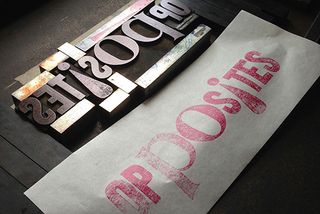
"Once we had identified the 500x500mm scale of the frames I proofed and measured some of my wood type collection, selected the paper stock and decided to compose and print the form on 'Frank' - my Farley No 25," Phillips adds. "I chose not to use the self-inking mechanism or feed board as was keen to hand ink and the form. I wanted the printing to be as manual as possible."
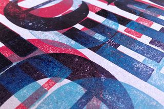
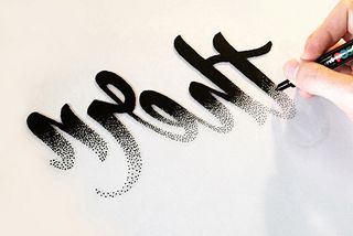
Phillips then shipped the packaged edition and proofs to Black in Glasgow. After an anxious wait, they arrived safely and Black could work his magic. He began by using a wrong reading pencil outline on the front face of the glass to guide him to stipple the backside using a paint pen. Once complete, he layered the lettered glass on top of the letterpress prints and made six custom frames.
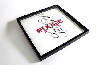
Soon after, the artworks were shipped to Dubai. "Our collaboration project got the best response as people wondered how we came together and how we made the works from opposite sides of the world," says Black.
Black then shipped the artworks back to Phillips in Australia, where she had hoped to show the pieces at the Design Conference in Brisbane. Unfortunately, one of the artworks did not survive the journey. However the audience didn't mind. "Just as Craig had experienced in Dubai, the community here was super curious (and excited!) that we were able to make an analogue collaboration work long distance," says Phillips.

Thank you for reading 5 articles this month* Join now for unlimited access
Enjoy your first month for just £1 / $1 / €1
*Read 5 free articles per month without a subscription

Join now for unlimited access
Try first month for just £1 / $1 / €1
Get the Creative Bloq Newsletter
Daily design news, reviews, how-tos and more, as picked by the editors.
Dom Carter is a freelance writer who specialises in art and design. Formerly a staff writer for Creative Bloq, his work has also appeared on Creative Boom and in the pages of ImagineFX, Computer Arts, 3D World, and .net. He has been a D&AD New Blood judge, and has a particular interest in picture books.
