Logotype: an in-depth look at type in branding
Copywriter and logo obsessive Michael Evamy investigates logotypes, leaving no stone unturned.

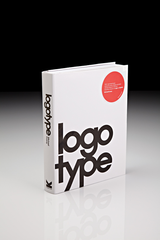
Half a decade after his tome Logo offered the last word on the titular design form, Michael Evamy has honed his focus onto logotypes with an equally encyclopaedic fervour. Logotype is a move from iconic symbols to a glut of unique typefaces, all kneaded, cajoled, refined and perfected to provide memorable brand-specific imagery. It’s as remarkable for its painstakingly polished visual content, as it is for its generous size.
Genetically of the same stock as Logo, there is overlap of a sort between the two books - but Evamy has pulled off a masterful feat of research, offering an abundance of different logotypes, and deliberately avoiding any repetition.

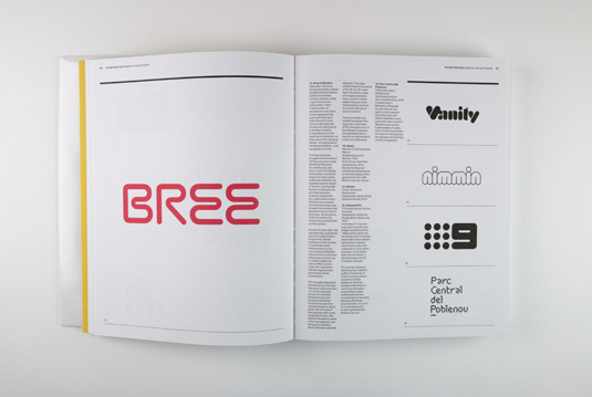
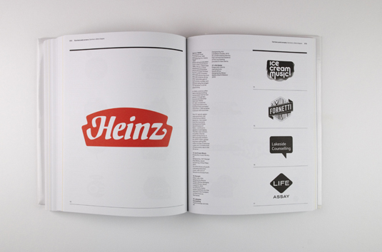
Of course that means that some ubiquitous cases featured in Logo - including Coca-Cola, Intel, CNN, Esso and IBM - are missing here. This is no bad thing. It’s refreshing to sift through the 300-odd pages of more than 1,300 typographic logos, without the more obvious cultural signposts taking precedence.
Designing recognisable, memorable type is at the heart of this book, and although there are only 40 logotypes that are given full-page, full-colour treatment, the anecdotes and backstories provided are enough to give a rounded context to each one. Whether it’s why Mark Zuckerberg’s red-blue colour blindness influenced Facebook’s look, or how Wolff Olins’ attempt to distil a whole city’s character in London 2012’s motif led to reactions as varied as the city itself.

The book is at its best, however, when the little things are magnified - when we get a glimpse of the countless revisions and amendments each design goes through, such as the incremental, seemingly pedantic, increase of height given to Dell’s sideways ‘E’, and the effect this has.
Whether you want to swot up on these kind of details, or just glance at the broad strokes of the history of logotype design, you’re bound to find something worth finding in Logotype.
This review was originally published in Computer Arts issue 205.
Key info
- Price: £22.50
- Author: Michael Evamy
- Publisher: Laurence King
Now read:
- How to brand a logo: 15 top logo and branding design trends for 2012

Thank you for reading 5 articles this month* Join now for unlimited access
Enjoy your first month for just £1 / $1 / €1
*Read 5 free articles per month without a subscription

Join now for unlimited access
Try first month for just £1 / $1 / €1
Get the Creative Bloq Newsletter
Daily design news, reviews, how-tos and more, as picked by the editors.

The Creative Bloq team is made up of a group of art and design enthusiasts, and has changed and evolved since Creative Bloq began back in 2012. The current website team consists of eight full-time members of staff: Editor Georgia Coggan, Deputy Editor Rosie Hilder, Ecommerce Editor Beren Neale, Senior News Editor Daniel Piper, Editor, Digital Art and 3D Ian Dean, Tech Reviews Editor Erlingur Einarsson, Ecommerce Writer Beth Nicholls and Staff Writer Natalie Fear, as well as a roster of freelancers from around the world. The ImagineFX magazine team also pitch in, ensuring that content from leading digital art publication ImagineFX is represented on Creative Bloq.
