5 ways to inject character into a font
Type designer Sofie Beier exposes the way minds react to typefaces at this year's TYPO Berlin.
The job of a type designer is to inject character into a typeface without interfering with its function. It's not just legibility and proportion that must be considered – developing a clear identity for type involves a delicate but constant tension between visibility and invisibility.
Think of the challenge a famous actor faces playing the lead role in a movie. Most people recognise George Clooney in the film Gravity, but it's his job to make viewers gradually forget this fact and believe he really is the character he's playing – to suspend the viewer's disbelief for as long as possible.
In a similar way, a typeface needs a character that doesn't work against its function – to communicate a particular message. What's important to remember however is that the character of a typeface can inform that message.
Speaking at this year's Typo Berlin conference, type designer and researcher Sofie Bieir demonstrated the relevance of character in typeface design with these five essential points.
01. The way we see
Studies in inattentional blindness show that humans perceive the world with spotlight-like attentional focus, making it extremely difficult for them to concentrate on two things at the same time. (See this video for example – and count how many times does the ball changes hands.) A typeface shouldn’t interfere or detract from the reading process for the same reason.
02. Personality

A typeface has a close relationship with the sound of the words that it communicates. Take the psychological experiment called the Bouba-Kiki effect: people consistently assign the names 'Bouba' and 'Kiki' to the same abstract shapes based purely on their visual appearance. So think about the personality attributes of your typeface. Should it be elegant, friendly, foreboding?
03. Semantic association
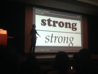
The choice of typeface can influence the interpretation of its content. Certain typefaces are more readily associated with certain products because of their visual appearance – the Bulldog skincare logo looks confident and assured, for instance, in the same way that the word 'strong' displayed in a thick roman font reads as more consistent than when read in a thin italic type.
04. Don't kill the skeleton

Create the skeleton of your typeface first before worrying about its character. You can concentrate on this later and achieve it by experimenting with different strokes, which allows for plenty of variability without destroying the skeleton of the letters.
05. The long-form rule
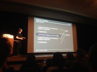
Readers of long-form text prefer conservative typefaces because of their familiarity, so keep flourishes to a minimum. That's not to say you can't develop character – in fact experiments show that the average reading speed of highly expressive typefaces reaches a rate close to text displayed formal type after just 20 minutes' reading – but first impressions and the initial challenge can put readers off before they even get going.
Exclusive TYPO offer: two-year Computer Arts subscription for the price of one
Computer Arts has teamed up with TYPO to bring you an exclusive offer that we'll be promoting throughout the conference.
Simply sign up to a two-year subscription to Computer Arts magazine and only pay for one!

Thank you for reading 5 articles this month* Join now for unlimited access
Enjoy your first month for just £1 / $1 / €1
*Read 5 free articles per month without a subscription

Join now for unlimited access
Try first month for just £1 / $1 / €1
Get the Creative Bloq Newsletter
Daily design news, reviews, how-tos and more, as picked by the editors.
The Creative Bloq team is made up of a group of design fans, and has changed and evolved since Creative Bloq began back in 2012. The current website team consists of eight full-time members of staff: Editor Georgia Coggan, Deputy Editor Rosie Hilder, Ecommerce Editor Beren Neale, Senior News Editor Daniel Piper, Editor, Digital Art and 3D Ian Dean, Tech Reviews Editor Erlingur Einarsson and Ecommerce Writer Beth Nicholls and Staff Writer Natalie Fear, as well as a roster of freelancers from around the world. The 3D World and ImagineFX magazine teams also pitch in, ensuring that content from 3D World and ImagineFX is represented on Creative Bloq.


