How to create visual language through typography
Jerry Cao explains how the content and context of what you're saying affects the look of your typography.
Combine copy and typography
We started this article explaining that a word's literal meaning and typographical meaning are two completely different things, but that doesn't mean they can't work together. A word's look and definition can complement each other when done right, heightening the intention beyond what each could accomplish on their own.
But word choice goes beyond mere meaning. When writing, think carefully about the lesser-acknowledged properties of words, such as:
- Length — How many letters? How many syllables?
- Sound — Rhyming can be an influential tool, so look for opportunities to use it.
- Shape — Which letters make up the word? What is the word's outline?
Beyond the audience and design objectives, you also need to balance legibility with readability. Legibility refers to the design elements such as width of strokes, presence of serifs, etc. Readability, on the other hand, is how the content, font colour, legibility, leading, tracking, and all other elements combine to create an overall impression.
Graphic designer Douglas Bonneville provides straightforward and effective advice on choosing and using typefaces. Let's explore some of his insights for legibility and readability.
Legibility
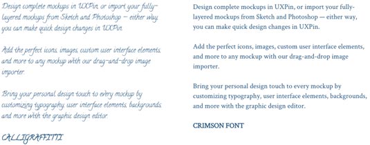
Decorative typefaces (like Calligraffiti below on the left) have poor legibility because they're designed to be glanced, not read. Meanwhile, serif typefaces like Crimson Text below on the right are much more legible and practical for content.

Think about where you typeface should fall between the two extremes above, then follow Bonneville's advice for legibility:
- Select typefaces with traditional letterforms — The more ornamental and artistic the typeface, the higher the cognitive load as users will first need to visually process the font instead of interpreting the message.
- Make sure the typeface has ample spacing — The tighter the tracking, the more the eye needs to fill the gaps between the shapes of letterforms. Users will need more time to recognize the form of letters, words, and sentences. Larger spacing allows the eye to catch up to the speed of the user's cognitive processes.
- Select typefaces with large x-height — Short x-heights reduces legibility for some letters. If the x-height is larger, the openings for lowercase letters that look similar (like "c" and "e") are more distinguishable, which lets users scan and read more easily.
For a quick set of guidelines for font legibility, check out this helpful excerpt of Web Style Guides.
Get the Creative Bloq Newsletter
Daily design news, reviews, how-tos and more, as picked by the editors.
Readability
A related concept to the F-pattern and Z-pattern, readability affects how much users actually want to engage with your content. Unless low readability is part of the message you're conveying, make sure to prioritize communication over style.
Let's take a look at an example below from graphic designer Douglas Bonneville's piece on how to select typefaces.

The version on the right features decreased font size, lightened colours, full justification, and some tweaks to the leading and tracking. As a result, it's much less readable.
In order to keep content readable like the example on the right, Bonneville again offers very practical advice:
- Match the typeface to its role — Some typefaces are better for headlines, while others are more flexible and are still readable at smaller sizes. It's not a bad idea to pair a more fun font (like Knockout) for headlines with a highly readable font (such as Tisa or Proxima Nova) for the body copy and microcopy.
- Set a "right ragged" text alignment to ensure proper spacing — Force-justified text leads to inconsistently spaced words, which increases friction since users need to "jump" from word to word as they complete sentences.
- Set your line height greater than point size for multi-line copy — A line of copy is hard to visually track if the lines above and below it are too close. On the other hand, if the line spacing is too great, users might end up re-reading the same line more than once.
To learn more about legibility versus readability, check out this comprehensive piece from tuts+.
Takeaways
It's tempting to think of typography as an extension of the site's writing, but that's not accurate. Nor is it accurate to think that the two are completely unrelated. The truth is that both are separate fields, each with their own best practices; however, they two are always intrinsically linked, and so each should be designed with regards to the other one.
To learn more about content-first design, download the free e-book Web UI Design for the Human Eye: Content Patterns & Typography. The e-book offers practical advice on visual hierarchy, designing for readability, and creating visual language through typography. Design examples are also analyzed from 30 companies including Dropbox, AirBnB, Marketo, Hulu, and Evernote.
Words: Jerry Cao
Jerry Cao is a content strategist at UXPin — the wireframing and prototyping app — where he develops in-app and online content for the wireframing and prototyping platform. To learn how to use mockups of all types and fidelities, check out The Guide to Mockups.
Like this? Read these!
- Download the best free fonts
- The best free cursive fonts
- The best free script fonts

Thank you for reading 5 articles this month* Join now for unlimited access
Enjoy your first month for just £1 / $1 / €1
*Read 5 free articles per month without a subscription

Join now for unlimited access
Try first month for just £1 / $1 / €1

The Creative Bloq team is made up of a group of art and design enthusiasts, and has changed and evolved since Creative Bloq began back in 2012. The current website team consists of eight full-time members of staff: Editor Georgia Coggan, Deputy Editor Rosie Hilder, Ecommerce Editor Beren Neale, Senior News Editor Daniel Piper, Editor, Digital Art and 3D Ian Dean, Tech Reviews Editor Erlingur Einarsson, Ecommerce Writer Beth Nicholls and Staff Writer Natalie Fear, as well as a roster of freelancers from around the world. The ImagineFX magazine team also pitch in, ensuring that content from leading digital art publication ImagineFX is represented on Creative Bloq.
