How to create visual language through typography
Jerry Cao explains how the content and context of what you're saying affects the look of your typography.
Form equals function, and that doesn't change just because we're dealing with text.
Typography is the aesthetics behind the written word, the art of making your text serve a purpose based only on its looks. This incorporates many different physical options — font, size, colour, position, etc — and also external factors like what's being said, how it's being said, and the context surrounding it.
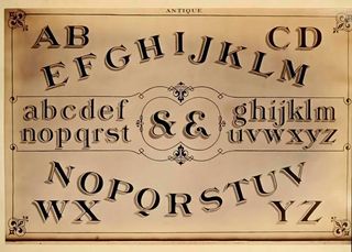
First we'll talk about how the content and context of what you're saying should affect the look of the words, then we'll discuss how to utilize the various visual elements, and we'll close by offering some helpful tips.
Many languages within a single word
Just like many other areas in design, content is still king in typography. Ultimately, the meaning behind the words you're communicating will affect the look of the text. Knowing the intention behind the message is the first step in the process.
A message's emotion or tone is more important than the words themselves. Gunther Kress and Theo van Leeuwen summarize it best in their book Reading Images: The Grammar of Visual Design when they say:
"The visual component of text is an independently organized and structured message, connected with the verbal text, but in no way dependent on it and similarly the other way round."
This signifies that every printed word can communicate two separate meanings: the literal definition and the emotion suggested by the typography. According to Caroline Knight and Jessica Glaser, your typographic choices create many layers of meaning.
Get the Creative Bloq Newsletter
Daily design news, reviews, how-tos and more, as picked by the editors.
We'll explain what we mean in the two examples below:
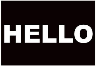
In the above example, the word HELLO seems imposing and loud. The impression is one of interruption, and carries a sense of urgency to it. This effect is not an accident.
Let's look at the elements at play here.
For starters, the text is large and all-caps, which is a quick and easy way to add gravity to any word. The subtler choices just support the tone: the font choice is simplistic and no-nonsense; the letters are thick tightly spaced, creating an oppressive block of text.
The colour scheme of white against black corroborates the directness, while the dominant black "negative space" lends more immediacy to the message. Lastly, the position of the word in the centre makes it seem more worthy of attention.
Compare that to the counterpart below:
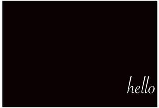
This version is far less intense.
It seems less like a command, and more of a gentle suggestion to be taken at your leisure. The text is small and lower-cased for starters, and on top of that has a more detailed font, with slight italics — the text here is more whimsical. The script typeface feels like a refreshing break from the monotonous black background, creating an oasis of elegance. The position at the bottom-right corner, the last seen position on the screen, makes the message seem almost like an afterthought.
Same exact word. Two completely different meanings.
Next page: the importance of context...

Thank you for reading 5 articles this month* Join now for unlimited access
Enjoy your first month for just £1 / $1 / €1
*Read 5 free articles per month without a subscription

Join now for unlimited access
Try first month for just £1 / $1 / €1
The Creative Bloq team is made up of a group of design fans, and has changed and evolved since Creative Bloq began back in 2012. The current website team consists of eight full-time members of staff: Editor Georgia Coggan, Deputy Editor Rosie Hilder, Ecommerce Editor Beren Neale, Senior News Editor Daniel Piper, Editor, Digital Art and 3D Ian Dean, Tech Reviews Editor Erlingur Einarsson and Ecommerce Writer Beth Nicholls and Staff Writer Natalie Fear, as well as a roster of freelancers from around the world. The 3D World and ImagineFX magazine teams also pitch in, ensuring that content from 3D World and ImagineFX is represented on Creative Bloq.
