How to choose the right fonts for your website
Typeface choice should be a science as well as an art. Veronika Burian and José Scaglione of TypeTogether provide a concise primer.
In the world of digital design, typography plays a leading role. Understanding how type acts is an absolute requirement for those designers who want to excel in their profession. This means taking account of some very complex issues connected to the choice and composition of type.
In this short article, we will discuss a series of factors that should be taken into consideration when selecting typefaces. Some are universal; others are specific to web typography. This cognitive process is just a starting point: our intention is to help designers to move outside of their typographic comfort zone, favouring an analytic approach over recipes that can only result in repetitive, inefficient and boring work.
Morphology and functionality
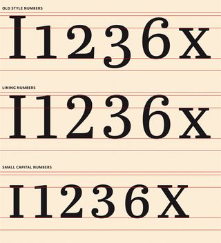
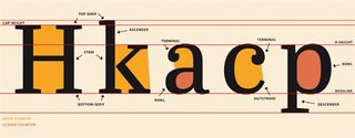
The first issue to consider is the relationship between the structure of letters and the content they are intended to convey. Thinking about how text will be rendered and read will tell a designer a lot about the shapes they need. A related point is the number of fonts necessary for a given layout. As a rule of thumb, fonts with large counters, open terminals and distinctive shapes tend to perform better as body copy, increasing the legibility of text rendered at this size. (The image to the left illustrates the anatomy of a typeface.) In addition, a font with old-style figures and capitals that are slightly shorter than ascenders gives a more even overall 'texture' to a block of text, since there are no bits and pieces to jump out of the screen, disturbing the flow of reading.
On the other hand, headlines require compressed shapes that permit many characters to be cramped into a single line of text. Very short ascenders and descenders are needed to avoid a flag-like appearance in multi-line titles. It is also necessary to give special consideration to the interplay of numbers, letters with ascenders and capitals.
Most typographic manuals and editorial design books agree that having too few typefaces is better than using too many. Indeed, a single typeface, with italics and small caps, will suffice for plenty of applications. However, more complex projects require a wide range of fonts, and probably different type families, in order to distinguish different sections of the text, technical information, pullout quotes, navigation elements, footnotes and so on.
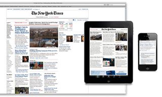
Another important factor to consider is the way readers relate to the application. Are they supposed to read steadily for a long period of time, or will they just browse small bits of information looking for a specific reference? Each of these scenarios calls for a very different typographic choice. In the first case, the reader's fatigue becomes the main problem. A serif typeface that has enough air - that is, white space - good typographic colour and, preferably, low contrast would be appropriate here. In the second scenario, reader fatigue is not a concern because the user is not exposed to the text for a prolonged period of time. Instead, a large number of styles may be necessary to aid navigation, and to provide a visual guide to the structure of the content.
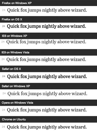
But the most important issue relating to font selection is probably the one most commonly overlooked: the character set. In other words, does the font contain all of the glyphs required to produce the work? It is alarmingly common for designers and developers to discover that they are missing a few accents (or fractions, or small caps) after convincing a client that they have found 'the right font for the job'. Nowadays, very little may be taken for granted beyond the classic Mac OS Roman 256-character set. Even if the text is set in English, there may be references to foreign names or places, or simply the need for specific characters. Therefore, it is good practice to familiarise oneself with a typeface as thoroughly as possible before deploying it on a project. It is even worth asking the type foundry for a special testing license.
Technical considerations
One of the most radical changes brought about by digital typography is the dissociation of type from the method of reproduction. By removing the corporeal element (whether metal or film) from the equation, type can now leave its mark in many different ways, ranging from offset presses to the full range of small screens in mobile devices. This enormous freedom of use means that many new factors should be taken into consideration when choosing typefaces.
One of these issues - one that is bound to affect the quality of type and the overall quality of the design - is the resolution at which type is reproduced. Computer screens, even the new ones, are quite limited when compared with offset printing. For example, a regular offset plate can print 2400 dots per inch, but a computer screen will only render between 120 and 300dpi. This difference will impact noticeably on printed type - and the smaller the type is reproduced, the larger the impact.
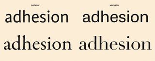
Some fonts are created specially for proper screen rendering. These are subjected to a post-production process called hinting. A hint is a term that describes how a type developer keeps the most important parts of the letters consistent with each other, after the font has been down-sampled. Hints help to keep the typeface from being down-sampled incorrectly, or too much, and ensure that parts of letters, such as stems, have a consistent width even in coarse grids.
Properly hinted fonts are bound to perform better on any screen. The results, however, will not be the same for all readers. For example, most browsers rely on operating system rasterisers to render type. They may even use different rasterising engines for different font formats. Additionally, browsers have their own layer of support for things like kerning or ligatures, which may change the appearance of type drastically. It is advisable to check results in a variety of browsers and operating systems to ensure some level of consistency in the appearance of type.
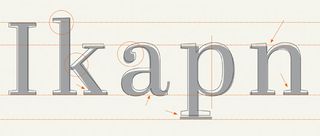
The details of the letter forms tells you a lot about when and at what size a typeface may be safely used. The fine details of a book type family, such as Maiola or Sabon, suggests a need for high-resolution rendering and rather generous reproduction sizes. Otherwise, those delicate shapes would be obscured. Typefaces that were engineered for newspapers or specifically for screens are more robust, though they lack the same refined appearance. For example, fonts such as Georgia or Abril Text, though visually cruder, will perform much better in low-resolution rendering.
Designers should also consider issues relating to system compatibility. Fonts are now bits of software and as such, they may not work - or work only partially - under certain operating systems or network environments. A font can, in fact, crash a computer in the same way other programs do.
Another issue, and one that straddles the boundary between technical and functional considerations, is that of OpenType. For a few years now, type foundries have relied on the OpenType format and its features to furnish fonts with better language support and other additional features. Today, small caps can be part of the same font file as the lower case letters, as can a whole range of other typographical niceties (discretionary ligatures, swash characters, contextual alternates, and so on). Nevertheless, the availability of these features is dependent on the support provided by the DTP application. A designer may end up buying a font with small caps they will never be able to use.
Aesthetic considerations
It is not by chance that this article addresses aesthetics after functional and technical considerations. The latter provide a framework that considerably limits the set of typefaces from which a designer may choose. Personal taste also takes a front seat here, making it difficult to formulate any absolute rules. Nevertheless, it is important to consider the following points.
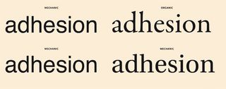
First, be careful about following trends. Fashionable type or composition styles can generate an immediate emotional response, which can be useful in advertising campaigns or other pieces with a short life span. However, fashions change quickly, and when they do, such designs can start to look outdated. Be particularly wary of following current trends when creating designs with a more permanent character, such as brands or publications.
Second, it is necessary to take into account that fonts have emotional properties, giving a design an overall 'atmosphere'. It is important that this is in harmony with the message the design is conveying. Information design, news and academic writing require fonts that add little emotional content, while a collection of poems may require just the opposite.
Interestingly, typefaces not only establish a relationship with contents but also with readers. Therefore, it is worth considering how visible typefaces are and with what 'volume' they communicate with the reader.
Titling types are by definition louder. The designer can get away with fonts that are slightly more personal or that include certain particularities in their shapes that make them unique to the untrained eye. Text fonts, on the other hand, demand a more subtle approach: one that requires the designer to balance very complex issues such as character repetition rate, character recognition and readability.
Economics
The final set of considerations determining the choice of a typeface are economic. These are undoubtedly the simplest to grasp - but in some cases, they may also be the most limiting.
Budgetary constraints may force designers to work with open-source fonts, or to work with fonts that are included in certain software packages, such as system fonts. It may also mean that some fonts are a given (for example, ones for which the client already owns a licence) and that the designer must choose only typefaces that get along with them. It is highly advisable to ask whether any such constraints exist before embarking on a wild goose chase (or should that be a wild font chase?).
We also recommend taking the time to look into any limitations your font licences may have. For example, to deploy a font as a web font, embed it in software applications or use it in mainstream broadcasting may require additional licensing – sometimes much more expensive licensing. Type foundries should be able to provide guidance here.
Analysis, not recipes
This brief overview of the considerations that go into choosing fonts is just the tip of the iceberg. We invite readers to rethink the issues discussed here and formulate new ones. Whatever your conceptual framework, it is important that type selection should be an informed task, with little room for stock 'recipes' or capricious choices.
A font selection process that is fully aware of issues beyond those of mere decoration will guide designers on a journey of type discovery, and can only result in better work. Remember, selecting the right fonts really does make a difference.
Words: Veronika Burian and José Scaglione
Veronika Burian and José Scaglione met at the University of Reading while completing their MAs in type design, launching the independent type foundry TypeTogether in 2006. This article first appeared in net magazine.

Thank you for reading 5 articles this month* Join now for unlimited access
Enjoy your first month for just £1 / $1 / €1
*Read 5 free articles per month without a subscription

Join now for unlimited access
Try first month for just £1 / $1 / €1
Get the Creative Bloq Newsletter
Daily design news, reviews, how-tos and more, as picked by the editors.
The Creative Bloq team is made up of a group of design fans, and has changed and evolved since Creative Bloq began back in 2012. The current website team consists of eight full-time members of staff: Editor Georgia Coggan, Deputy Editor Rosie Hilder, Ecommerce Editor Beren Neale, Senior News Editor Daniel Piper, Editor, Digital Art and 3D Ian Dean, Tech Reviews Editor Erlingur Einarsson and Ecommerce Writer Beth Nicholls and Staff Writer Natalie Fear, as well as a roster of freelancers from around the world. The 3D World and ImagineFX magazine teams also pitch in, ensuring that content from 3D World and ImagineFX is represented on Creative Bloq.
