Typography lovers will adore this delightful wine
If you like your drink with a side order of sans-serifs, then you'll love Helvetica Wine.
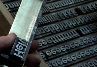
We've seen many weird and wonderful uses for Helvetica over the years, but here's some packaging design that really tickles our typography-obsessed fancy.
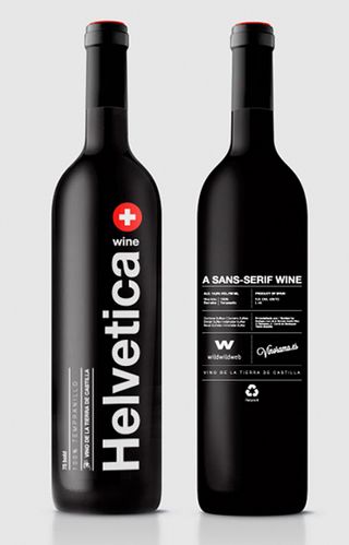
Madrid web design studio Wild Wild Web has teamed up with Spanish wine merchants Vinorama to create what they call their "tribute to the queen of the typefaces", Helvetica Wine.
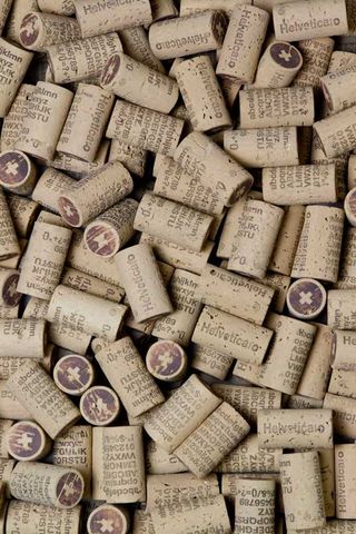
Making a beautiful case for the power of screen printing, 1,300 limited edition bottles were produced of the 'Sans-Serif Wine', and we especially love the attention to detail in the packaging, which carries through from the label to the corks.
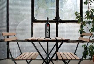

Have you spotted a great use of packaging design? Let us know in the comments below!

Thank you for reading 5 articles this month* Join now for unlimited access
Enjoy your first month for just £1 / $1 / €1
*Read 5 free articles per month without a subscription

Join now for unlimited access
Try first month for just £1 / $1 / €1
Get the Creative Bloq Newsletter
Daily design news, reviews, how-tos and more, as picked by the editors.
Tom May is an award-winning journalist and editor specialising in design, photography and technology. Author of the Amazon #1 bestseller Great TED Talks: Creativity, published by Pavilion Books, Tom was previously editor of Professional Photography magazine, associate editor at Creative Bloq, and deputy editor at net magazine. Today, he is a regular contributor to Creative Bloq and its sister sites Digital Camera World, T3.com and Tech Radar. He also writes for Creative Boom and works on content marketing projects.
