The pro's guide to hand-drawn typography
Top designers offer their advice on everything from nailing the initial concept to making your lettering legible.
Illustrated typography has become a field in its own right, with illustrators, designers and self-made letterers working across media to present their unique spin on this growing trend.
From traditional sign making in local communities to editorial illustration and publishing, to ground breaking advertising campaigns such as Kate Moross Cadbury’s billboards, hand drawn typography injects personality and playful fun into our daily lives.
Creating your own lettering might be something you do for fun, a simple exercise in doodling to kick start your creativity - but with an abundance of opportunities for specialists in this field it might be time to focus your energies on developing your skills.
Carving out a niche
Based in London and working collectively under the name Animaux Circus, Lana Hughes, Rory Elphick & Margaux Carpentier formed a bond over their mutual love of design whilst studying Graphic Communication at University of the Creative Arts.
Sharing a creative upbringing, with parents that include a skilled sign-writer and carpenter, an architect and ceramicist and a pair of graphic designers, their colourful explosions of bright and bold handmade type and illustration have decorated the Queen of Hoxton, the Hoxton Window Project and a recent mural advertisement commissioned by South Bank London for Waterloo Station.
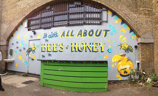
“Type design is a strength we’ve developed over the years as a collective,” says Hughes. “We enjoy the creative process and working collaboratively. There’s nothing quite like designing your own type on a fresh bit of wood or wall.”
For Bristol based illustrator Dave Bain, the ‘vibrant locally focused scene’ of the city, coupled with the recession provided an opportunity to carve out a niche for himself as a sign maker, particularly for small independent businesses keen to work with local creatives.
Get the Creative Bloq Newsletter
Daily design news, reviews, how-tos and more, as picked by the editors.
“I was fortunate enough to be ready to take on a variety of jobs at that time," he explains. "There was also, and still is, a shift towards hand-painted signage for businesses here. Handmade reflects a level of authenticity and people-focused approach that the community really responds to.”
Work that resonates
There is something about the craft of the handmade that resonates with people on the most basic level. “One of the most appealing things about letterform in hand lettering is its ability to reveal the hand of its creator,“ says US illustrator Jay Roeder. “It can convey a sense of gestural human craft that a computer font can’t replicate.”
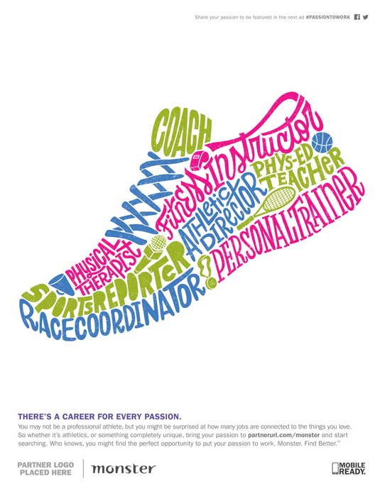
For Roeder, discovering that hand lettering was at the root of his passion for design saw him commit to drawing letters every day to hone his technique. “Since I started drawing letters my passion has grown exponentially. I’m not sure it’s possible to hand letter every single day unless you truly are obsessed… or completely insane... or both?”
Rob Lowe aka Supermundane shares a similar passion. “The beauty of hand lettering is the speed at which you can make something unique.” With a career that includes packaging design, a stint at Mathmos and album covers for Ministry of Sound, it was Lowe’s early gig at Sleazenation magazine that marked a turning point, leading into 10 years of magazine design for, amongst others Anorak and Fire & Knives.
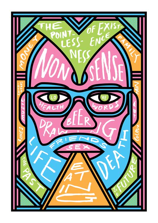
“I’ve always enjoyed working with hand drawn type. As far as the letterforms go themselves, the alphabet is a wonderfully resilient code. The letters can be dressed up in so many different ways but it is still recognisable to us. I feel like it is something that will never get boring.”
It's about problem solving

It’s a sentiment shared by US letterer Jessica Hische, who studied Fine Art initially before moving into Graphic Design at college. “I loved that design was about problem solving rather than being self-expressive, and that every project had a solid jumping off point on which to begin making work.”
Whilst working as a designer in Brooklyn, Hische was building a second career as a freelance illustrator. “With each project, I tried to integrate manipulated or custom type and letterforms, eventually discovering whilst working for Louise Fili that there was a way to make a career out of it.”
Her side project Daily Drop Cap project began in 2009 as a bit of fun to ‘inject a bit of regularity’ into her schedule after leaving full time employment. “It was an amazing way to challenge myself to try new things, to experiment and be silly, ”reflects Hische.
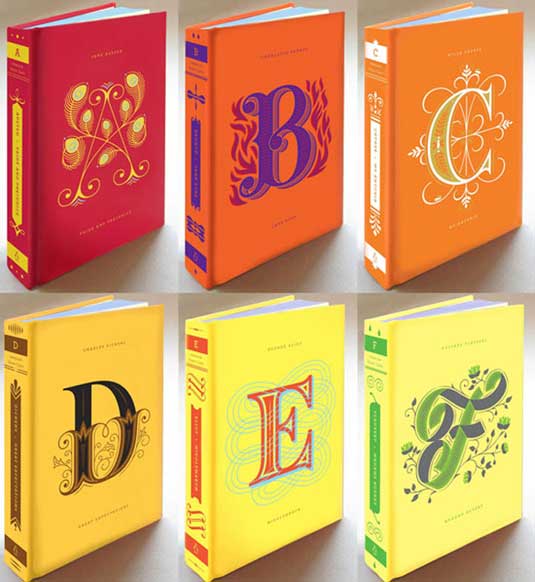
The project caught the eye of Penguin who commissioned Hische for the Penguin Drop Caps Series, illustrating a series of twenty-six collectible hard cover editions of literary classics in 2012.
“Overtime I worked lettering into my illustration projects, eventually having a portfolio rich enough in lettering work that clients began to request it. Now, I do hardly any pictorial illustration work - nearly all of my client work is lettering.”
A love for type
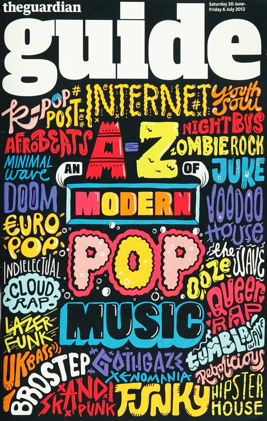
In her first book Make Your Own Luck (published by Prestel), designer and illustrator Kate Moross writes that hand-drawing letterforms is something she has always done.
“As a young child I used to draw band logos meticulously over and over again at school. I was never great at drawing objects or people, but words and letters felt like a natural subject for me. To this day nearly my work is nearly all type-based.”
An early fascination with typography is also at the root of Wisconsin based illustrator Emily Balsley’s career path. Discovering ‘pages and pages of alphabets’ in the books her mother brought home from art class when she was a child, studying graphic design was the only choice, cementing her love of type at college.

Graduating in 2001, it was a further 10 years before she started her illustration career. “My first job was at a bicycle company, designing bike graphics. Kids' bikes were especially fun – I had to make the name as visually exciting as possible within a very narrow space.”
Making the most of what she was given, Balsley took every opportunity to experiment with digital software, playing with layers and icons to compliment the brand name of the bike. “I learned a lot about utilizing type as design itself in that time.”
Taking an organic approach to image-making, Balsley made the progression into illustration slowly, combining the hand drawn qualities of her lettering style with digital tools. “I really try to get to the root of the meaning,” she says of her working process. “What are the key words? What is the nature of the words? How do I want the reader to feel?”
Nailing the concept
Basley begins each project using thumbnails, to figure out the layout, format, sizing and proportion early to avoid ‘getting distracted by all the little details.’ Utilizing transparent layers to arrange her sketches, she begins to add colour once she is happy with the composition. “I use A LOT of layers! It makes it much easier to tweak and adjust later the artwork later on.”
Hische uses a technique called ‘verbal brainstorming’ to avoid getting hung up on decoration before landing on a solid concept. “In the beginning I like to do word association lists rather than work visually,” says Hische. “I often have a vision in my head of how I want the words to interact.”
Roeder, who practices drawing as a daily exercise, reveals that landing on a concept can often be one of the toughest steps of a project. “If I hear a song that I love or a funny line in a movie, that can inspire a concept. My daily drawings are essentially a visual diary or stream of consciousness. I do all my hand lettering the old-fashioned way, with pencil, pen and paper.”
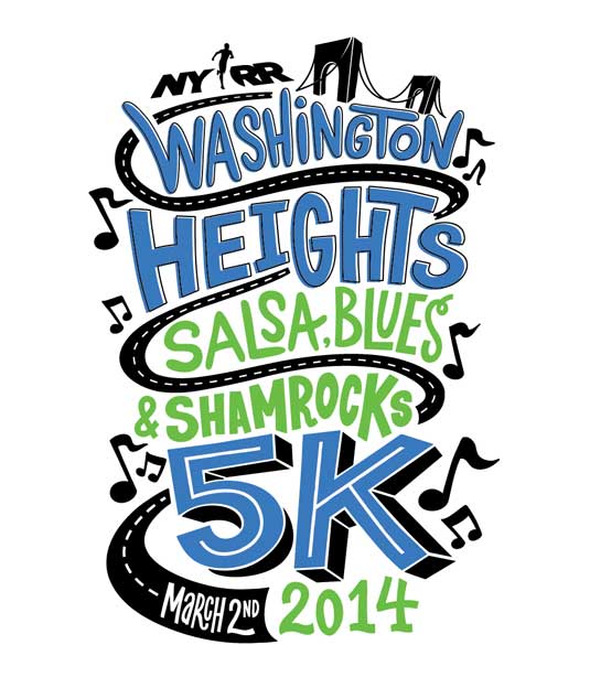
Approaching the task with freedom of thought is also a technique embraced by Kate Moross. “I never really plan a drawing. I just sit down in front of a blank page and go for it. I have never been precious about my drawings; I just think of them as sketches and scraps of paper.
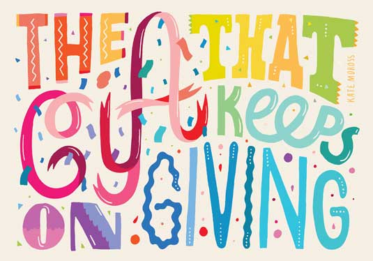
"That way they don’t intimidate me, and I can’t mess them up. I make mistakes all the time, but try to work them back into the picture somehow. That’s a great skill to learn as an illustrator: how to hide your mistakes and make them into happy accidents.”
Defining your style
Born and raised in Minnesota, Roeder, who describes his style as ‘embraced imperfection’, says it was only when he learned to ‘accept the crooked lines, misaligned type and illegibility’, that his lettering took on interest and character.
“As odd as it seems, creating these imperfections is as much of a craft as striving for perfection.” Inspired by song lyrics, random objects and catch phrases, Roeder started drawing letters every single day of the week and has not missed a day since 2010. “Don’t be afraid to screw things up, because your work might be more interesting that way.”
Defining your style takes practice and experience, and it’s essential to keep learning and trying new techniques to inform your design work. “A great thing to do is go to an art store and buy a few different kinds of pens and brushes,” enthuses Hische. “Mixing up mediums can be the thing that pushes you out of your comfort zone. I’ve been having a lot of fun with brush pens recently and think that they’ll really start influencing my work this year.”
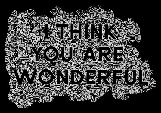
Lowe uses ‘whatever there is to hand’ for his illustrations, keeping an array of calligraphy dip pens, gouache, watercolour, pencils and marker pens within arms reach. “Experiment to find what feels most comfortable with your way of drawing” advises Lowe. “The more natural it feels the more confident your work will look and the better the lettering will be.”
Designer Kate Moross turns to her sweet wrapper collection to get her creative juices flowing, “I adore sweet packaging – I think it is some of the finest design around. The typography is usually so direct and complete, illustrating what is inside the wrapper perfectly.”
“Every single sweet wrapper evokes a strong and everlasting nostalgia in anyone who used to enjoy them as a child. The simple colour palettes and often hand-rendered typography definitely influenced me when I was younger, and to this day I continue to pay homage to bubblegum type in my own work.”
Technique
Discussing his technique, Bain says, “I’ll often begin by sketching out the overall shape of the entire composition to work out how best to position each text and illustration element. I tend to do this quickly, drawing out a few different thumbnail ideas first and then working on a larger version of the most suitable one. Hand-lettering is often viewed as an art piece, so it’s important that the main message is clear.”
Legibility is essential, says Bain, whose recent mural for LIFE agency in Birmingham was created in response to the phrase ‘Today is a good day.’ A 7ft x 14ft mural, the paintwork took 35 hours to complete, and is visible from the street to passersby and visiting clients.
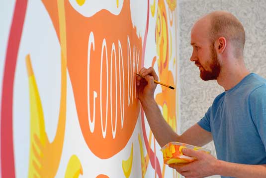
“There is something innately special about handmade type because it is expressive and completely unique.” says agency creative and type enthusiast Luke Tonge. “We’re a passionate agency with fantastic clients, and there’s a great camaraderie here. The message reminds us to be grateful and enjoy what we do” adds Luke.
The key to executing hand lettering with impact? Have fun, says Lana. “It’s good to play around, draw silly images and enjoy it. Make type out of all sorts of things and just go mad. Some of our best ideas are formed this way.”
Learn by doing
Balsley urges illustrators to just get stuck in. “You can study typefaces, lettering and other artists’ work until you’re blue in the face, but until you actually start putting pen to paper, how are you going to learn?” US designer and illustrator Jay Roeder agrees. “If hand lettering is something that interests you don’t be afraid to dive right in and make plenty of mistakes.”
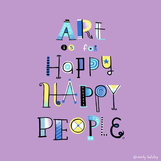
Type design takes time to master says Hische, and managing your expectations is important as a beginner. “Be patient. It’s ok to perpetually feel like you’re on your way to becoming something rather than worrying that you need to become an expert quickly. Be patient. We have long careers ahead of us and the only thing that can really stifle a career is feeling like there’s nothing left to learn.”
Words: Lisa Hassell

Thank you for reading 5 articles this month* Join now for unlimited access
Enjoy your first month for just £1 / $1 / €1
*Read 5 free articles per month without a subscription

Join now for unlimited access
Try first month for just £1 / $1 / €1

The Creative Bloq team is made up of a group of art and design enthusiasts, and has changed and evolved since Creative Bloq began back in 2012. The current website team consists of eight full-time members of staff: Editor Georgia Coggan, Deputy Editor Rosie Hilder, Ecommerce Editor Beren Neale, Senior News Editor Daniel Piper, Editor, Digital Art and 3D Ian Dean, Tech Reviews Editor Erlingur Einarsson, Ecommerce Writer Beth Nicholls and Staff Writer Natalie Fear, as well as a roster of freelancers from around the world. The ImagineFX magazine team also pitch in, ensuring that content from leading digital art publication ImagineFX is represented on Creative Bloq.
