Greatest fonts countdown: 70 - Copperplate
This late-Victorian typeface remains widely used, and widely loved and hated in equal measure…
FontShop AG, the renowned type foundry, conducted a survey based on historical relevance, sales at FontShop.com, and aesthetic quality. With a few additions from the experts at Creative Bloq and Computer Arts magazine, the best fonts ever were selected for the book, 100 Best Typefaces Ever.
Here we are counting down the 100 greatest fonts, but you can read interviews with some of the typefaces' creators, a brief history of type, the anatomy of a font, and much, much more in the book – find out how to get your copy in print or digital formats at the foot of this post.
But without further ado, here is the 70th best typeface…
70. Copperplate
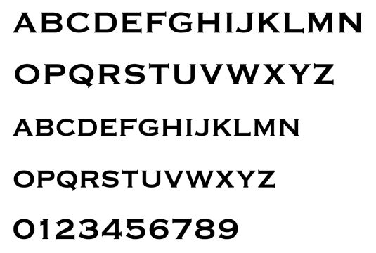
- Frederic W Goudy, 1901
Copperplate Gothic is another of those typefaces that draws strong reactions. Overuse could be the cause of it – supplied free with many computers it is often used by amateurs to denote seriousness or in an attempt at elegance. Lots of small businesses use it in lieu of an identity. Nevertheless, it’s probably the most popular of the 116 typefaces drawn by the American printer Frederic W Goudy.
Copperplate is like a sans-serif typeface – its maker even called it Gothic – with serifs. The vertical and horizontal stroke weights are very like a sans-serif typeface, yet the terminus of each stroke is affixed with a standard serif. These look unusual in certain instances – like at the bottom of a J, and on the number one. The tails on the ampersand give it the effect of being made out of a metal pipe, and the tail of the Q looks like a damaged railway spike.
With its Victorian signwriting roots, Copperplate uses small caps instead of a lower case. The stroke weights of the small caps match those of the capital letters – although the small caps can look as if they are in a bold typeset next to their big brothers. This uniformity could explain the typeface’s serious connotations.
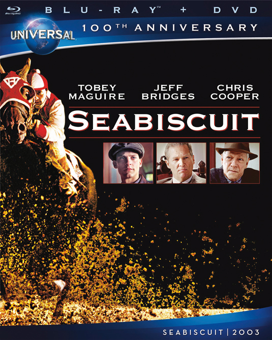
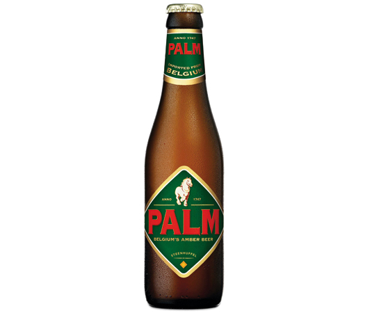
When used on a letterpress, Copperplate leaves a satisfyingly clean impression on soft, heavy card stock. It’s ideal for stationery, for lettering etched onto glass and, as you might expect, for copper plate signs. Some designers love its bold feel, and the hint of heritage it brings.
Get the Creative Bloq Newsletter
Daily design news, reviews, how-tos and more, as picked by the editors.

The 100 Best Typefaces Ever
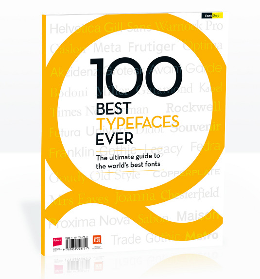
This is an extract from The 100 Best Typefaces Ever, the definitive guide to the greatest fonts ever created, in association with FontShop AG. Over 180 premium pages, the book dissects the world's greatest typefaces, bringing you some insightful background on each and interviews with their creators.
You can pick up the book at all good newsagents today or order it online. Or you can download a digital edition directly to your iPad from the Computer Arts app on iTunes.

Thank you for reading 5 articles this month* Join now for unlimited access
Enjoy your first month for just £1 / $1 / €1
*Read 5 free articles per month without a subscription

Join now for unlimited access
Try first month for just £1 / $1 / €1

Rob is editorial, graphic design and publishing lead at Transport for London. He previously worked at Future Publishing over the course of several years, where he launched digital art magazine, ImagineFX; and edited graphic design magazine Computer Arts, as well as the Computer Arts Projects series, and was also editor of technology magazine, T3.
