Greatest fonts countdown: 52 – Kabel
We're counting down the 100 greatest typefaces in existence. Here is number 52...
FontShop AG, the renowned type foundry, conducted a survey based on historical relevance, sales at FontShop.com, and aesthetic quality. With a few additions from the experts at Creative Bloq and Computer Arts magazine, the best fonts ever were selected for the new book, 100 Best Typefaces Ever.
Here we are counting down the 100 greatest fonts, but you can read interviews with some of the typefaces' creators, a brief history of type, the anatomy of a font, and much, much more in the book – find out how to get your copy in print or digital formats at the foot of this post.
But without further ado, here's the 52nd best typeface…
52. Kabel

- Rudolph Koch, 1927
Kabel, a geometric sans-serif, took its name from the transatlantic telecommunications cable. Rudolf Koch was not a fan of 'mechanised graphics', which is how he derogatively described Paul Renner's work. But he was a supporter of modernisation, and so he accepted the trend towards constructed typefaces.
In the autumn of 1926, he drew an alphabet that he christened Kabel. The new typeface by Koch took its name from a contemporary symbol of technological progress – the transatlantic telecommunications cable.
It must be said that Koch enthusiasts had little use for Kabel. But others who found the prevalent linear Roman fonts too cold were certainly glad to use it. Koch succeeded, with minimal means such as proportioning and a variable configuration of width and spacing, in creating a sans-serif font with a unique, individual charm. In 1975, under special license from D. Stempel AG, the International Typeface Corporation redrew the family and added a fifth weight. In addition, ITC Kabel can be spoiled by its increased x-height.
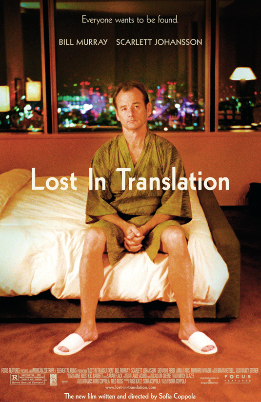
Throughout the years, Kabel has been used in many different applications – from the opening credits of Yellow Submarine to the Lost in Translation movie poster. Possibly its most popular, and important usage though, is across the entire Monopoly board. The game, published by Parker Brothers in 1935, uses Kabel extensively – on the board, on property cards and on pretty much everything else. Kabel remains popular to this day – you can even see it used in the credits for the 90s smash TV show, The Fresh Prince of Bel Air.
This is an extract from The 100 Best Typefaces Ever, the definitive guide to the greatest fonts ever created, in association with FontShop AG.

Thank you for reading 5 articles this month* Join now for unlimited access
Enjoy your first month for just £1 / $1 / €1
*Read 5 free articles per month without a subscription

Join now for unlimited access
Try first month for just £1 / $1 / €1
Get the Creative Bloq Newsletter
Daily design news, reviews, how-tos and more, as picked by the editors.

The Creative Bloq team is made up of a group of art and design enthusiasts, and has changed and evolved since Creative Bloq began back in 2012. The current website team consists of eight full-time members of staff: Editor Georgia Coggan, Deputy Editor Rosie Hilder, Ecommerce Editor Beren Neale, Senior News Editor Daniel Piper, Editor, Digital Art and 3D Ian Dean, Tech Reviews Editor Erlingur Einarsson, Ecommerce Writer Beth Nicholls and Staff Writer Natalie Fear, as well as a roster of freelancers from around the world. The ImagineFX magazine team also pitch in, ensuring that content from leading digital art publication ImagineFX is represented on Creative Bloq.
