Greatest fonts countdown: 82 - Otto
We're counting down the 100 greatest typefaces in existence. Here is number 82, plus its creators discuss their approach to type.
FontShop AG, the renowned type foundry, conducted a survey based on historical relevance, sales at FontShop.com, and aesthetic quality. With a few additions from the experts at Creative Bloq and Computer Arts magazine, the best fonts ever were selected for the new book, 100 Best Typefaces Ever.
Here we are counting down the 100 greatest fonts, but you can read interviews with some of the typefaces' creators, a brief history of type, the anatomy of a font, and much, much more in the book – find out how to get your copy in print or digital formats at the foot of this post.
But without further ado, here is the 82nd best typeface…
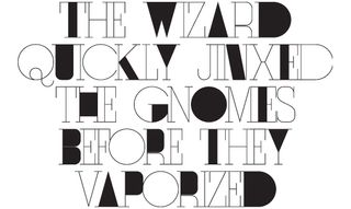
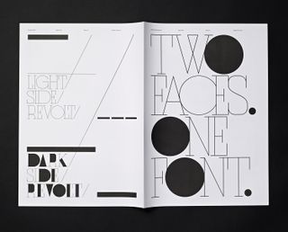
82. Otto

- Non-Format, 2009
The world renowned studio Non-Format is made up of design duo Kjell Ekhorn and Jon Forss. Working together since 2000, Ekhorn and Forss have worked for clients such as Coca-Cola, Nike, Orange, and Uniqlo. Otto offers an alternate version for many of its characters but both versions are bundled within a single font. We caught up with the duo to discuss not only Otto, but the studio’s approach to type in general.
One of the areas the studio is best known for is its custom type – what is it about typography that interests you both the most? "This is an almost impossible question to answer," says Jon Forss. "It must just be in our DNA. A typeface can make or break a word. It can encourage a meaningful relationship with language, or it can disappear altogether – I’m looking at you Helvetica. There are just an infinite number of ways of expressing the written word and it’s a constant fascination for us."
Kjell Ekhorn adds: "One of the things we most enjoy about creating our own typefaces is that they instantly transform a piece of design and make it unique. There’s a real sense of ownership that comes from designing with your own typefaces. That way of expressing those particular words, whatever they are, is unique to you.

Otto was Non-Format’s first commercially available font – do you plan to release any more? "One of the reasons why we haven’t released many of our custom typefaces as fonts is because once they’re out there in the world for anyone to use, they cease to be unique to our own designs," says Ekhorn. "However, having said that, we do have plans to release a few more of our typefaces as fonts very soon, starting with Gridiron, which we originally created for ESPN magazine."
Get the Creative Bloq Newsletter
Daily design news, reviews, how-tos and more, as picked by the editors.
In terms of the balance between effective communication and achieving an emotional connection with your audience, how important is legibility in type design? "It depends on what the type is going to be used for," says Forss. "Anyone who looks at our body of work will be able to see that we have a fairly broad definition of legibility.
"We reckon that the human brain enjoys playing games. If it has to engage a little to figure out the words, the meaning of those words will stick around a lot longer. So if you make something super-legible, we believe it has a tendency to skim across the brain and hardly cause a ripple. What you need is a great boulder of a typeface that creates a wave when it hits your noggin, something that will knock you for six. It’s something of a cliché but that’s because it’s true: don’t mistake legibility for communication."

The 100 Best Typefaces Ever

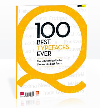
This is an extract from The 100 Best Typefaces Ever, the definitive guide to the greatest fonts ever created, in association with FontShop AG. Over 180 premium pages, the book dissects the world's greatest typefaces, bringing you some insightful background on each and interviews with their creators.
You can pick up the book at all good newsagents today or order it online. Or you can download a digital edition directly to your iPad from the Computer Arts app on iTunes.

Thank you for reading 5 articles this month* Join now for unlimited access
Enjoy your first month for just £1 / $1 / €1
*Read 5 free articles per month without a subscription

Join now for unlimited access
Try first month for just £1 / $1 / €1
Rob is editorial, graphic design and publishing lead at Transport for London. He previously worked at Future Publishing over the course of several years, where he launched digital art magazine, ImagineFX; and edited graphic design magazine Computer Arts, as well as the Computer Arts Projects series, and was also editor of technology magazine, T3.
