10 captivating uses of typography in movies
The opening credits are often the first clue you have to a film's theme and tone, and typography is integral to that.
The TV and film industry is spend a lot of time marketing new releases, utilising beautiful 3D art in movie wallpapers and creating show-stopping trailers, for example. But it's the opening credits of a new show that really gives audiences an insight in to its theme and style.
We've all sat through bland title sequences that seem never-ending. To counter act these boring displays, designers have been engaging viewers with interesting animation and typography for years. And here are some top examples of both...
01. Psycho
There's no better place to start than the combination of Alfred Hitchcock and Saul Bass. Psycho's black and white title sequence consists of bars sliding onto the screen from different sides, gliding through the typography slowly revealing words to the viewer. It is both simple and intriguing.
02. Moonlight Kingdom

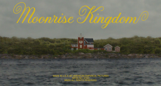
Wes Anderson loves splashing yellow typography over his movies, in fact he uses it in all of the openings title sequences except The Life Aquatic. The playful opening starts by a young boy playing the vinyl 'The Young Person’s Guide to the Orchestra' the camera begins to capture different areas of the house introducing new characters.
Once the camera pans out from the house the film is introduced with a lightning strike – the typography appears with the flash. The beautiful scripted typeface was designed by Jessica Hische.
03. Juno
A playful handcrafted sequence by Gareth Smith of Smith & Lee Design. Smith experimented with "Xerox-copied cut-out animation" to give it the captivating stop motion look. The typography is a custom design for the film called 'Kaylee', it looks as if it has just been torn from a child's sketchbook and is used throughout the movie. To create the animated look for the typography, the letterforms were traced four times to produce a typographic loop.
04. King Kong

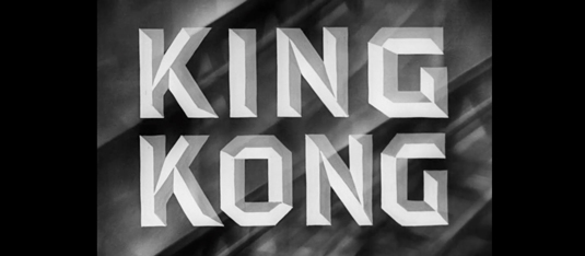
The title sequence for the original King Kong was created by Pacific Title & Art Studio. Designers in the '30s ranged from self-taught sign painters to advertising art department staff who knew a great deal about typography – the development of film typography accelerated. The title sequence for King Kong became very trendy in its era, rather than have simply text it pushed the limits of what was possible, going on to influence many other designers.
Get the Creative Bloq Newsletter
Daily design news, reviews, how-tos and more, as picked by the editors.
05. Catch Me If You Can
An illustrative sequence from design studio Nexus Productions, the style can easily compared to the work of Saul Bass. Two different types of typefaces are used throughout, they compliment the illustration and tall walking characters. We open with the a sans-serif called 'Coolvetica', the tails shoot off the screen throughout. We are then introduced to a wide slab-serif font called 'Archive Antique Extended'.
06. Star Wars
The opening credits for Star Wars is possibly one of the most iconic sequences. It had such an impact on George Lucas he used it on every Star Wars movie. Switching the perspective of the text becomes really engaging – especially with the amount of copy displayed. Two typefaces are used in the opening sequence, News Gothic for the episode number and main body of the text, and Univers for the title of the film.
07. Se7en
A dark mysterious opening title sequence by R/GA Digital Studios. The typography is scribbled over close-up shots of photos, newspaper cuttings, and razor blades. Kyle Cooper the director of the title sequence states, "The typography itself, which would likely break several guild legibility rules in modern times, was hand-etched into black-surface scratchboard and manipulated during the film transfer process to further smear and jitter it. This transfer was then cut up and reassembled during post production to add a final layer of temporal distress."
08. Dr Strangelove
The opening sequence of Dr Strangelove or: How I Learned to Stop Worrying and Love the Bomb (1964) was way ahead of its time, you may have noticed a resurgence of hand-rendered typography in recent years. The most appealing part of this ride in the sky title sequence is the thick sans-serif typeface 'Strangelove' overlaying the thin and oversized text 'Dr'.
09. The Rocky Horror Picture Show
This is one of those movie experiences you never forget, brought to you by the studio Camera Effects Ltd. The red seductive lips grab your attention at the start then the bloody science fiction typography jumps in with the drums. Everything about this film is strange, captivating and sexy and is captured perfectly in the opening credits. Fun fact: those lips belong to Magenta, one of the 'otherworldly' characters in the film.
10. Alien
Tense cinematographic build up of segmented letterforms creates a dark and intriguing setting. The title sequence by Richard Greenberg is a simplified idea compared to some of the aforementioned credits; however, it creates tension and introduces the mood of the movie perfectly.
Words: Aaron Kitney
Aaron Kitney is a freelance graphic designer and art director based in London and Vancouver. He specialises in branding, identity, web design, publication design, packaging and book design.
Liked this? Read these!
- Download the best free fonts
- Free tattoo fonts for designers
- Our favourite web fonts – and they don't cost a penny
- See some stunning examples of kinetic typography
- These retro fonts will add a touch of nostalgia

Thank you for reading 5 articles this month* Join now for unlimited access
Enjoy your first month for just £1 / $1 / €1
*Read 5 free articles per month without a subscription

Join now for unlimited access
Try first month for just £1 / $1 / €1

The Creative Bloq team is made up of a group of art and design enthusiasts, and has changed and evolved since Creative Bloq began back in 2012. The current website team consists of eight full-time members of staff: Editor Georgia Coggan, Deputy Editor Rosie Hilder, Ecommerce Editor Beren Neale, Senior News Editor Daniel Piper, Editor, Digital Art and 3D Ian Dean, Tech Reviews Editor Erlingur Einarsson, Ecommerce Writer Beth Nicholls and Staff Writer Natalie Fear, as well as a roster of freelancers from around the world. The ImagineFX magazine team also pitch in, ensuring that content from leading digital art publication ImagineFX is represented on Creative Bloq.
