Why your typography doesn't need to be readable
Jason Cranford Teague explains how to increase visual interest by increasing disfluency while remaining legible.
Ask most designers what the goal of good typography is, and they will respond without much thought: "It's about readability." I beg to differ.
Good typography is about understanding.
Good typography is about empowering the reader to process what they are reading and turn that information into knowledge. Setting a goal of readability for typography seems obvious, but only if you think the goal of reading is to finish reading.
Discover the typographic mistakes everyone makes (including us…)
Readability is the quality of typography that makes it easy to read text for sustained periods of time with minimal strain to the reader, primarily through creating quickly discernible – legible – text. However, putting the stress on readability and legibility as the primary qualities of good typography turns reading into a race.
Having legibility as a goal is like trying to win the sprint: we want to get through the course as quickly as possible. Readability, then, is like a marathon, where speed is important, but endurance is key: you want to get through the entire long course as quickly as possible, but this means pacing yourself so that you are not worn out before the finish line.
The end goal of reading text, however, is not speed or even endurance, it's retention and comprehension. Therefore, your goal as a designer using type should be to aid the reader in remembering and understanding what they have read, while allowing them to do so as quickly as possible.
Get the Creative Bloq Newsletter
Daily design news, reviews, how-tos and more, as picked by the editors.
Understandability and readability are, of course, not mutual exclusive, but, surprisingly, they are sometimes at odds. Adding a little friction to slow down the reader can actually end up enhancing their understanding.
When legibility and readability are a problem
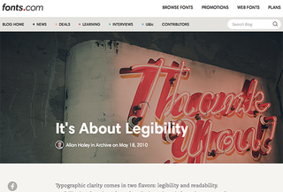
Traditionally, readability is achieved through the use of highly legible typefaces, highly contrasted colors, and well proportioned line lengths and spacing. According to Allan Haley in his article for Fonts.com, It's About Legibility: "A long-standing typographic maxim is that the most legible typefaces are "transparent" to the reader – that is, they don't call undue attention to themselves. Additionally, the most legible typefaces contain big features and have restrained design characteristics."
So, to Haley, what makes for legible text is that it allows the reader to move through copy as effortlessly and quickly as possible, with the typography becoming transparent to the author's underlying message.

Surprisingly, though, transparency may actually work against understanding the authors message if the design becomes too fluent, that is, too easy to read. According to a study conducted by Daniel Oppenheimer and colleagues at the Princeton University Department of Psychology: "When people find something easy to read, they take that as a sign that they've mastered it. Conversely, the researchers believe harder-to-read fonts provoke a feeling of lack of mastery and encourage deeper processing."
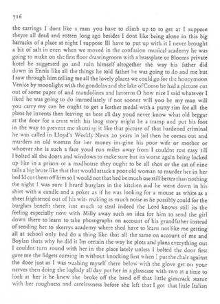
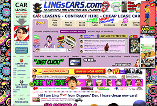
When typography that is less legible forces the reader to more sharply focus their attention it actually aids in the retention and deeper processing of the information they are reading. In fact, Oppenhiemer found that by increasing disfluency in the text by using handwriting fonts like Comic Sans at lower contrast levels – traits that are commonly associated with poorer legibility – they actually improved student learning in testing by forcing them to engage more deeply with the material. "A number of so-called 'desirable difficulties' show that when people process information deeply they learn more effectively, and depth of processing is not necessarily easy."
Think of these desirable difficulties as speed bumps in the design that force the reader to slow down and pay attention rather than just speeding along. Eliminate the bumps and the reader zooms through without paying attention. Make them too big, and people simply take a different direction or go home.

There needs to be a more study on the effect of disfluency in design, but this helps explain why design is so important to creating meaningful communication. Professor Oppenheimer commented in an email to me that "anything that makes the text slightly harder to read – for example contrast – could make a difference", and that's the designer's job.
What designers already know
Designers inherently know that introducing a controlled amount of disfluency into monotonous text may decrease readability speed, but increase memorability. But they probably don't think of what they are doing in quite that way. Our job as designers, isn't to make the page "pretty" for the sake of aesthetics, but to make it engaging in order to keep the reader's interest. This is such an integral part of what we do, it may make it hard to step back and recognize—much less explain—where the method in our madness comes from.
Designers mostly assume that that the job of making textual information understandable is the domain of the writer, and our job is simply to speed the reader along their way. It is becoming increasingly clear, however, that the designer's job is not just to speed the reader through the text, but guide and reinforce the message to help the reader to a deeper understanding.
Unfortunately, much of the text on the web is laid out by default, with the design varying little from piece-to-piece. The power that allows us to quickly publish text for mass-consumption also leads to monotonous layouts with little variety to engage readers. The designer might create an article template and even some variations, but rarely is power given to the writer or editor to add variety to the layout based on the content.

This problem with monotonous legibility being harder to process is likely tied to repetition blindness, a human condition where our consciousness drops into auto-pilot when we stop seeing significant changes in our environment.
Think about the difference between driving on an open highway versus a twisting mountain road. On the highway, you may be driving at high speeds, but the driving does not require your attention because you are not being called upon to continuously act, and your surroundings begin to blur together. On the mountain road, however, where your life may rely on being aware of your surroundings and requires your active attention, you are far more likely to take notice and remember the scenery you are driving through.
Does this mean that readability doesn't matter?
This does not mean we need to create unreadable designs to improve understanding. However, striving for perfect transparency in our designs will likely have counter-productive results. Legibility and readability should not just be chucked out the window in order to make text more interesting. Obviously, it is desirable to still be able to read the information as quickly as possible for sustained periods of time, but only if the end result is that the reader understands and remembers what they have read.
The problem often arises, though, when designers stray from the transparent into the disfluent, they are met with push back from partners, clients, and even other designers who know 'the rules' of good typography. Indeed, knowing when to add a bit of controlled noise into our designs to increase visual interest by increasing disfluency is possibly one of the most difficult skills to master, and what separates a pro from a novice. Being able to then explain the method of your madness makes you a design superstar.
Words: Jason Cranford Teague
Jason Cranford Teague is a senior creative director at Capital One. He will be speaking this summer in Barcelona at WebVisions and is available for professional training through Rosenfeld Media.
Like this? Read these...
- 5 things your portfolio must have
- How to start a blog
- Download the best free fonts

Thank you for reading 5 articles this month* Join now for unlimited access
Enjoy your first month for just £1 / $1 / €1
*Read 5 free articles per month without a subscription

Join now for unlimited access
Try first month for just £1 / $1 / €1
The Creative Bloq team is made up of a group of design fans, and has changed and evolved since Creative Bloq began back in 2012. The current website team consists of eight full-time members of staff: Editor Georgia Coggan, Deputy Editor Rosie Hilder, Ecommerce Editor Beren Neale, Senior News Editor Daniel Piper, Editor, Digital Art and 3D Ian Dean, Tech Reviews Editor Erlingur Einarsson and Ecommerce Writer Beth Nicholls and Staff Writer Natalie Fear, as well as a roster of freelancers from around the world. The 3D World and ImagineFX magazine teams also pitch in, ensuring that content from 3D World and ImagineFX is represented on Creative Bloq.
