Designers react to the new London Underground font
Discover exactly what's changed about the Transport for London font and find out what designers make of it.

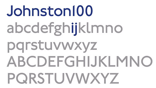
Johnston, the straightforward but elegantly quirky font found on the London Underground has been guiding commuters effortlessly for a century. Yesterday saw the unveiling of a subtle redesign for the typeface, which will help the retro font work on digital platforms.
Designed by Monotype, the polished font dubbed Johnston100 aims to recapture the soul of the original design which has slowly been diluted over the years.
Harking back to calligrapher Edward Johnston's original lettering, with its emphasis on "bold simplicity", Johnston100 continues this tradition by introducing a variety of new weights that will work more efficiently on various screen sizes.

Despite minor changes over the decades, Johnston has remained a consistent and recognisable part of London's identity. Unsurprisingly then, Johnston100 isn't so much a redesign of the beloved typeface, but more of a smartening up to ensure that it remains fit for purpose for another 100 years.
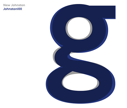
“We didn't want to redesign it, but we did know that certain things, for various reasons, had changed,” says Transport for London Head of Design Jon Hunter. “Some of the lower case letters, for example had lost their uniqueness.”

Even to the trained eye, Johnston100 is a very subtle update. But as Hunter mentioned, the changes can be found in lower case letters such as the diagonal bowl in the letter g. Meanwhile the uppercase U has been made wider.
It is hoped that these idiosyncrasies will revive some of the font's soul. Some previous iterations had made the typeface mechanical and uniform.
Get the Creative Bloq Newsletter
Daily design news, reviews, how-tos and more, as picked by the editors.
While the changes may appear minor on the surface, they've generated a huge and positive reaction from designers.
TFL’s Johnston typeface gets its first revamp in 100yrs. Loving the ‘extreme thin’ weight: https://t.co/sFqL8Eoe6p pic.twitter.com/DiWxUCXvgzJune 15, 2016
Losing my shit over the new hairline Johnston100-Monotype unveils its new Transport for London typeface, Johnston100 https://t.co/628l0qT5ujJune 15, 2016
@DarrenatFriends Mmm... fonts. Guess you've spotted the new @TfL #Johnston100 font. It looks perfectly fine to me. Nice.June 14, 2016
The brand new cut of Johnston, Johnston100 is nice, but just a touch "stressy" for me...June 14, 2016
With a design that Monotype Type Director Nadine Chahine describes as being "like you have someone with you, holding your hand, along the way," it seems that the personality of Johnston is set remain a popular and accessible part of the London landscape.

Thank you for reading 5 articles this month* Join now for unlimited access
Enjoy your first month for just £1 / $1 / €1
*Read 5 free articles per month without a subscription

Join now for unlimited access
Try first month for just £1 / $1 / €1

Dom Carter is a freelance writer who specialises in art and design. Formerly a staff writer for Creative Bloq, his work has also appeared on Creative Boom and in the pages of ImagineFX, Computer Arts, 3D World, and .net. He has been a D&AD New Blood judge, and has a particular interest in picture books.
