Create stunning 3D typography – 7 pro tips
How self-taught 3D wizard Rizon Parein designed incredible lettering for Computer Arts' latest cover.
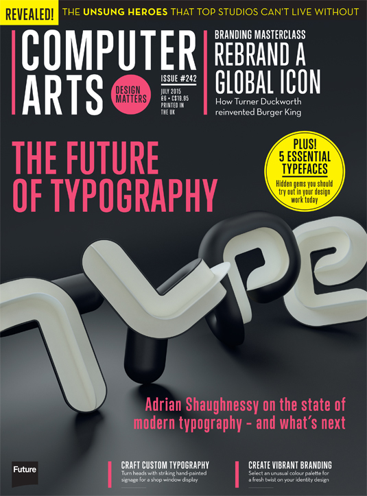
Fresh from his talk at OFFF 2015, self-taught 3D wizard Rizon Parein began work on some bold 3D type for Computer Arts' latest issue, 242, a typography special.
Parein was briefed to make the headline – The Future of Type – take up most of the image box, leaving space for the strapline. Using his Fortune Magazine editorial and Nike explorations as reference, he fired up Cinema 4D and started experimenting with perspective.
The only stipulation from art editor Jo Gulliver was that the type remained legible, and the structure followed Computer Arts' guidelines, with 'Type' forming the top of the visual hierarchy. Colour palette, font and style were up to Parein.
Here, the Belgium-based designer and illustrator explains how he approached the brief…
01. Experiment with brass pipe lettering
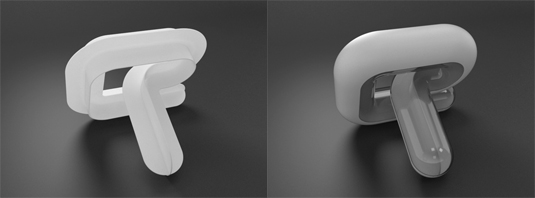
My first plan was to make each letter out of a massive brass pipe, more or less based on how I model my 3D neon stuff. I had the ambition to make each letter into an intriguing object, which would work as a real life decorative element.
I was imagining that it would be fun to make your own compositions of the word 'type', playing with these cute heavy little bended letters.
02. Add depth by cutting the tube in half
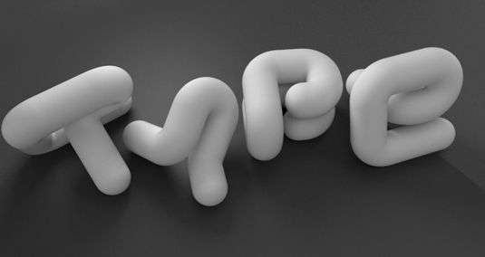
The massive bended pipe lettering wasn't interesting enough – I wanted to make it richer, more clever and needed to add something new...
Then I decided to cut the tube in half. At that point it started to become something. It was also fascinating that the axis of cutting the tube gave the letter a different weight and feel, while there was still harmony and balance.
03. Finetune legibility
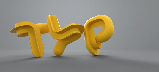
The only problem at that point was that I was loosing legibility: at certain corners I needed silhouette lines that defined the letter. Here I choose to add the crosshair shape inside the tube, which worked well and gave it that little extra… It made the whole composition sharper.
04. Model the lettering in C4D and Vray
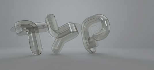
I used C4D and Vray. The modeling went quite smoothly – I just got stuck on the letter 'e'. It was hard to be consistent in the bending while still having a negative space that was in balance with the other letters. At the end I had to adjust the other three letters to fit with the 'e'.
05. Focus on the texturing
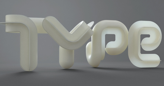
Most of the time I do the texturing in parallel with the modeling. All together it was a week's work, with healthy breaks.
06. Start playing with colour
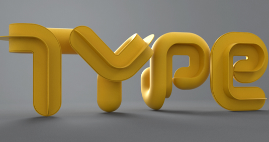
I started with a calm, subtle light grey - an off-white palette. I was aiming for the feel of modern medical or lab instruments.
When the modeling was done, it felt to me more as though it had something Italian Art Deco-ish - a bit wrong, awkward and over the top, but still stylish... Then the black and white felt right in this atmosphere.
07. Render using subsurface scattering
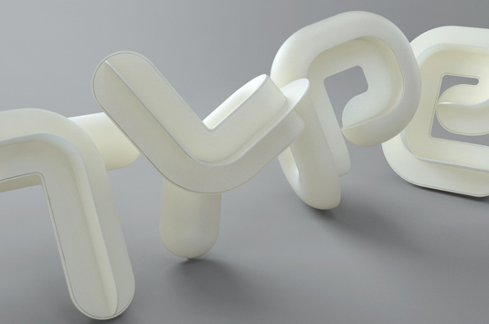
Rendering went quickly. I used subsurface scattering - this used to be slow, but these days you hardly notice any difference in the render time.
There's still time to get your hands on Rizon Parein's stunning 3D type for Computer Arts – grab a copy of CA 242 here.
Inside the issue: Adrian Shaughnessy explores the state of contemporary typography; how Turner Duckworth rebranded iconic global brand Burger King; the designer's guide to accessibility; the results of the inaugural Unsing Heroes awards; and much more.
Liked this? Try these…
- How to move from 2D to 3D
- This illustration project made a D&AD New Blood judge cry
- Free graffiti font selection

Thank you for reading 5 articles this month* Join now for unlimited access
Enjoy your first month for just £1 / $1 / €1
*Read 5 free articles per month without a subscription

Join now for unlimited access
Try first month for just £1 / $1 / €1
Get the Creative Bloq Newsletter
Daily design news, reviews, how-tos and more, as picked by the editors.

The Creative Bloq team is made up of a group of art and design enthusiasts, and has changed and evolved since Creative Bloq began back in 2012. The current website team consists of eight full-time members of staff: Editor Georgia Coggan, Deputy Editor Rosie Hilder, Ecommerce Editor Beren Neale, Senior News Editor Daniel Piper, Editor, Digital Art and 3D Ian Dean, Tech Reviews Editor Erlingur Einarsson, Ecommerce Writer Beth Nicholls and Staff Writer Natalie Fear, as well as a roster of freelancers from around the world. The ImagineFX magazine team also pitch in, ensuring that content from leading digital art publication ImagineFX is represented on Creative Bloq.
