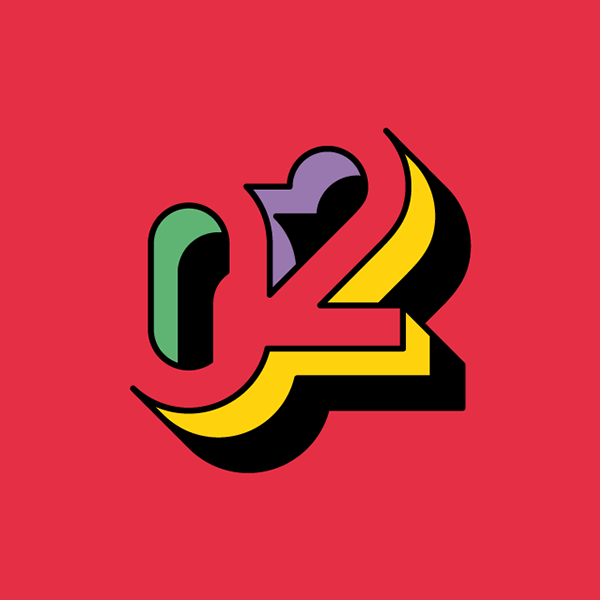
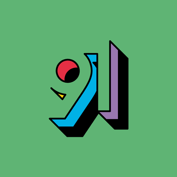
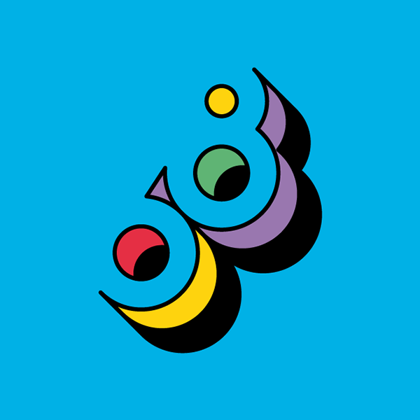
Unique number typography plays with negative space
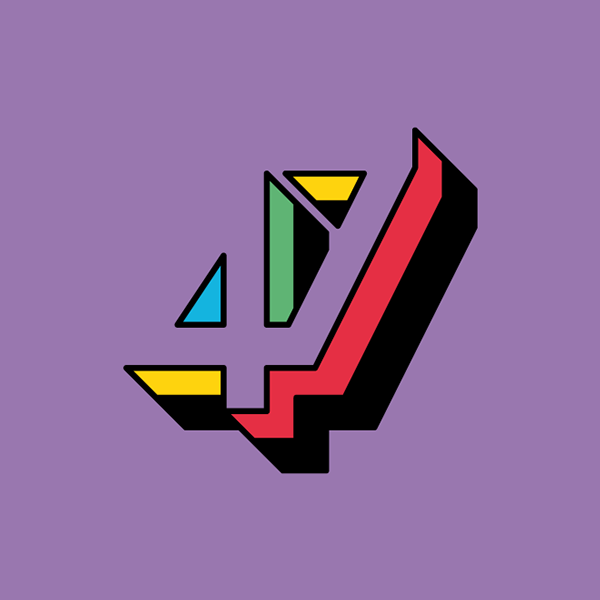
Forma and Co created this original number typography for the latest issue of Yorokobu magazine.

Magazine illustrations can really make or break an article. Catching the reader's eye is imperative in its success and showcasing intense and unique illustrations alongside those all important words can make all the difference. When it comes to typography, you have to be even more inventive and this project is one of the most inspiring we've seen.
Created by graphic design, illustration and motion graphics studio Forma and Co, the Barcelona based team were commissioned by Yorokobu Magazine to create some original number typography for their latest issue. And one thing's for sure – it certainly caught our eye.
Using popping primary colours throughout, with a clever use of negative space that creates an almost 3D-like effect, the team have done a wonderful job in producing a unique number font. Their well-known line art made them the perfect choice for this particular project.

Liked this? Read these!

Thank you for reading 5 articles this month* Join now for unlimited access
Enjoy your first month for just £1 / $1 / €1
*Read 5 free articles per month without a subscription

Join now for unlimited access
Try first month for just £1 / $1 / €1
Get the Creative Bloq Newsletter
Daily design news, reviews, how-tos and more, as picked by the editors.

Sammy Maine was a founding member of the Creative Bloq team way back in the early 2010s, working as a Commissioning Editor. Her interests cover graphic design in music and film, illustration and animation. Since departing, Sammy has written for The Guardian, VICE, The Independent & Metro, and currently co-edits the quarterly music journal Gold Flake Paint.
