5 top typography tips for your homepage
These top tips will help you nail the typography on your homepage.
Whether it's an ecommerce website or your very own online design portfolio, there's no excuse for a poorly designed homepage. But, if we all tried to express what makes for 'a good homepage', it would lead to a litany of design preferences – most often personal ones – versus an in-stone evergreen guide.
There's one element of a homepage, however, that holds some consistent truths that most of us can agree on: Typography. In this post I'll provide some great tips to help you nail down the key essentials to the most effective typography for your homepage.
01. Let the type fit the voice

It's a bit pointless for marketers and analysts to spend any amount of time developing a brand voice for their company if the site experience doesn't echo that voice. Yes, it's critical for your type to be clear, legible, and visible on any device, but it should never look detached from your brand. Or worse, boring.
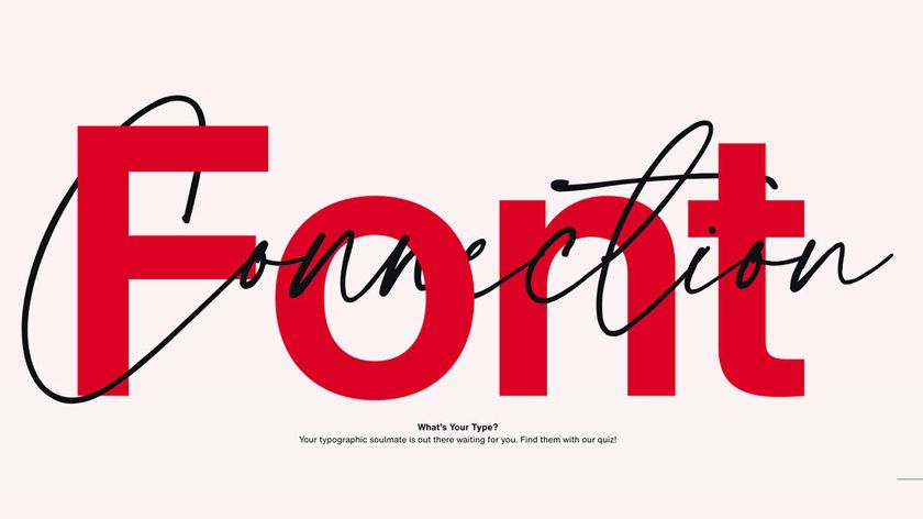
Typography is a great way to give your brand an added layer of personality. Ensure that your typographical choices make sense for every aspect of your specific brand and industry. For instance, styles and fonts used for the homepage of a yoga studio should look very different than ones used for an amusement park.
Acclaimed marketing marvel Ann Handley likes brands to ask themselves: If you covered your logo, would you recognise yourself from your content alone? The same question can be posed for homepage designers to help ensure everything is working together and feels like one unique brand.
02. Don’t fear white space
Full disclosure and transparency can certainly help potential customers and clients get more acquainted with your brand – and quite possibly convert – but it doesn't mean homepages should put it all out there at once.
White space can very often be a designer's best friend
White space can very often be a designer's best friend. Provide your website’s visitors' eyes with some visual relief. Crowded copy can create anxiety, confusion, and even a little distrust in potential customers. Friendly design – which allows for the eye to travel – helps visitors along for a more seamless experience.
03. Be consistent

Guiding customers through a homepage experience is no easy feat, so it's critical for brands to keep things consistent. Overloading the page with too many fonts, styles or colours may have the customer looking for a way out rather than looking for your call-to-action button.
Consistency is also important for brand identity, having your company's (or client's) style flow throughout the entire site to provide a complete experience for your visitors. Typographical consistency on your homepage, along with good design, initiates your visitors with how they can expect the rest of the site to look.
Always review your homepage in sections, starting with your navigation bar, and work your way down. It should always feel like one cohesive site and customer experience.
04. Less (and fewer) is more
From the UX side of things, typography is critical for the hierarchy and usability of a homepage. Keep your fonts simple. Consider how much capitalisation should be used, and where. Think about your other marketing assets – emails, for instance. If they are leading users to your homepage, do they feel related? They need to.
A good way to ensure your visitors grasp the important parts of your homepage is to stick to only using a couple of fonts. The weights and heights of those chosen fonts can – and should - vary where needed (the value props of your service should stand out, for instance), leading to an easy, minimal display, that reads as welcoming, clear, and friendly.
If you're looking to keep things on the safe side in terms of clear readability, it may be best to consider a sans-serif font, like Arial 12-point for general online copy, and a sans serif font (Verdana 10-point) for smaller print.

05. Mobile, mobile, mobile
You knew this was coming, right? Mobile is more important than ever. We know it to be true, and we need to embrace it. To that end, we must all pay more attention to how the typography of our homepages looks on mobile devices. Carefully consider everything from type and font sizes to line lengths and character counts.
Remember, too, that people are becoming more accustomed to scrolling down through information, so be sure your design and typography happily work together towards that goal.
Related articles:
- We reveal the best web fonts for your site
- Download the best free fonts
- The designer's guide to working from home

Thank you for reading 5 articles this month* Join now for unlimited access
Enjoy your first month for just £1 / $1 / €1
*Read 5 free articles per month without a subscription

Join now for unlimited access
Try first month for just £1 / $1 / €1
Get the Creative Bloq Newsletter
Daily design news, reviews, how-tos and more, as picked by the editors.


