5 hidden typeface gems you need to know about
Some of the world's best type designers reveal the secret typefaces that excite them the most.
Good news for the modern graphic designer and typographer. From tattoos to global branding schemes, choice of typeface has never been more important.
There is now more freedom than ever before to create typographic expression that goes beyond the mere graphic presentation of text.
Designers and typographers are turning typographic tradition on its head and pushing experimentation into the mainstream.
Here, professional typeface designers hand-pick the less well-known typefaces that excites them the most…
01. TwoPoint, ThreePoint and FourPoint by MuirMcNeil
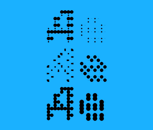
"In the last couple of years, Hamish Muir and Paul McNeil have been reinventing some amazing concepts within 'parametric type' design," says US designer and co-founder of type foundry Associated Typographics, Michael Cina.
"This is how I entered the world of type design as well, learning from the genius of Wim Crouwel and other greats. What I love about their work is that they use process-based design and execute it with pure skill."
"A lot of times a typeface/system like this can get easily written off, but they present it in a way that demands attention and respect. It also challenges the designer/user to interact with the work and build upon its limitations, which I see as a good thing. True genius."
02. AMC Zing by Jeremy Mickel
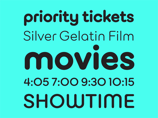
"I have a real admiration for the work of Jeremy Mickel's work in general – even though he has abandoned us for LA, the traitor – but I have a special fondness for his AMC Zing from 2012," says designer Erik Brandt.
03. Maison Mono by Timo Gaessner
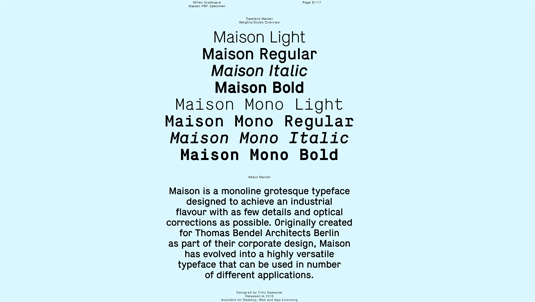
"This monolined grotesque has been one of my favourite fonts for a while. I don't know if it is a hidden gem, but it is a gem to me," says designer Rejane Dal Bello.
04. BC Liguria by Jan Novák
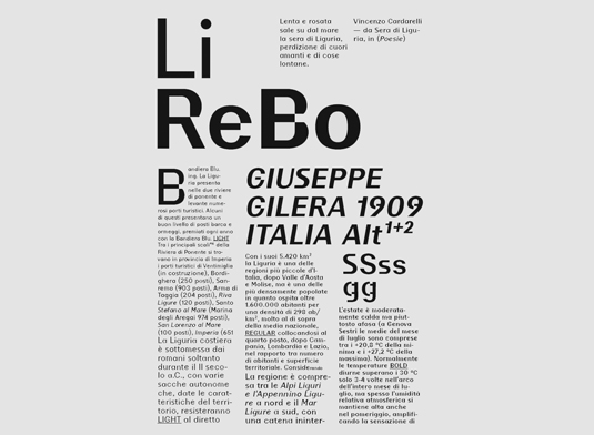
"BC Liguria is highly typographic while being playful and distorted at the same time," reflects Michael Cina.
"It reads amazingly well and oddly enough, I have not seen anything quite like it. Normally typefaces like this miss the mark in one or more levels but Liguria is well executed from start to finish."
05. Haas Unica / Unica77 by Lineto
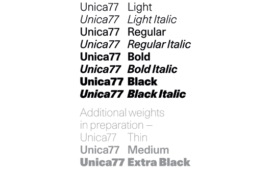
"Originally drawn for phototypesetting technology, the typeface was everything Helvetica should have been, but sadly lost to time and a legal battle. Now beautifully re-drawn for the current day by Lineto," say the team at London and New York-based independent type foundry, Colophon Foundry.
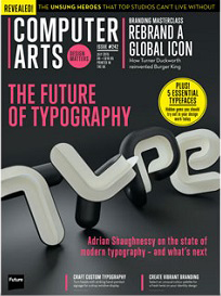
The full version of this article first appeared inside Computer Arts issue 242, a typography special that explores the state of contemporary typography. You can grab your copy of Computer Arts 242 here.
Liked this? Try these...
- Download the best free fonts
- Illustrated GIFs fight back against body shaming
- The best jobs for every personality type

Thank you for reading 5 articles this month* Join now for unlimited access
Enjoy your first month for just £1 / $1 / €1
*Read 5 free articles per month without a subscription

Join now for unlimited access
Try first month for just £1 / $1 / €1
Get the Creative Bloq Newsletter
Daily design news, reviews, how-tos and more, as picked by the editors.

The Creative Bloq team is made up of a group of art and design enthusiasts, and has changed and evolved since Creative Bloq began back in 2012. The current website team consists of eight full-time members of staff: Editor Georgia Coggan, Deputy Editor Rosie Hilder, Ecommerce Editor Beren Neale, Senior News Editor Daniel Piper, Editor, Digital Art and 3D Ian Dean, Tech Reviews Editor Erlingur Einarsson, Ecommerce Writer Beth Nicholls and Staff Writer Natalie Fear, as well as a roster of freelancers from around the world. The ImagineFX magazine team also pitch in, ensuring that content from leading digital art publication ImagineFX is represented on Creative Bloq.
