Forget how to draw or how to start a blog, in this post we're concentrating on how to kern type. Or not. Every now and again, we come across signs, logos, posters, etc, displaying questionable kerning. Some are frustrating, some are cringeworthy and some are just downright funny.
Here are some of the worst examples we've seen. Let them be a lesson to you: kerning is very important! Here's how not to do it...
01. STOP

Latest Videos From Creative Bloq
02. Excuse me?

03. Funny. Not.

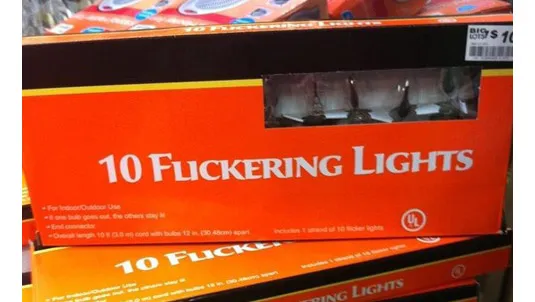
04. 'Special' lighting
05. For professionals...

06. Stop M, yeah?


Thank you for reading 5 articles this month* Join now for unlimited access
Enjoy your first month for just £1 / $1 / €1
*Read 5 free articles per month without a subscription
Join now for unlimited access
Try first month for just £1 / $1 / €1

LATEST ARTICLES