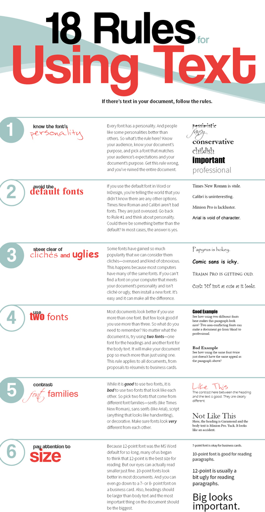
18 rules for using text
If there's text in your design, follow the rules in this infographic and you won't go wrong.

We visited The Visual Communication Guy and found this – one of the best infographics we've seen that provides designers with 18 rules for using text – so we had to share it with you.
The use of typography can be confusing – which font do you choose, and what size? If you follow these 18 rules you won't go wrong and quickly start to see a world of difference in your designs.
Like this? Try these…
- Tips for using grids in logo design
- The biggest logo designs of 2015 so far
- The best tools for data visualization

Thank you for reading 5 articles this month* Join now for unlimited access
Enjoy your first month for just £1 / $1 / €1
*Read 5 free articles per month without a subscription

Join now for unlimited access
Try first month for just £1 / $1 / €1
Get the Creative Bloq Newsletter
Daily design news, reviews, how-tos and more, as picked by the editors.

The Creative Bloq team is made up of a group of design fans, and has changed and evolved since Creative Bloq began back in 2012. The current website team consists of eight full-time members of staff: Editor Georgia Coggan, Deputy Editor Rosie Hilder, Ecommerce Editor Beren Neale, Senior News Editor Daniel Piper, Editor, Digital Art and 3D Ian Dean, Tech Reviews Editor Erlingur Einarsson, Ecommerce Writer Beth Nicholls and Staff Writer Natalie Fear, as well as a roster of freelancers from around the world. The ImagineFX magazine team also pitch in, ensuring that content from leading digital art publication ImagineFX is represented on Creative Bloq.
