Treat your type with neon colours
Mateusz Sypien explains how to mix 3D and 2D for some simple, yet stunning text effects
- Software Photoshop CS4 or later and 3ds Max 2011 with V-Ray 2.0
- Time needed 3-5 hours
- Skills-Build and light 3D objects-Work with layers and different blend modes-Create glow effects-Learn post-production techniques
- Download support files
In this walkthrough I’ll explain how to create 3D type and give it a glowing neon look using a couple of simple tools, filters and options in Photoshop. The trick is to think about your light sources wisely: instead of over-lighting your objects, try to subtly highlight them, drawing out the beauty of their shape.
We’ll prepare a set of layers using 3D software and some different settings, before combining them together in Photoshop. You’ll see how quick and simple it is to control the whole composition when everything is separated, and how this technique can benefit other projects. If you’re not familiar with 3D software, you can use the support files and start from step 08 when post-production begins. If you’re starting from step 01, you can refer to the V-Ray_setup folder for all the accurate settings needed throughout.
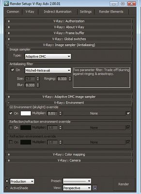
01 Create a new document in 3ds Max and assign V-Ray as your rendering engine. The V-Ray settings used in this tutorial are mainly default – only a couple need to be changed. Open Render Setup and go to the V-Ray tab. Under Image sampler set Type to Adaptive DMC. Check the On box for Antialiasing Filter, and pick Mitchell- Netravali. Now check the On box underneath ‘GI Environment (skylight) override’, choosing a solid white colour and setting Multiplier to 0.01. Go to the Indirect Illumination tab and check the On box. Under the bounces menus, set the GI engines to Irradiance map and Light Cashe, both with Multiplier set to 1.0.
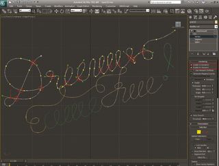
02 Go to Create>Shapes>Line and draw your text. When all the vertex points are placed in the same line, the object will look flat; that’s why you have to select the points where the splines cross together and move them forward or backward. Experiment. Check the Preview boxes next to Enable In Renderer and Enable In Viewport, and set Thickness to 1.2. Select MeshSmooth from the Modifier List menu.
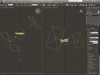
03 Create two V-RayLight sources (Create>Lights>Vray>VrayLight) and place them in front and behind the shape. The front light is your primary light source, so select it and make it pure white with Multiplier set to 60. The light behind is your backlight and adds an outline to one side. The setup is almost the same, but change Multiplier to 70. Create a V-Ray camera and place it in front of your object.
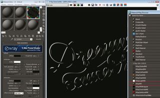
04 Open the Material Editor and make a new VrayMtl, setting Diffuse to solid black and Reflect to solid white. Tick the Fresnel reflections box and set Fresnel IOR to 0.35. When you render your image it’s important to render both layers separately: save your image, remove the backlight, render your image and save it as a PNG file with a transparent background. Repeat, with the front light source removed.
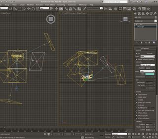
05 Now start duplicating your backlight, placing the copies in random positions. The colours and amount of different light sources are up to you. Experiment with different colours and Multiplier values between 100 and 300, then render your composition and save it as another PNG file.
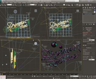
06 For added interest in the final piece, fill your composition with different geometric shapes: don’t limit yourself – go mad and unleash your creativity. When your composition is filled, remove the text from the middle, select the V-Ray camera and go to the Sampling options. Activate ‘depth-of-field’ and then render another layer.
Get the Creative Bloq Newsletter
Daily design news, reviews, how-tos and more, as picked by the editors.
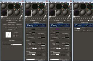
07 Open the file with two primary lights and remove the back light. Open the Material Editor and create a new Blend material. Material 1 controls the object colour. Input VRayMtl with a Solid Black diffuse. Material 2 gives the colour of the wireframe that we will render. Again use VrayMtl with Diffuse set to R:112, G:0, B:156 and no reflections. The third slot is for VrayEgdesTex.
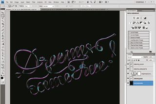
08 Open your first two PNG files with primary lights in Photoshop. Add a Brightness adjustment layer between them, change the Brightness value to -100, click above the layer and select Create Clipping Mask. Change the blend mode to Screen. Next, open your neon text image and place it on the composition, changing the blend mode to Screen.
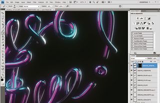
09 Duplicate your backlight layer and add a Gaussian Blur (Radius: 20px). Do the same with the first highlights layer (Radius: 10px; Opacity: 70%) and repeat with the neon light layer (Radius: 70px and 20px). Add the wireframe layer, set to Screen and 10% Opacity. Duplicate this layer (Opacity: 100%). Hide the top layer with a mask, and remove it with a soft brush (Opacity: 20%) over the text highlights.
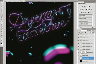
10 Open the file with the geometry objects around the text and move it to the bottom of your layers, above the background layer. Change the blend mode to Screen. If you feel that the depth of field rendered in 3ds Max isn’t strong enough, go to Filter>Blur>Lens Blur and enhance it a little more.
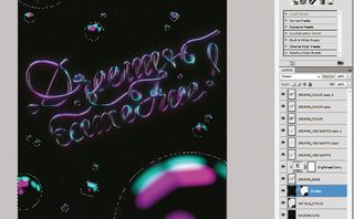
11 Next, create a new layer and fill it with black. Go to Filter>Noise>Add Noise, set Amount to 30%, Distribution to Gaussian Blur and check the Monochromatic box. Now add a Gaussian Blur with the Radius set to 2px. Go to Image>Adjustments>Levels and change Input Levels accordingly to your needs (I’ve set mine to 40/0.37/58). Select all the objects in the composition and go to Layer> Layer Mask>Hide Selection. Lastly, change the blend mode to Screen, adding star shapes to the top of highlight areas.
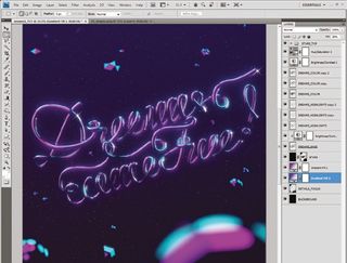
12 Finally, add a Hue/Saturation adjustment layer with Hue set to -5, and the Brightness/Contrast layer below this with the Brightness value set to 30. Now create two gradient fill layers between the layers with your additional shapes and background stars, and experiment with the settings until you’re happy.

Thank you for reading 5 articles this month* Join now for unlimited access
Enjoy your first month for just £1 / $1 / €1
*Read 5 free articles per month without a subscription

Join now for unlimited access
Try first month for just £1 / $1 / €1
The Creative Bloq team is made up of a group of design fans, and has changed and evolved since Creative Bloq began back in 2012. The current website team consists of eight full-time members of staff: Editor Georgia Coggan, Deputy Editor Rosie Hilder, Ecommerce Editor Beren Neale, Senior News Editor Daniel Piper, Editor, Digital Art and 3D Ian Dean, Tech Reviews Editor Erlingur Einarsson, Ecommerce Writer Beth Nicholls and Staff Writer Natalie Fear, as well as a roster of freelancers from around the world. The ImagineFX magazine team also pitch in, ensuring that content from leading digital art publication ImagineFX is represented on Creative Bloq.
