The top 20 graphic design trends of 2012
We look back at our predictions for design from a decade ago.
Creative Bloq is now ten years old! To celebrate a decade of design, we're looking back at some past predictions. Read on to find out what we thought was going to be hot over a decade ago (the original piece was published in December 2012). What did we get right? What's still trending now? And what did we get wrong?
For many designers, the word 'trend' has a negative connotation, tarred with images of blind imitation of whatever's hot at any given time, rather than genuine innovation and independent creative thought.
So rather than serving you up seasonal, flash-in-the-pan trends that you'd frankly be a fool to follow, here we've provided an essential overview of 20 longer-lasting styles and movements that have genuine impact on creative professionals.
Notable in 2012 is the trend for pared-back minimalism, which cuts through the noise with considered use of white space, clean type, bold, simple shapes and limited colour palettes, rather than ladling on special treatments and effects – and we've covered several applications of this here.
Likewise, the current consumer desire for authentic, unique products that give a sense of heritage rather than bland mass-production manifests itself in several smaller ways too. You'll find a few wildcards in there, too – so read on for your snapshot overview of the design trends from 2012.
Back to basics
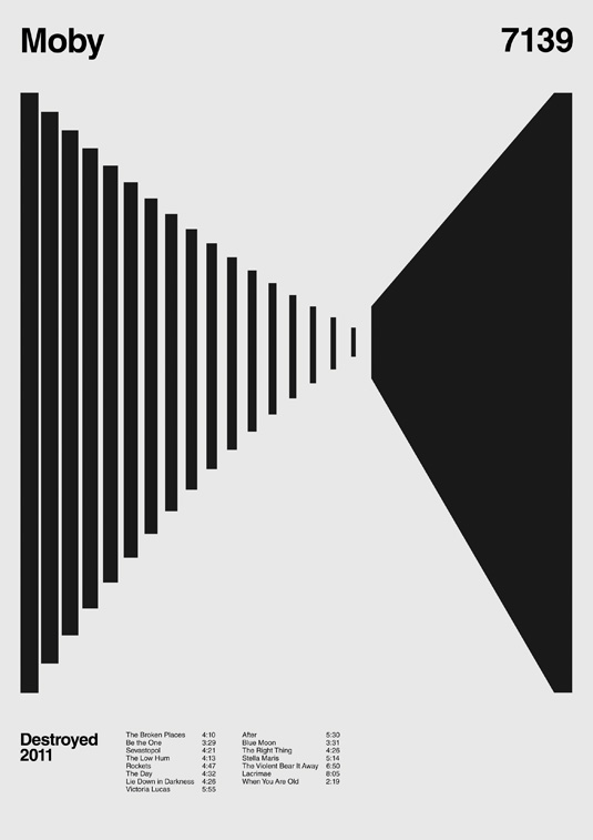
Reacting against a modern-day existence in which we’re overloaded with information, data and constant updates about the world around us, this trend for refined, ultra-simplified design boils communication down to its bare bones, stripping out unnecessary fuss and complications to leave graphic artwork in its purest form. It takes confidence and skill to design in this pared-back way – there’s nothing to hide behind – and the few elements need to work extra hard.
Build your own type
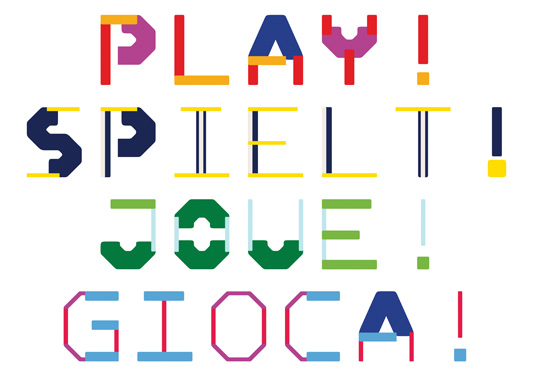
DIY type systems’ basically enable you to compile your own letterforms using so-called ‘modular construction kits’, and then test and play around with the resulting alphabet for interesting results. Many such kits come in hybrid forms, combining multiple elements in various ways for true versatility. Christine Gertsch’s Modono project, for instance, provides a series of horizontal, vertical, diagonal and corner components that can be used to make monospaced characters of different weights and colours.
Get the Creative Bloq Newsletter
Daily design news, reviews, how-tos and more, as picked by the editors.
Timeless heritage

In order for a new brand identity to stand out in an already densely populated marketplace, it needs to be timeless, clean and communicate clearly. Many consumers are embracing global brands that demonstrate a truly international aesthetic – designers are often achieving this by looking to how great brands of the past for inspired use of bold colour stripes and simple fonts, similar to examples of now-iconic airline branding that has really stood the test of time.
Handwritten type
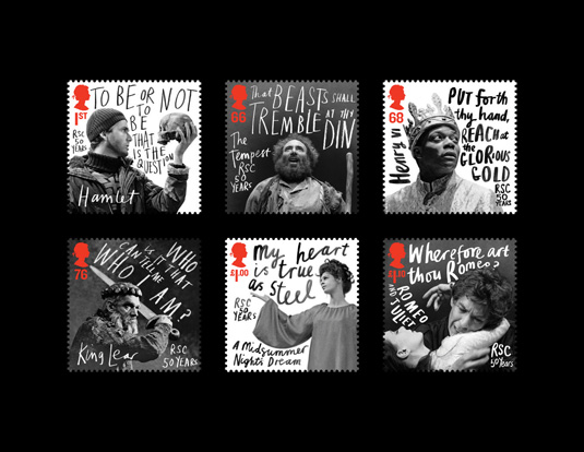
With polished digital perfection everywhere, the raw, flawed product of the human hand is becoming increasingly appealing, especially in contrast to overly slick digital design that’s too clean and crisp to have a soul of its own. Starting in reaction to the homogenisation of type in emails, texts and tweets – where the personality of handwriting is stripped away – hand-written type adds a real sense of authenticity to a piece of design, as well as a whimsical edge.
Type from objects
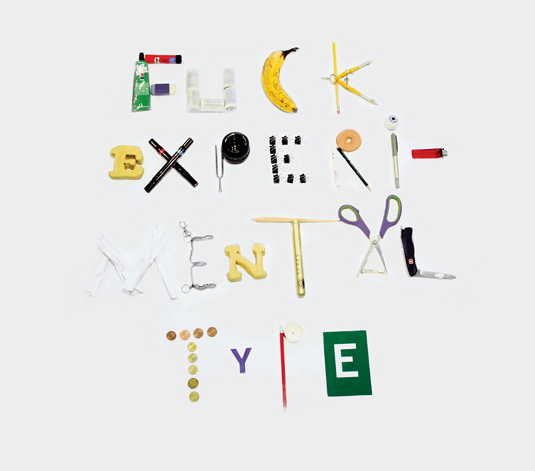
Pushing the idea of DIY type systems a little further, some designers are manipulating everyday objects into playful, spontaneous typographic designs. Compiled from any number of gathered, scavenged and collected objects, these alphabets are truly unique and individual. One example is Jonas Buntenbruch’s provocatively titled ‘Fuck Experimental Type’ piece, which utilises ‘found’ objects from his workspace to create the phrase – including pens, coins, scissors and a banana.
The incomplete look
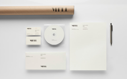
Some typographic branding work has been pared back beyond its core elements, stripping out parts of letterforms for a more subtle, sophisticated approach that communicates using the least information possible. When the right balance is struck, missing elements in logos leave the viewer to fill in the blanks as the brain automatically solves the puzzle. Anagrama’s work for architectural firm MTLL, for instance, strips out the lines from the ‘M’ to help convey its dedication to finding simple solutions.
Back to Bauhaus
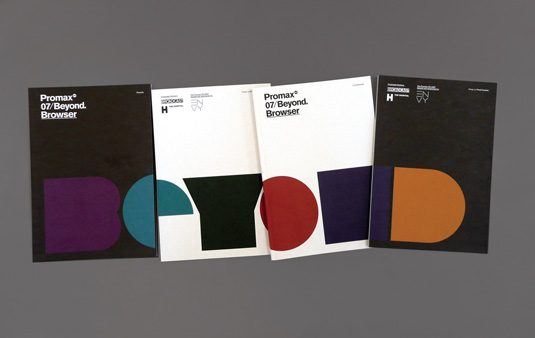
This particular trend is characterised by simple, strong, graphic patterns that chime with the Bauhaus aesthetic: it’s all about straight edges, angular shapes and bold colours. Triangles, circles and hexagons replace more ornate patterns for a real sense of clarity, purity and authority – enhanced by widespread use of saturated primary colours. In some cases, shapes are also layered into abstract typography in a style that blends classic Bauhaus Modernism with 1980s graphic design.
Old school calligraphy
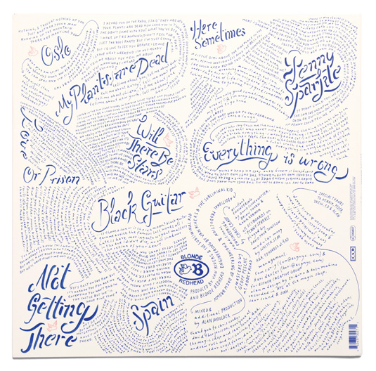
Pushing against the ubiquity of particular typefaces, this trend develops the trend for rough, hand-drawn lettering even further. Rather than settle for the unnatural smoothness of standard off-the-shelf script fonts, designers are developing their own type using calligraphic techniques, imitating the authenticity of hand-inked lettering. This kind of unique craftsmanship is particularly in vogue, and the visual style of a hand-written personal letter suggests that time, effort and skill have been invested in a piece of graphic design.
Moiré patterns
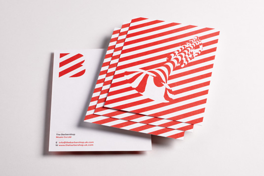
Comprising two or more grid-like patterns that are overlapped to create a simple optical illusion, moiré techniques are being used extensively in branding work in particular – providing an engaging, eye-catching way to attract consumers’ attention. From simple black-and-white effects to bold uses of stripes and bright primary colours, such as Here Design’s branding work for music and sound design company Barbershop, moiré designs make simple shapes and colours work doubly hard.
Artisan authenticity
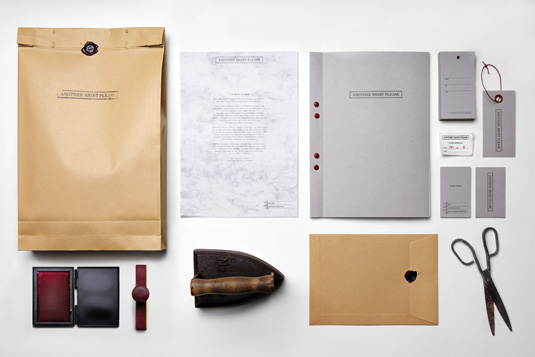
With giant multinational brands dominating the high street and efficient mass-production stripping any sense of variation out of the products they sell, consumers are consciously seeking out an independent, artisan aesthetic for a refreshing change. For designers, it pays to make the effort to communicate the heritage of a brand – as well as reveal the ‘craft story’ behind a product – to tap into this widespread desire for a genuine connection with the process by which things are made.
Generative type
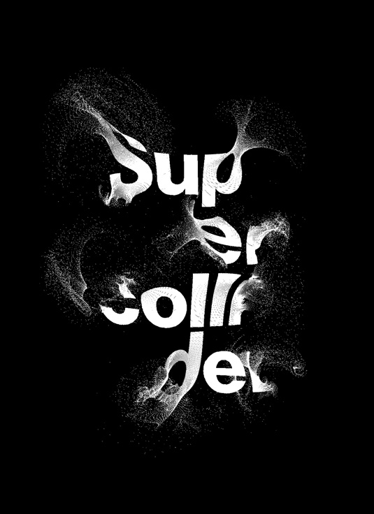
The rise and rise of generative art – particularly tools such as Processing – has spread to typography, with new abstract letterforms being created in an organic (yet still wholly digital) way. Although manipulating the code can control various factors, the randomness of the final output can also have a similarly raw, unique appeal to handcrafted work. New York-based typographic illustrator and designer Craig Ward has produced various generative art experiments, with often-unexpected results.
Silhouetted shapes
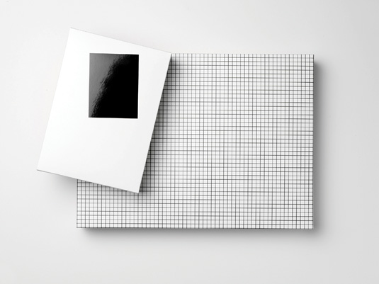
Taking cues from street signs and other simple graphic systems that rely on basic shapes, designers are working with silhouette-like patterns and stark black-and-white palettes, playing with positive and negative space with striking consequences. Swedish art director Daniel Carlsten adopted this style for a packaging brief for fashion brand Acne, combining shapes into a series of patterns that are greater than the sum of their parts.
Feminine elegance
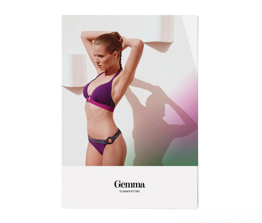
Continuing the trend for clean, simple design that’s free from fussy embellishments, this particular aesthetic brings an elegant, feminine touch to the table. Combining subtle textures with soft, pastel colour palettes, the resulting design work exudes quiet confidence without the need to shout. Bold photography is juxtaposed with blocks of dusky pink, pale aqua and pigeon grey for a feeling of calm, often combined with Didot-inspired fonts for that extra touch of sophistication.
Three-dimensional effects
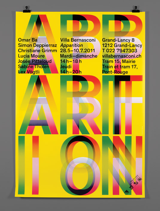
3D is the talk of the movie industry, and the distinctive aesthetic is fast spreading into graphic design work as well – with RGB layering, stereoscopic techniques and various 3D-inspired print effects shaping a unique middle ground between digital and analogue. Swiss design studio Schaffter Sahli, for instance, used an eye-catching 3D optical effect on a poster to promote Villa Bernasconi arts centre – while other projects take this a step further, requiring 3D glasses to fully appreciate them.
Rough sketches
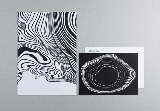
Instead of making use of clean photography, polished illustration and crisp typography, some designers prefer a more rough-and-ready, spontaneous approach, utilising basic sketching techniques to explore the diversity, depth and personality of particular brands. Blending traditional ink, paper and pencil skills with modern production methods, the resulting designs are quick to produce and can exude a certain carefree charm. The process isn’t always simple, however: Demian Conrad’s branding for Almighty, for instance, makes use of the Japanese art of Suminagashi marbling.
So bad, it's good
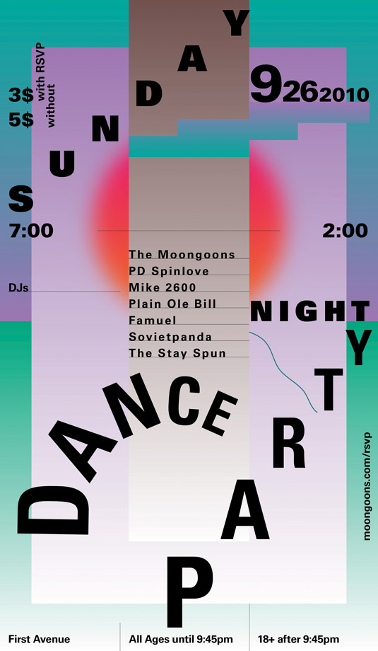
There’s a strong design movement to celebrate glitches, failures, errors and mistakes – deliberately encouraging them to take place for aesthetic reasons in many cases. Where once designers would avoid them like the plague, tools such as WordArt and ClipArt are enjoying an unlikely resurgence in work that’s intentionally chaotic and confusing. This trend is driven partly by nostalgia, and partly by the influx of amateur Photoshop users who no longer see bevels, drop shadows and rainbow gradients as cardinal sins.
Shake and distort
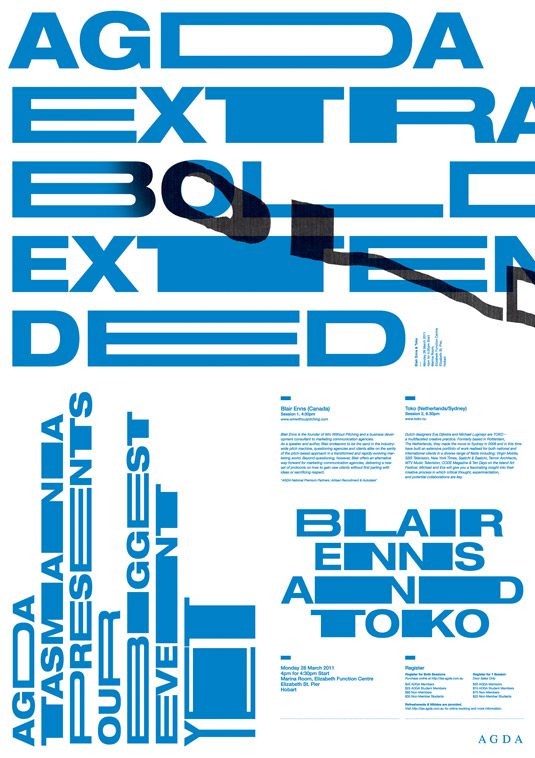
This belief in the value of mistakes as part of the creative process has had a particular impact on the use of typography. Harking back to the pre-digital days when mistakes were regularly made in the printing process – particularly in DIY cut-and-paste zines – this trend explores the unique effects that resulted, including jumbled, stretched, distorted and often illegible text, to the chagrin of dyed-in-the-wool type traditionalists and advocates of the pure Swiss style.
Crack the code
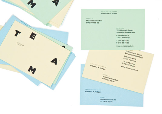
Designers are also breaking up individual words in a design in order to construct simple codes or puzzles – splitting, cutting, inverting or removing elements. Seen primarily on corporate identity and packaging work, type is often aligned along horizontal, vertical or diagonal grid lines, further emphasising the ‘wordsearch’ feel. Hort’s work for TEMAConsults, for instance, varies the branding across its many applications – placing letters randomly on different surfaces so the logo is never displayed in the same way twice.
Brutally simple packaging
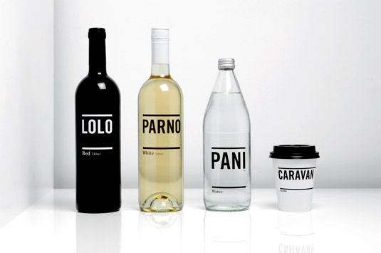
Weary of too much choice on the shelves, many consumers are turning to packaging that cuts through the noise with simple, black-and-white communication that combine bold type with plenty of white space – the IKEA approach made famous by Stockholm Design Lab. The implication is that the product is of sufficient quality to speak for itself, without the need for ornamentation to sell it too hard. It’s minimalism at its most brutal, but effective.
Didot typography
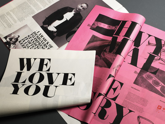
Named after the French family of type-designers and printers who created it, Didot is an elegant neoclassical typeface that was popular in the late 18th century – and is enjoying another revival, having been last popular in the New York design scene in the 60s and 70s. Best-known for the strong contrast between stroke weights, and especially their ultra-thin hairlines, Didot fonts are most effective used at large display sizes.
Read more:
- How to break into children's book illustration
- 69 brilliant Photoshop tutorials to boost your skills
- Kanye West forces small business to redesign Ye-inspired branding

Thank you for reading 5 articles this month* Join now for unlimited access
Enjoy your first month for just £1 / $1 / €1
*Read 5 free articles per month without a subscription

Join now for unlimited access
Try first month for just £1 / $1 / €1

Nick has worked with world-class agencies including Wolff Olins, Taxi Studio and Vault49 on brand storytelling, tone of voice and verbal strategy for global brands such as Virgin, TikTok, and Bite Back 2030. Nick launched the Brand Impact Awards in 2013 while editor of Computer Arts, and remains chair of judges. He's written for Creative Bloq on design and branding matters since the site's launch.
