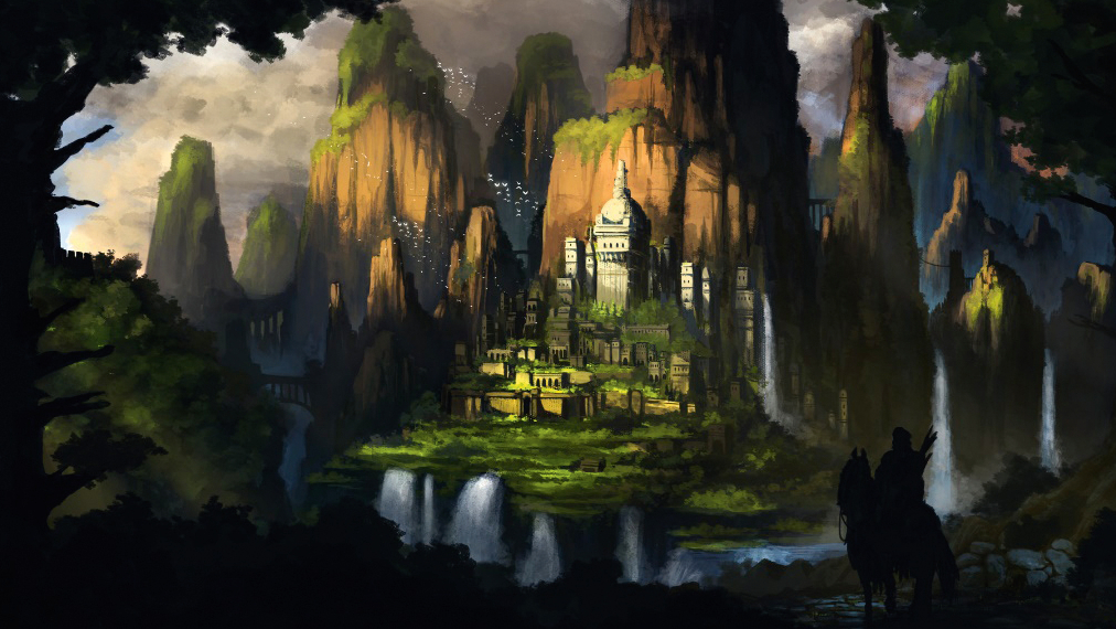
Usually, freelance CG artist Daniel Kho models his characters in an A-pose, but the dynamics of concept artist Renan Nuche's sketch - called Pow - forced Kho to change tactics.
01. Start with a concept
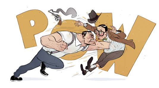
I always work with a concept, it gives me a better idea of things. With this piece, I chose one by the amazing Renan Nuche. I start by analyzing the concept, and figuring out which parts need extra attention, which can i use symmetry on, basically any where I can cut corners.
02. Model the face
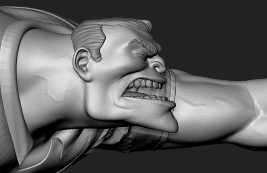
Start with the face, I tend to pay most attention to the faces, because for people, faces are almost always the first read. Once i have a rough feel of the character, I blocked out a rough pose just to get a better feel of the character.
03. Set a dynamic pose
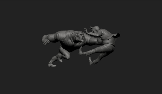
The next step is focusing on the posing, and the dichotomy of the characters. I try to find nice form and balance between the two interacting characters, the rhythm of their poses, and making sure they look good from all angles.
04. Create styised details
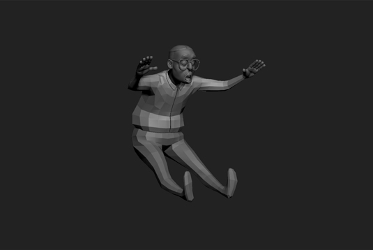
After all that is settled, I move on to the tertiary details. Remembering that this is a stylised character, I make sure that my details are scaled up a little, so it would work well with the rest of the sculpt.
05. Start texturing
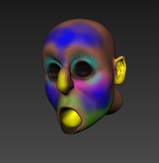
I then proceed to the texturing phase. I mostly use Mudbox, because it enables me to paint in 3D. As you can see, I block in rough colors as masks for my textures, and then fix up everything in photoshop to get the final look.
06. Turn to the shading
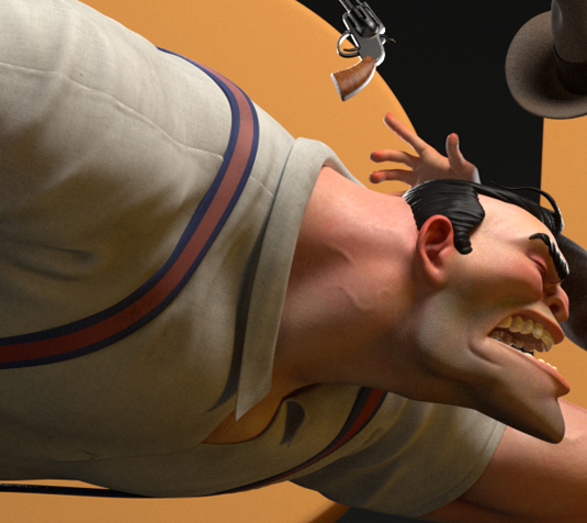
Shading is an essential part of the process. With stylised shading, I tend to push the materials a little more. Stronger bumps, deeper subsurface, exaggerate the details, to amplify the form.
Get the Creative Bloq Newsletter
Daily design news, reviews, how-tos and more, as picked by the editors.
07. Set-up the lighting
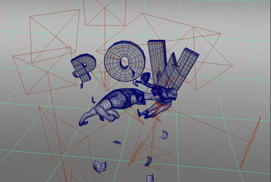
The lighting was quite a challenge. I made a setup that would light both characters properly, while also adding mood and story element to the image. I used a lot more lights than I normally do, because of how close the characters are to each other.
08. Tighten the composition
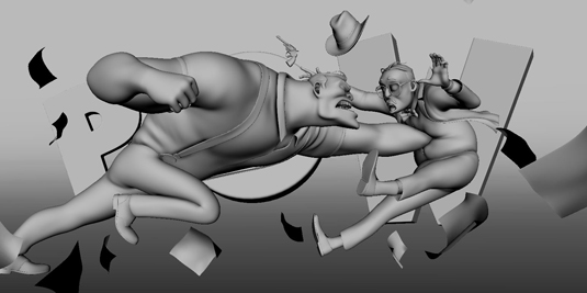
Composition played a huge part in this image. In order to push the dynamicness of the image, I could not stick with the same composition as the original concept. I went with a wider lens, and added papers to help exaggerate the action of the scene.
09. Render and colour correct
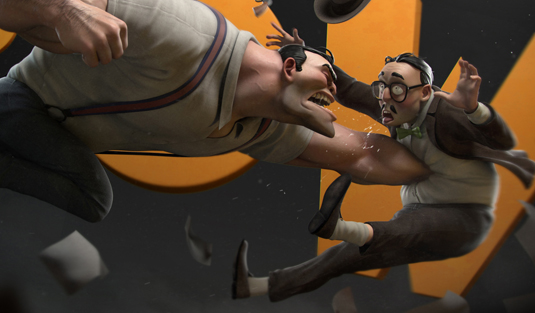
Lastly, I rendered out all the passes and put the together in Photoshop for some colour correction and minor tweaks. I then added motion blur to the papers for a more dramatic effect.
See more of Daniel Kho's work at his portfolio site here.

Thank you for reading 5 articles this month* Join now for unlimited access
Enjoy your first month for just £1 / $1 / €1
*Read 5 free articles per month without a subscription

Join now for unlimited access
Try first month for just £1 / $1 / €1

Ian Dean is Editor, Digital Arts & 3D at Creative Bloq, and the former editor of many leading magazines. These titles included ImagineFX, 3D World and video game titles Play and Official PlayStation Magazine. Ian launched Xbox magazine X360 and edited PlayStation World. For Creative Bloq, Ian combines his experiences to bring the latest news on digital art, VFX and video games and tech, and in his spare time he doodles in Procreate, ArtRage, and Rebelle while finding time to play Xbox and PS5.
