Texturise web type with CSS
As newer CSS properties, such as text-shadow, gain traction, there’s no limit to what can be done with web type. Trent Walton from Paravel goes a step further by texturising it
- Knowledge needed: Basic CSS and HTML
- Requires: Text editor and WebKit Browser (Chrome or Safari)
- Project time: 30 mins
- Download source files
This article first appeared in issue 221 of .net magazine - the world's best-selling magazine for web designers and developers.
Thanks to the growing acceptance of WOFF and services such as Typekit, Fontdeck, Font Squirrel, and Fontspring, web fonts are everywhere. Now that web designers have access to more type choices, they want the same level of control over fonts that print designers have. While much can be achieved with web-safe fonts and core CSS properties such as font-weight or letter-spacing, many CSS3 properties can now be used to provide even greater control. WebKit browsers have a little-known but fantastic property that can be applied to text called mask-image.
Mask-image can be used to knock out small textural pieces of headline text. Using this technique with paragraph text would hurt readability, but when applied to a large-format display font, it can create a subtle point of interest. Though it’s currently only a WebKit safe (Safari and Chrome) property, it degrades gracefully by just showing no texture to non-supporting browsers.
Article continues belowIn this tutorial we’ll walk through texturising type from scratch – beginning with basic HTML and CSS, then creating a semi-transparent texture in Photoshop and implementing it on some headline text within a web page. We’ll finish it off by adding some extra CSS and JavaScript love.
The design for this page has been inspired by the colour and type found on 1970s American muscle cars, particularly the Boss 302 Mustang.
Step 1: Setting up with HTML and CSS
Let’s begin by setting up an extremely simple index.html page with the following markup:
- <!DOCTYPE html>
- <html lang="en">
- <head>
- <meta charset="utf-8"/>
- <title>Netmag / Mask-Image</title>
- <link rel="stylesheet" href="style.css" type="text/css" />
- <!--[if IE]><script src="http://html5shiv.googlecode.com/svn/trunk/html5.js"></script><![endif]-->
- </head>
- <body>
- <header>
- <h1>Netmag</h1>
- </header>
- </body>
- </html>
From there, we’ll start adding basic style and layout via the style.css style sheet we’re loading:
Sign up to Creative Bloq's daily newsletter, which brings you the latest news and inspiration from the worlds of art, design and technology.
- body {
- background-color: #d8411f;
- color: #222;
- font: 2em/1 sans-serif;
- text-align: center;
- }
- header {
- margin: 15% auto;
- width: 700px;
- }
Now we’re sitting pretty with some dark grey (#222) text on an orange background. In this case, just any ol’ sans-serif font won’t cut it, so we’ll be loading in League Gothic, courtesy of theleagueofmoveabletype.com. Here’s the updated CSS for the body, h1, and the Font Squirrel-generated @font-face:
- /* Generated by Font Squirrel (http://www.fontsquirrel.com) on July 5, 2011 */
- @font-face {
- font-family: 'LeagueGothicRegular';
- src: url('/fonts/league_gothic-webfont.eot');
- src: url('/fonts/league_gothic-webfont.eot?#iefix') format('embedded-opentype'),
- url('/fonts/league_gothic-webfont.woff') format('woff'),
- url('/fonts/league_gothic-webfont.ttf') format('truetype'),
- url('/fonts/league_gothic-webfont.svg#LeagueGothicRegular') format('svg');
- font-weight: normal;
- font-style: normal;
- }
- body {
- background-color: #d8411f;
- color: #222;
- font: 2em/1 'LeagueGothicRegular', sans-serif;
- text-align: center;
- }
- h1 {
- border: .12em solid #222;
- font-size: 8em;
- line-height: 1;
- padding: .08em .08em 0;
- text-transform: uppercase;
- }
Step 2: Adding texture via mask-image
Let’s start by opening up Photoshop to create a semi-transparent .png texture to mask the text. It’s important to remember that when an image is masked using CSS, wherever there is transparency, the text will be erased or knocked out. That being the case, we only want to have subtle amounts of texture to ensure that the text remains legible.
Take a look at the three layers found in knockout.psd. Here’s the step-by- step for what I did from the bottom layer up:
The Background layer is simply the orange fill. I used the Texture – pre knockout layer to add some grunge, a few brush strokes at a time. While this layer isn’t used in the export, it’s included to help track the progression.
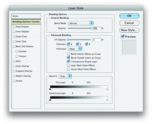
Next, I duplicated the Texture – pre knockout layer and renamed it Texture – used. In the Photoshop layer styles palette, I set the Fill Opacity to 0% and the Knockout to Deep to gain transparency.
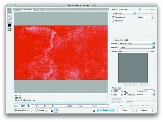
When exporting/saving for web, be sure to export your image as a PNG-24 with the transparency checkbox checked.
Whew! Back to code. This part is magically simple – just expand the code for the h1 to include the mask image code:
- h1 {
- border: .12em solid #222;
- font-size: 8em;
- line-height: 1;
- padding: .08em .08em 0;
- text-transform: uppercase;
- -webkit-mask-image: url(/img/knockout.png);
- -o-mask-image: url(/img/knockout.png);
- -moz-mask-image: url(/img/knockout.png);
- -ms-mask-image: url(/img/knockout.png);
- mask-image: url(/img/knockout.png);
- }
And presto! That flat and boring text in a box now has texture. And never fear if the text takes up more space than the image you export because it automatically repeats. As I said before, this only works in WebKit, but I’ve added all the other vendor prefixes with high hopes that the property gains acceptance very soon.
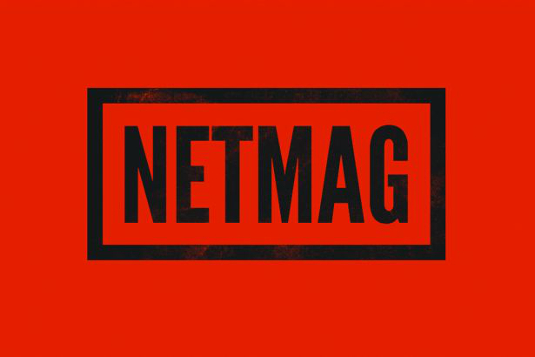
I would say it’s appropriate to use this property as-is on client sites today because the fallback is perfectly acceptable. In this particular case, it would simply render as black text with no texture. No harm, no foul. As thrilling as this all is, I’d like to turn things up not one, but two
more notches!
Step 3: Make it skew with CSS3
CSS Transforms are rapidly gaining support among browsers that include IE9+, Safari 5, Firefox 4, Opera 11.1 and Google Chrome, so let’s put them to good use here:
- h1 {
- border: .12em solid #222;
- font-size: 8em;
- line-height: 1;
- padding: .08em .08em 0;
- text-transform: uppercase;
- -webkit-mask-image: url(/img/knockout.png);
- -o-mask-image: url(/img/knockout.png);
- -moz-mask-image: url(/img/knockout.png);
- -ms-mask-image: url(/img/knockout.png);
- mask-image: url(/img/knockout.png);
- -webkit-transform: skewY(-7deg);
- -o-transform:skewY(-7deg);
- -moz-transform: skewY(-7deg);
- -ms-transform: skewY(-7deg);
- transform: skewY(-7deg);
- }
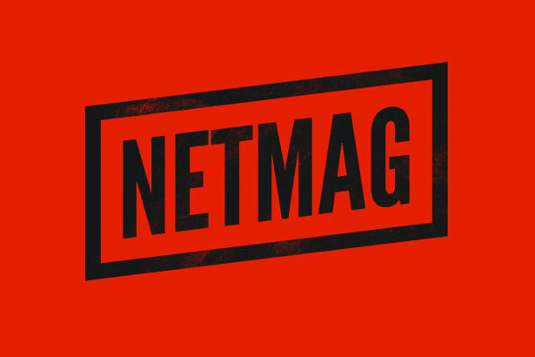
Voilà! That’s a lot of style being applied without any extra HTML whatsoever, and it’s not hard to imagine how one or all of these steps could be used to spruce up your work today. That is, unless you’re charged with building an adaptive or responsive layout. How can all of this pixel-pushed love translate to a fluid, flexible, and/or media queried layout without falling apart?
Step 4: Make it scalable via FitText
While redesigning my blog last Spring, I hit a major roadblock when I realised how difficult it would be to scale large-format headline titles where I didn’t want the text to wrap. I needed a way to achieve scalable headlines that fill the width of a parent element. Thankfully, my Paravel cohort, Dave Rupert, responded to the challenge by creating FitText.
Let’s put it to the test with this design, and make it perfectly scalable from a full-width desktop view down to a mobile device.
To start, let’s adjust the width of our header in the CSS:
- header {
- margin: 20% auto;
- width: 80%;
- }
Now that the width will be 80 per cent of our browser window, let’s load jQuery and FitText in that order in index.html:
- <body>
- <header>
- <h1>Netmag</h1>
- </header>
- <script src="http://ajax.googleapis.com/ajax/libs/jquery/1/jquery.min.js"></script>
- <script src="js/jquery.fittext.js"></script>
- </body>
FitText needs us to set the compression. The larger the number, the more compression you get on the size of the font. Here’s the final HTML with all the FitText JavaScript from lines 14-18:
- <!DOCTYPE html>
- <html lang="en">
- <head>
- <meta charset="utf-8" />
- <title>Netmag / Mask-Image</title>
- <link rel="stylesheet" href="style.css" type="text/css" />
- <!--[if IE]><script src="http://html5shiv.googlecode.com/svn/trunk/html5.js"></script><![endif]-->
- </head>
- <body>
- <header>
- <h1>Netmag</h1>
- </header>
- <script src="http://ajax.googleapis.com/ajax/libs/jquery/1/jquery.min.js"></script>
- <script src="js/jquery.fittext.js"></script>
- <script type="text/javascript">
- $("h1").fitText(.24);
- </script>
- </body>
- </html>
How exciting that we’re able to do all the fine-tuning we want to type and make it scalable, built on a flexible foundation!

The Creative Bloq team is made up of a group of art and design enthusiasts, and has changed and evolved since Creative Bloq began back in 2012. The current website team consists of eight full-time members of staff: Editor Georgia Coggan, Deputy Editor Rosie Hilder, Ecommerce Editor Beren Neale, Senior News Editor Daniel Piper, Editor, Digital Art and 3D Ian Dean, Tech Reviews Editor Erlingur Einarsson, Ecommerce Writer Beth Nicholls and Staff Writer Natalie Fear, as well as a roster of freelancers from around the world. The ImagineFX magazine team also pitch in, ensuring that content from leading digital art publication ImagineFX is represented on Creative Bloq.
