Test your site on 2000 mobile devices at once
MITE shows you how your pages look on more than 2,100 mobile devices, highlights problems, can run scripted tests and more – and it’s all for free, says Mike Williams
This article first appeared in issue 235 of .net magazine – the world's best-selling magazine for web designers and developers.
Designing a website that looks good on the desktop is challenging enough, but these days that’s just the start. If you want to attract the widest possible audience, then your pages will need to work just as well when they’re viewed on an iPad, iPhone, Android tablet or any of the hundreds of other mobile devices – so testing your site’s mobile-readiness can be a complicated and time-consuming business.
Unless, that is, you get a little help from Keynote MITE (Mobile Internet Testing Environment), a free but surprisingly powerful Windows application that comes packed with essential site-checking features. At its simplest, you can see how any URL looks on an iPad, Blackberry, Galaxy S3 or any of more than 2,100 mobile devices out there. It’s really straightforward: just choose your preferred hardware from the library, enter the URL, and in a click you’ll be able to browse the page in an emulated version of that device.
That’s just the start, though. MITE can also check your site to see how well you’ve optimised it for performance, and whether you’re following the best practices for mobile sites, with the program highlighting problems and recommending what you should do next. And if you don’t have time for manual testing, no problem – MITE can record your site navigation actions in a script, replaying them later so your benchmarking becomes almost entirely automatic.
There’s plenty of power here, then, yet despite all this functionality the program remains extremely easy to use. Whether you’re a web development novice or an old hand it’s all very accessible, and there are plenty of essential features to explore.
Getting started
You can grab your copy of MITE from the Keynote site, after you’ve completed a registration form. The download may take a while, unfortunately: the MITE installer is almost 70MB in size, and in our tests the Keynote servers delivered it at a glacial pace. Maybe we were unlucky, but if you do find your download speeds are equally poor, just be patient – you’ll get there eventually.
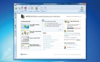
Once the installation file is finally downloaded, life improves immediately. Installation is straightforward, with no complicated options to consider, and MITE launches by default as soon as it’s complete. All you have to do is log in with the Keynote user name and password that you created earlier and you’re ready to test your first website.
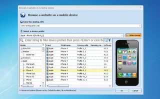
The process can be surprisingly easy, too. Simply click Browse website, enter a URL you’d like to examine, then click Select device and choose the hardware you’d like MITE to emulate: iPad, PlayBook, Galaxy S3 or whatever it might be. Click OK and you’re done. MITE’s WebKit-based browser will now display your specified page just as you’d expect it to appear in that specific device (complete with HTML5, scripts, Flash apps and so on). Follow links, explore the site as normal and generally confirm that everything is working as you’d like.

If you want to rotate the device, then just click the Rotate button, which is the icon furthest to the right on the Device Profile toolbar. You can switch the orientation to 0, 90, 180 or 270 degrees.
Need to check the source code? Click the DOM view tab to take a closer look. And when you’re happy with your testing, click the Home tab on the ribbon, followed by Stop browsing. The MITE browser will disappear and you’ll return to the program’s launch screen, ready for your next step.
Site analysis
Checking the visual appearance of your site in a mobile device is just one aspect of MITE – there’s plenty more to discover. The program also carries out an in-depth analysis of the current page, looking for problems and assessing how well it conforms to W3C mobile web best practices, before awarding the page a score and alerting you to any problems.
This all starts with a simple summary in the MITE score pane (click Views > Basic Layout, or Views > Configure and check MITE score if you don’t see this): you’ll see the page size, download time, number of images, page elements and lots of other equally useful stuff.
The more in-depth tests are then itemised below this. Did your page have some oversized images? Are your JavaScript and CSS files positioned for the best possible performance? Could you be compressing resources or caching static objects to improve download speeds? You’ll discover all that and more.
MITE also checks to see whether you’re following good practice, whether it be giving pages a title, using alt for images, avoiding frames and similar – mostly commonsense – points. Every test the program has made is summarised in the score pane, with an icon indicating its status – so a green tick means all is well, a yellow exclamation mark shows your attention is required and a red cross indicates major problems.

Clicking any test reveals more details to its right. Click Alt for images?, for example, and you’ll see a list of all your <img> tags, with any that are missing alt references highlighted at the top. Or, if you just want a quick idea of how well you’re doing, take a look at the score you’ve been awarded at the top of the page. This is calculated by looking at the results of each test, and will be somewhere between 0 (terrible) and 100 (perfect).
This grade only gives you a very general idea of your site’s mobilefriendliness, of course (and only according to Keynote’s very specific chosen rules). But it’s still incredibly useful. When you check MITE’s tests and start correcting problems in the way it suggests, you’ll be able to watch the score increase every time you browse that page. This is an easy way to get instant and measurable feedback on how the site is improving.
Automated testing
The testing we’ve done so far is great for identifying issues with your site, but there is one problem: it takes time. Perhaps a lot of time, if you’d like to thoroughly check a really big site for every possible eventuality.
Fortunately Keynote understands this, and MITE can also record and replay a sequence of browsing actions, allowing the program to automatically test as many pages as you require while you just sit back and watch.
To give this process a try click Home, then hit Record script. This works like the Browse button: enter your starting URL, select the device you’d like to use, and click OK to begin.
When the site appears, just follow the links that it suggests, or otherwise browse the site, navigating to the pages you’d like to test.
Finished? Click Scripts > Pause to stop recording, then click Save and give the script a meaningful name.
And that’s it, you’re done. Clicking Scripts > Script Library at any time will display the script; right-click it, select Play and MITE will replay it. Easy.
Get the Creative Bloq Newsletter
Daily design news, reviews, how-tos and more, as picked by the editors.

To then view what you’ve just executed and recorded, click the Results tab. Selecting Test list will display a summary of any scripts you’ve run; clicking Test Results automatically summarises all of these for you, with a list of pages checked and the MITE score for each; and clicking Run results enables you to drill down into the same test detail that we saw earlier, if you really need to find out something specific from the results.
The scripting module does have one limitation, in that it only lets you test a site against one device at a time. If that’s a major problem then you could upgrade to the commercial MITE Pro, which can run your scripts against up to seven devices, from seven geographic locations, among other advantages.
It’s not cheap at $5,000 though, and if you’re a mobile site-testing novice then the free build offers plenty to explore for now. MITE is a great product – powerful and packed with essential features – and is an excellent addition to every web developer’s testing toolkit: go grab your copy immediately.

Thank you for reading 5 articles this month* Join now for unlimited access
Enjoy your first month for just £1 / $1 / €1
*Read 5 free articles per month without a subscription

Join now for unlimited access
Try first month for just £1 / $1 / €1
The Creative Bloq team is made up of a group of design fans, and has changed and evolved since Creative Bloq began back in 2012. The current website team consists of eight full-time members of staff: Editor Georgia Coggan, Deputy Editor Rosie Hilder, Ecommerce Editor Beren Neale, Senior News Editor Daniel Piper, Editor, Digital Art and 3D Ian Dean, Tech Reviews Editor Erlingur Einarsson and Ecommerce Writer Beth Nicholls and Staff Writer Natalie Fear, as well as a roster of freelancers from around the world. The 3D World and ImagineFX magazine teams also pitch in, ensuring that content from 3D World and ImagineFX is represented on Creative Bloq.
