Redesigns of anything can prompt a negative reaction initially, and UI design is no different. A major change to the layout of an app can make something you've been using comfortably for ages suddenly feel confusing and unfamiliar.
With that in mind, I thought initial criticism of the Apple Photos app redesign in iOS 18 would blow over once people got used to it. But it hasn't. Two months on after the release in September, not a day goes by without dozens of people taking to social media to complain about how much they detest the new layout (looking for Apple deals? See our iPad Black Friday live roundup)
I really hate the new iOS layout for the photos app. Still not used to it. If it ain’t broke don’t fucking change it! UGHHHHH WHY APPLENovember 21, 2024
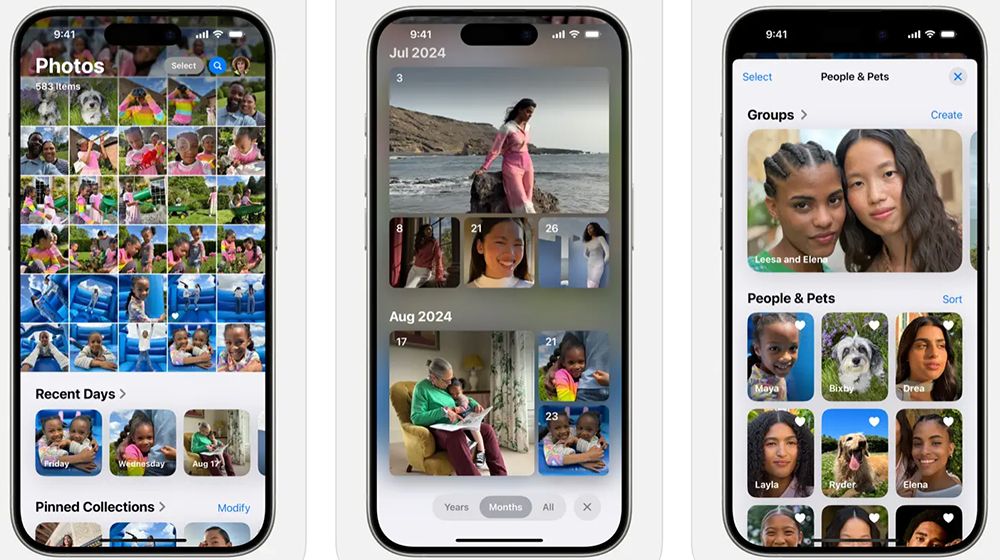
Why do people hate the iOS 18 version of Apple photos so much? Basically, because it's more cluttered and convoluted compared to iOS 17. A lot of the change was focused on putting Apple Intelligence at the centre of photo management – to simplify things in theory, although some will argue that Apple felt obliged to follow the lead of Google and Samsung in this area (like it feels obliged to catch up with an Apple AI image generator).
There's a new scrollable interface, smart collections that automatically group photos by topic, and it's easier to search for photos using natural language. But, as with most implementations of AI, there are also unhelpful and just plain random irritations, such as unwanted auto-generated albums and collections, and some people say the removal of traditional tabs is making it harder to find things.


Apple has already made some tweaks, removing the highlights carousel and bringing back pinch-to-zoom. It will also restore full-screen playback for video. But some are still not convinced. "Apple, I hope you are listening, the new updates in the Photos app suck. Navigating my photo gallery is a disaster now. Not all change is progress," one person wrote on X this week.
Some have welcomed the app redesign. The key to making it work seems to be the customisation. If you go to the bottom and click customise, you can remove the panels you don’t want. People ideally don't want that hassle. But this is like bloatware – removing all the redundant features is a hassle that the user doesn't want to have to sort out for themselves.
See the best current prices on iPhone 16 and alternatives below. We're also tracking MacBook Black Friday deals.
Get the Creative Bloq Newsletter
Daily design news, reviews, how-tos and more, as picked by the editors.

Thank you for reading 5 articles this month* Join now for unlimited access
Enjoy your first month for just £1 / $1 / €1
*Read 5 free articles per month without a subscription

Join now for unlimited access
Try first month for just £1 / $1 / €1
Joe is a regular freelance journalist and editor at Creative Bloq. He writes news, features and buying guides and keeps track of the best equipment and software for creatives, from video editing programs to monitors and accessories. A veteran news writer and photographer, he now works as a project manager at the London and Buenos Aires-based design, production and branding agency Hermana Creatives. There he manages a team of designers, photographers and video editors who specialise in producing visual content and design assets for the hospitality sector. He also dances Argentine tango.

