I'm recommending the iPhone 16 Plus over the Pro and I'm as surprised as you are
After a week with both models, it's clear to me which is the best for most people.

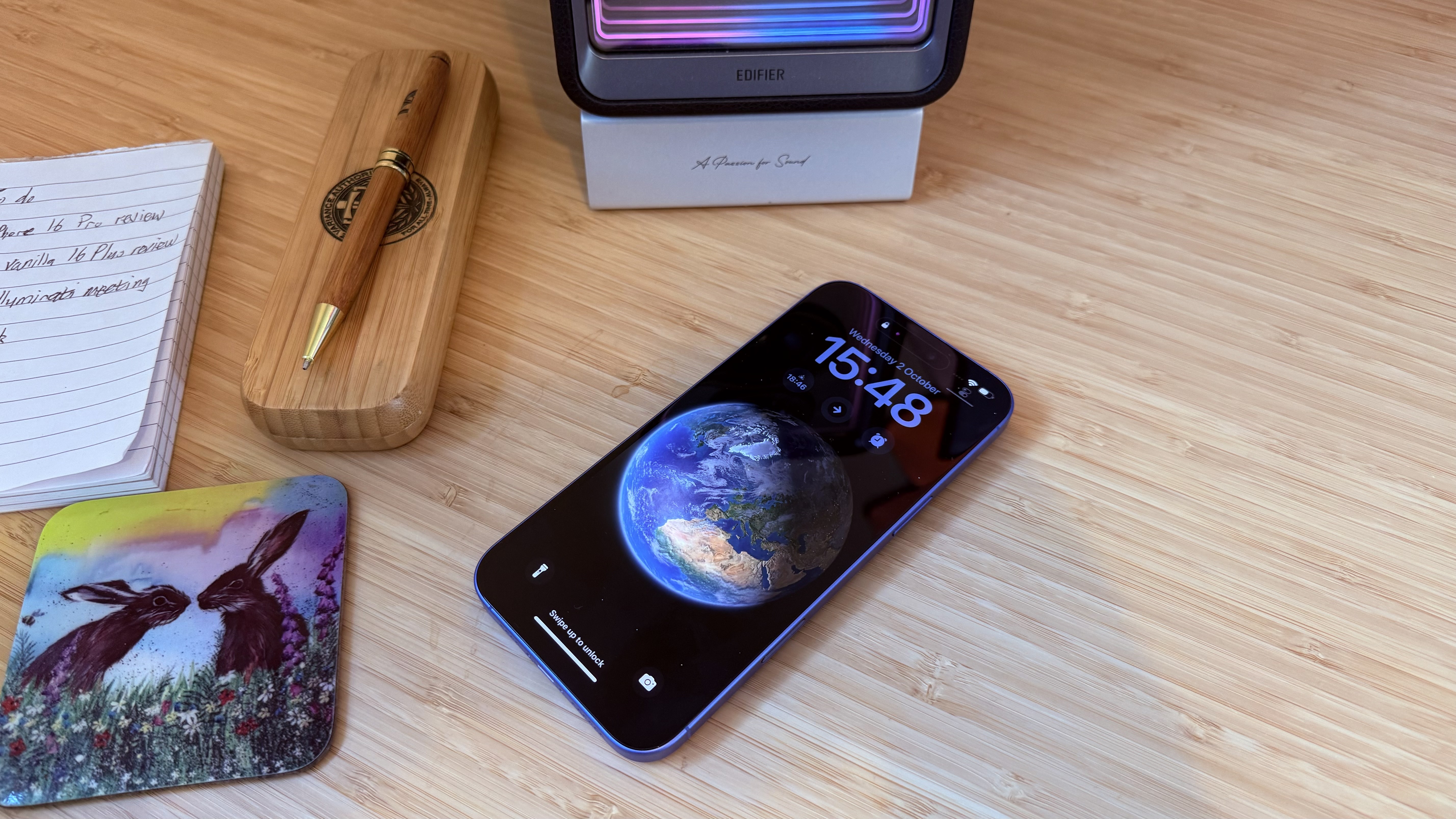
I've now lived with both the new iPhone 16 Pro and the iPhone 16 Plus for just over a week, as I was tasked with reviewing them for Creative Bloq (I know, it's a dirty job but someone's got to do it).
I have used, tested and had my grubby mitts on quite a few iPhones over the years, for every model I've seen until now, if given the choice, I'd go for the Pro variant in a heartbeat. It usually has considerably more power, the camera features are much better, and the finish and look has a notably more premium feel to it.
Until now.
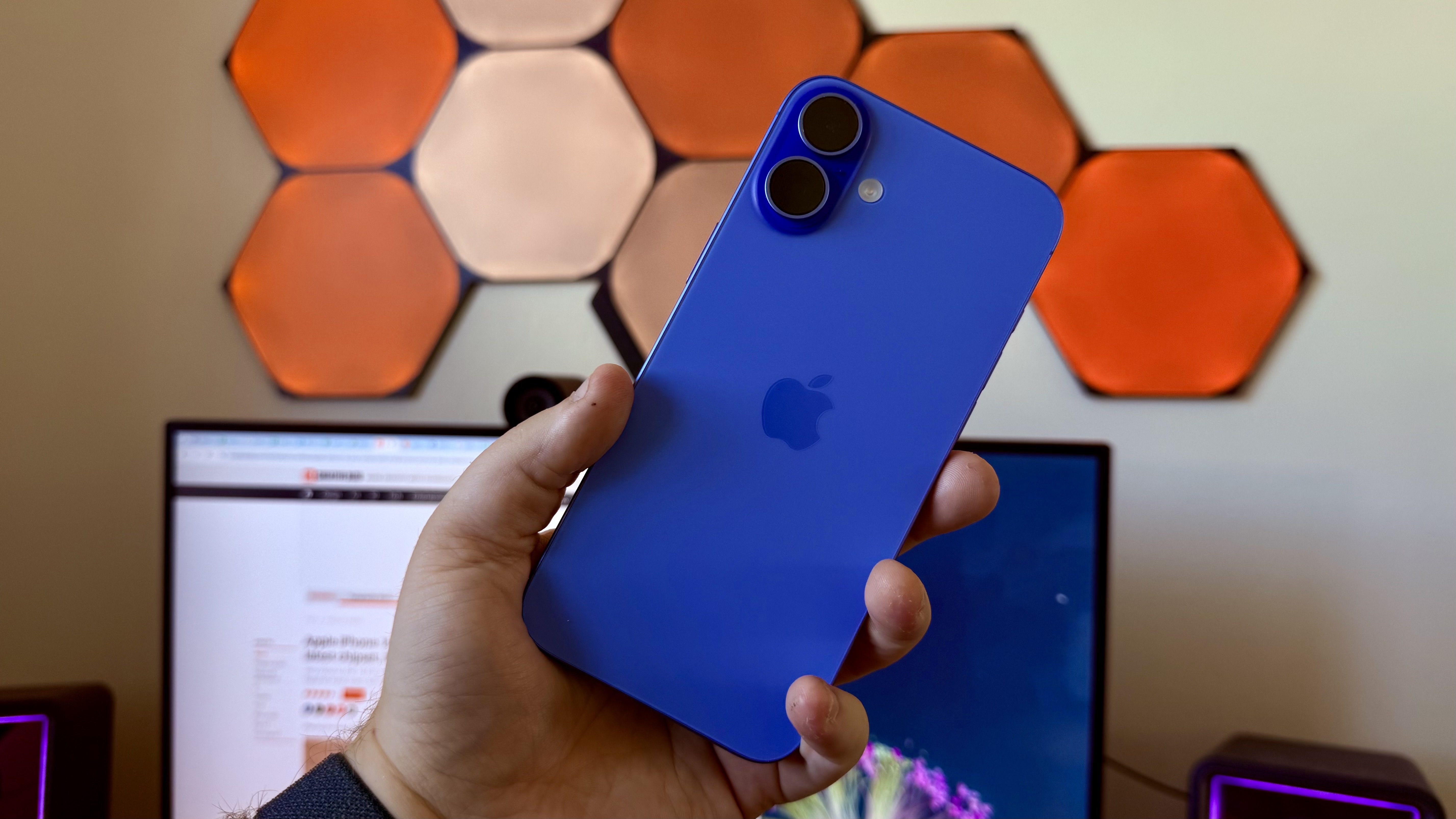
Now, after a week of having those models side-by-side, I - quite shockingly, if you ask me - find myself drawn to the vanilla iPhone over the Pro variant for the first time. And it's not just because it's all colourful and shiny now (although it helps).
Yes, like I go through in my reviews, the 16 Pro has a more advanced camera than the 16/16 Plus, with a telephoto lens, better optical zoom and the ability to shoot 4K video at 120fps, making it the best iPhone for photography yet. Also, it's got the Always-on screen, a titanium frame and a few other luxury features.
But when I ran the 16 Plus (which is the same phone as the 16 except with a bigger 6.7-inch screen and larger battery) through the testing gauntlet, I was astounded to find that it performs pretty much just as well as the Pro (Geekbench CPU scores are near-identical and the GPU in the Plus is only slightly slower), and apart from it lacking the ability to take macro images and the ultrawide lens being the same 12MP offering as last year, instead of the new 48MP in the Pro, the difference in real-life everyday camera performance is negligible.

Yes, suppose your livelihood depends on shooting highly editable video footage in 4K at the fastest framerate possible and getting mega-close-ups of flowers, insects and your increasingly irate cat/dog/gecko. In that case, the Pro is the one to go for. But if you're pretty much literally anyone else, you don't actually need it. And as I was raised in a household that never had an abundance of money, I just don't see a reason to stump up the extra several hundred quid that the Pro or Pro Max would set me back for those marginal gains.
Get the Creative Bloq Newsletter
Daily design news, reviews, how-tos and more, as picked by the editors.
Also, I like bigger screens, and the bump to 6.3 inches for the Pro just isn't enough for me when the regular model has the same screen spec and a 6.7-inch option in the Plus - that's not too far from being an iPad mini but a phone (oh, there might be a new iPad mini on the way too)
Plus, it's colourful again!

Thank you for reading 5 articles this month* Join now for unlimited access
Enjoy your first month for just £1 / $1 / €1
*Read 5 free articles per month without a subscription

Join now for unlimited access
Try first month for just £1 / $1 / €1

Erlingur is the Tech Reviews Editor on Creative Bloq. Having worked on magazines devoted to Photoshop, films, history, and science for over 15 years, as well as working on Digital Camera World and Top Ten Reviews in more recent times, Erlingur has developed a passion for finding tech that helps people do their job, whatever it may be. He loves putting things to the test and seeing if they're all hyped up to be, to make sure people are getting what they're promised. Still can't get his wifi-only printer to connect to his computer.
