Typography of the decade
Latest about Typography of the decade
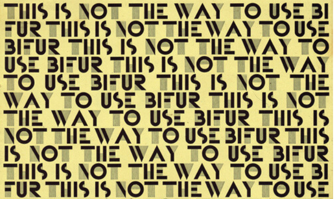
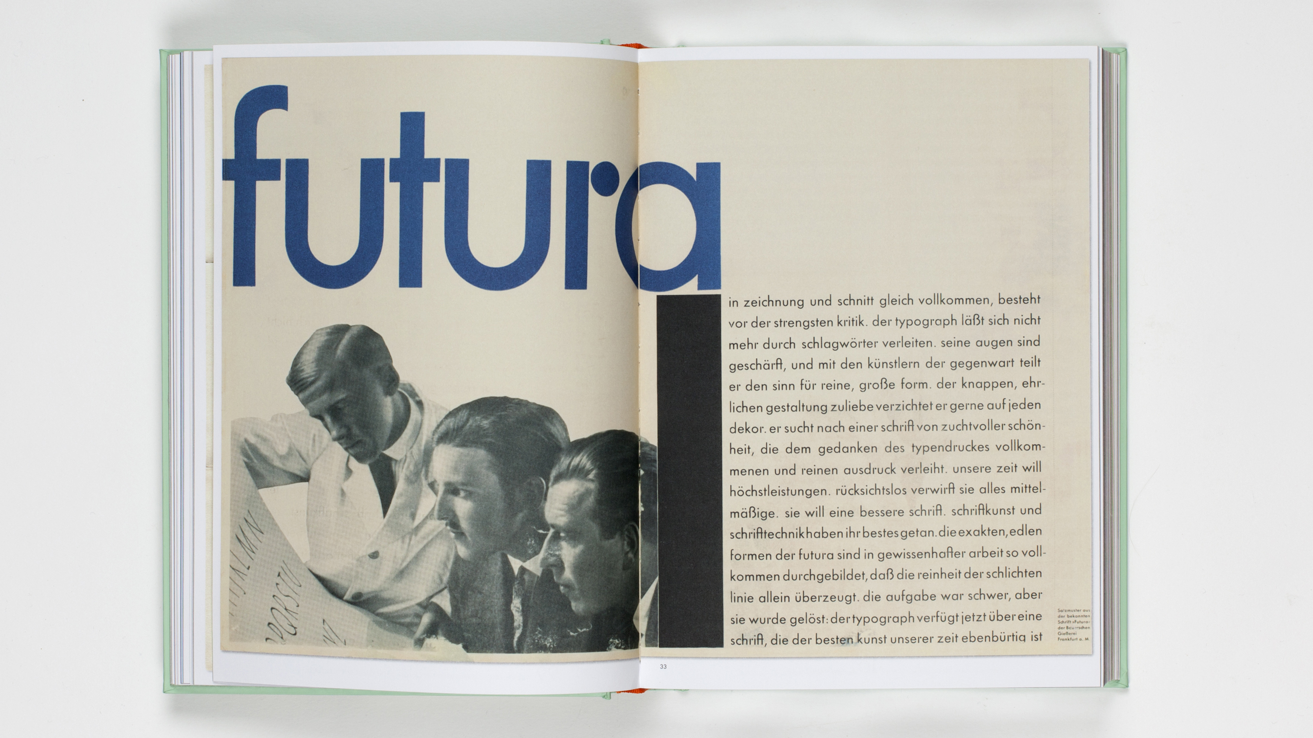
The best typography of the 1920s – from Futura to Industria Gravur
By Antonia Wilson published
Designers and industry experts pick their top type from an era of experimentation.
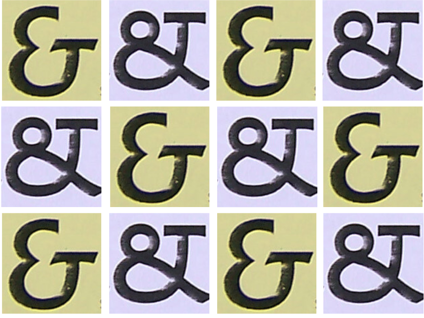
The best typography of the 1930s
By Antonia Wilson published
From playful to serious, functional to decorative, designers pick their top type of the decade.
The best typography of the 1940s – our experts take a look back at the decade's most iconic fonts
By Tom May published
Our experts explore the most iconic fonts of the 1940s.
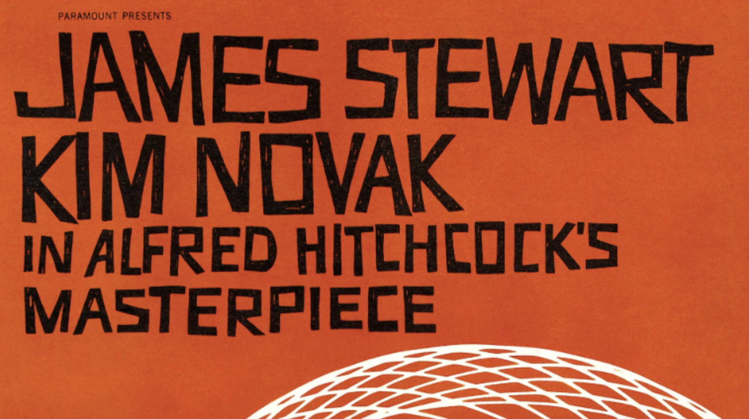
The best typography of the 1950s, as chosen by experts
By Tom May published
Classic typefaces and lettering, from the era of Swiss Style.
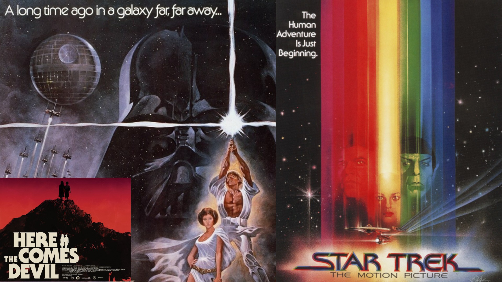
The best typography of the 1970s, as chosen by experts
By Tom May published
From groovy fonts to spaced-out vibes, we explore the iconic typefaces that defined the 1970s.
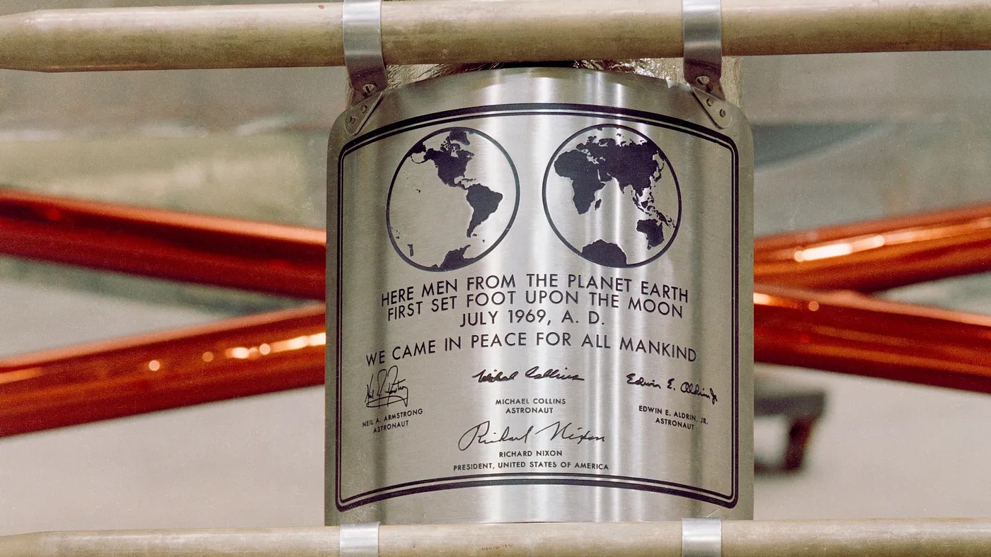
The best typography of the 1960s, chosen by the experts
By Tom May published
It was an era in which geometric shapes and new technologies revolutionised lettering forever. Our experts look back on the best typefaces of the 1960s.
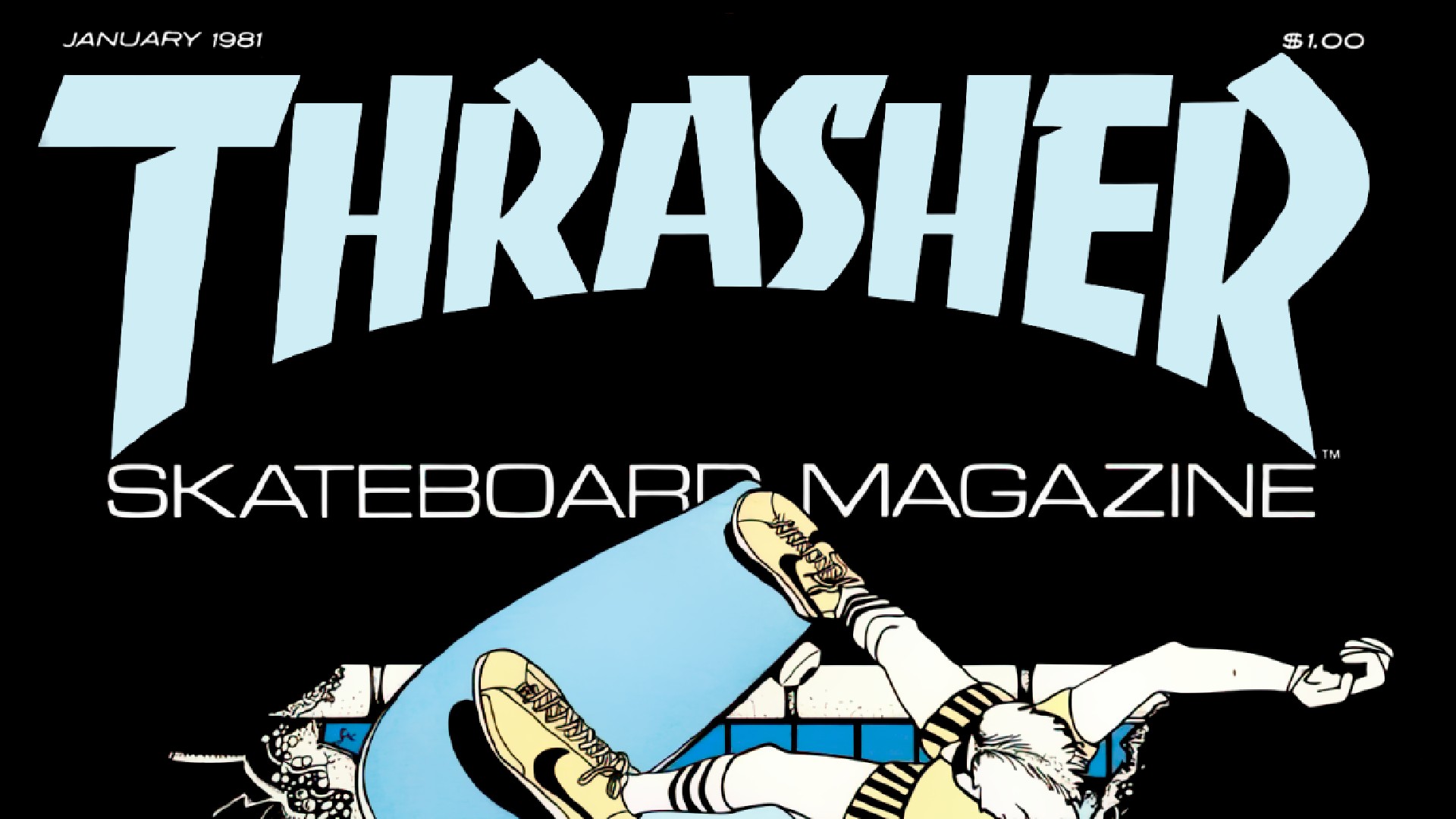
The best typography of the 1980s, as chosen by design experts
By Tom May published
Discover how the 1980s transformed typography
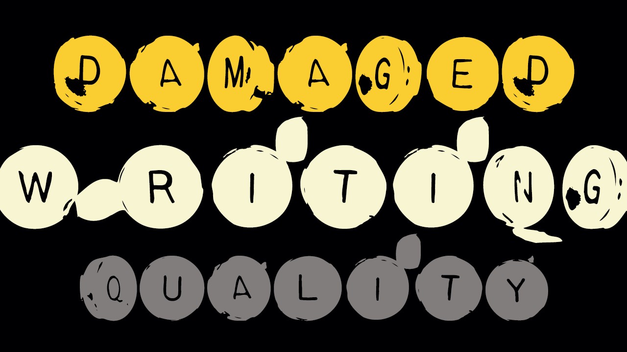
The best typography of the 1990s, according to type experts
By Tom May published
From FF Blur to Comic Sans, these fonts defined the 90s.
Get the Creative Bloq Newsletter
Daily design news, reviews, how-tos and more, as picked by the editors.
