12 beautiful spirit bottle labels
Competition amongst liquor brands is intense. These inspiring and imaginative designs help their products stand out from the crowd.
There is a lot of competition among liquor producers to stand out on the store shelves. Often this means creative and unique bottle shapes or eye-catching labels. Needless to say we have come a long way from the jug and cork. Here are 10 awesome examples of liquor bottle labels...
01. Arriba Mezcal

This simple yet striking packaging design for Arriba Mezcal was created by Spanish designer Ana Popova. The label design comes in a range of bright and beautiful colours that really makes the bottle pop. The all black canvas ensures the label is the main focus and we think it really works.
02. W&M Whiskey

Created by Russian based art director Myznik Egor, this label design for W&M Whisky. "I wanted to embody the spirit of New York streets in the design and at the same time to convey the classic nature of the product," he explained. "The solution combines the traditional aesthetics of consumption of whisky and the street culture."
"The logo of Whyte & Mackay, which is more than two centuries old, is adjacent to a graffiti-tag, and the 22-year-old whisky is packed in a bag of kraft paper."
03. Stranger & Stranger Absinthe No. 12
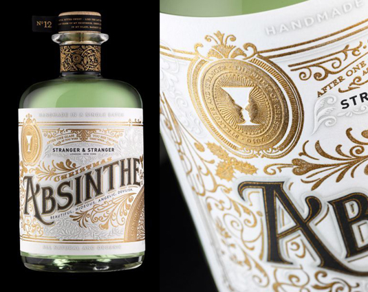
Stranger & Stranger are no strangers to packaging design: they do some of the most elaborate and creative bottle and label designs in the industry. So one should expect nothing less than amazing from their limited edition holiday give-away bottle of Absinthe.
The ornate detailing in gold and silver is top notch and invokes the spirit of early 20th century Paris where you might find Earnest Hemingway sitting in darkly lit Parisian bar with this very bottle.
04. Espolón Tequila
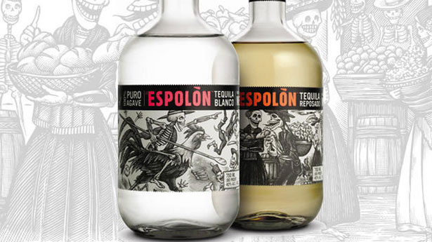
Having an illustration dominate your label is a rarity in the liquor world, but Espolón Tequila pulls it off in stellar fashion. Artist Steven Noble integrated traditional Day of the Dead art from José Guadalupe Posadas on the stunning label. The label is meant to celebrate the culture of Mexico and includes fictional characters that retell the story of Mexico’s past.
Get the Creative Bloq Newsletter
Daily design news, reviews, how-tos and more, as picked by the editors.
05. Joss Vodka
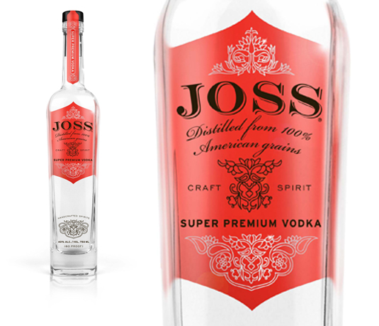
A new premium vodka definitely needs a new premium look. The team at Archrival created a label with lavish floral details that feel both classical and glamorous. The choice of a near pink color is immediately eye-catching and really helps to make Joss Vodka standout in a crowd.
06. Hooghoudt

Hooghoudt bottles designed by PROUDdesign are bold, colourful, and informative. The Hooghoudt logo is painted directly on the bottle and is raised off the surface slightly to give a nice tactile feel. The label for each flavor of Jenever features illustrations of the base ingredients such as lavender or cranberry.
The numbers on the labels correspond to the number of the recipe in Hooghoudt’s 'cookbook' which holds a lot of history as they have been distilling Jenever in the Netherlands since 1888.
07. 1000 Acres Vodka

Sometimes it doesn’t take a fancy label to differentiate between vodkas. 1000 Acres Vodka proves that bottle design can sometimes say more than a label. The Arnell Group, who created the look of the 1000 Acres Vodka bottles, kept the use of typography to a minimum, giving them a simple and clean look. The 'wow' factor is in the bottle’s design where they use interesting shapes or slightly tweak the look of a traditional bottle.
08. Woodford Reserve

Vodka distillers are not the only ones who can keep things minimal. Brown-Forman’s Woodford Reserve bottle is unpretentious in its simplicity. The lack of a highly elaborate and decorative label allows the bourbon within the bottle to speak for itself. The small paper label towards the bottom of the bottle gives you information about your bourbon including its batch and bottle number, as well as the signature of who approved the quality of the product.
09. Jose Cuervo Traditional Tequila

One word you would probably not use to describe Jose Cuervo’s label design for their limited edition Day of The Dead bottles is 'minimal'. This festive design is reminiscent of tattoo art and depicts a skull, which is a common motif found in the Day of the Dead celebration. While you might think you are looking at four different bottle designs, in fact what you are seeing is two designs that change colour as they are chilled.
10. OOLA Gin and Vodka
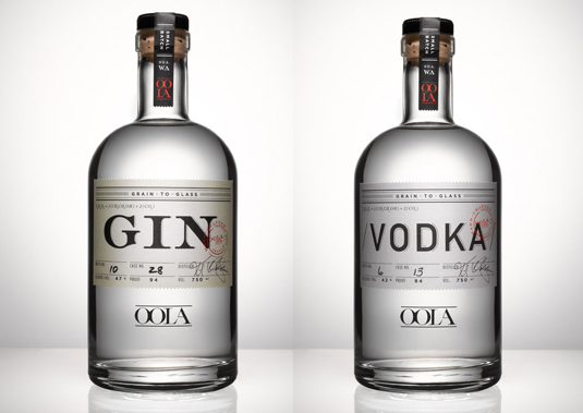
Back in Colonial America, physicians used alcohol as a painkiller. So it is easy to see what inspired designer Brian Piper when he created the labels for OOLA’s gin and vodka bottles. The label design is very reminiscent of old medicine bottles and even includes the chemical formula break down of each alcohol right on the label.
11. Reyka Vodka

A new trend in label design for liquor is not just about an eye-catching graphic, but also the tactile experience of holding the bottle. Distiller Willam Grant and Sons wanted a rebranding of Reyka, their Icelandic vodka. They worked with Here Design to come up with a label that appears as handcrafted as the vodka. The label consists of embossed lettering and illustrations on a nicely textured paper.
12. Stranger & Stranger Spirit No. 13
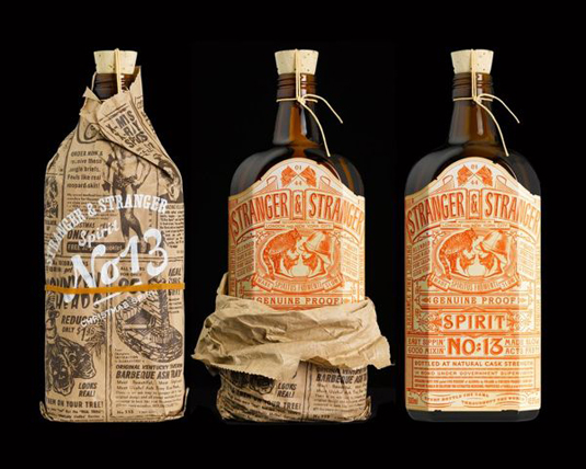
When compiling a list of 10 standout liquor label designs it is hard not to make every one a Stranger & Stranger designed bottle. It seems only fitting to end cap this list with one more of their creations. Spirit No. 13 is another limited edition holiday give-away liquor that features one of the most detailed labels you will ever see. The label just screams vintage and consists of over 500 words. To top it all off, the bottle is presented wrapped in a specially printed piece of newspaper that gives it what they call a 'moonshine' feel.
Have you spied a great example of liquor bottle label design? Let us know about it in the comments!
Words: Ben Whitesell and Sammy Maine
Ben Whitesell is a media designer specializing in a variety of different types of content creation including tradition print page layout, poster design and illustration.

Thank you for reading 5 articles this month* Join now for unlimited access
Enjoy your first month for just £1 / $1 / €1
*Read 5 free articles per month without a subscription

Join now for unlimited access
Try first month for just £1 / $1 / €1

The Creative Bloq team is made up of a group of art and design enthusiasts, and has changed and evolved since Creative Bloq began back in 2012. The current website team consists of eight full-time members of staff: Editor Georgia Coggan, Deputy Editor Rosie Hilder, Ecommerce Editor Beren Neale, Senior News Editor Daniel Piper, Editor, Digital Art and 3D Ian Dean, Tech Reviews Editor Erlingur Einarsson, Ecommerce Writer Beth Nicholls and Staff Writer Natalie Fear, as well as a roster of freelancers from around the world. The ImagineFX magazine team also pitch in, ensuring that content from leading digital art publication ImagineFX is represented on Creative Bloq.
