Our Verdict
The new responsive tools in Adobe Muse are an exciting prospect for designers. They bring with them new possibilities, workflows and a new approach to designing websites. There are some weaknesses to be aware of – responsive is still largely uncharted territory in Muse – but the benefits are promising when used carefully, with the right projects.
For
- You only have to develop one page
- Elegant degradation
Against
- No scroll effects
- Many widgets are not yet responsive and won’t scale
Why you can trust Creative Bloq

Exclusive offer: Save 15% on Adobe Creative Cloud now
For designers, it's always a waiting game when it comes to obtaining a website builder that give us the design abilities we want. The problem is that it takes some time for programs like Adobe Muse to catch up with all the exciting things developers invent for the web.
New design and communication trends spike and crash quickly, and Muse – more than almost any other tool in Adobe's arsenal – must continually reinvent itself to keep up. So what's new? This time it's tools for responsive web design.
What is responsive?
The short answer is: rather than having to design and develop separate pages or sites for desktop, tablet and mobile window sizes – often called 'fixed layouts' – a responsive site will automatically scale and morph in various ways to become easily viewable on any device or window size.
This sounds like what we've always wanted, right? Sometimes.

Responsive does answer a lot of needs, and can make some things much easier. The fact that we now have it in Muse is making many designers giddy beyond belief.
But don't take this to mean that all your work should be done this way. Keep in mind that the vast majority of web sites continue to use fixed layouts because it still works better for many situations.
Caveat emptor
From the designer/developer's point of view, the biggest benefit from responsive toolsets is that you only have to develop one page instead of three. The downside to this is that developing a responsive page can involve a lot more work that a static one. And there are often more design compromises that must be made to make a responsive page work across all sizes.
Steve Harris is the head guy at Muse-Themes, the hugely successful third-party developer of templates and widgets for Adobe Muse. Few people know more about the subject, and he confirmed what we suspected.
"We're big fans of responsive Muse, but it requires a completely different approach to designing your site. Getting a page to break down gracefully can be a big job."
The real compromise here will be the need to create a simpler design. Often much simpler. Try to avoid clutter, and limit the number of breakpoints used. Steve also notes that existing fixed-layout sites can be very complex to convert to the new responsive format. He suggests that it is often a better idea to start anew from a clean slate.
Jumping in
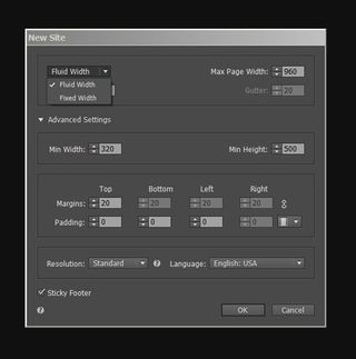
In the new Adobe Muse CC (revision 2015.1, released Feb 8, 2016. What's New), choosing New Site gives the options of Fluid – responsive – and the traditional Fixed.

If Fluid is chosen, you will also see a new option labeled Min Width, which can put a lower-end limit on just how responsive you wish your site to be.
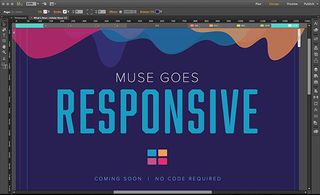
When the new Fluid document opens, existing users will notice the addition of a violet bar along the top, and a smattering of controllers for it, as show below.

These are the tools that allow us to create what are called 'breakpoints'. These are simply the webpage width dimensions where items on the page change to accommodate the needs of various device sizes.
What's important to realize is that Muse allows for what is sometimes called 'elegant degradation', meaning that you aren't forced to have breakpoints where everything happens at once. Instead, as a browser narrows (either due to a smaller device or scaling a window), some items will need to adjust sooner than others. Photos lined up left to right will need to either scale down, or be broken into multiple lines, in a stacked fashion.
By comparison, some text blocks might weather the transition from desktop format to tablet rather well. They might only need to be altered as the site nears mobile device sizes. The whole process forces the designer to view web design in a different way.
By necessity, one begins to view the design on a spectrum from large to small (or small to large, as many desktop sites have taken on a very mobile-looking design. Amazon.com on the desktop is one example).
More compromises
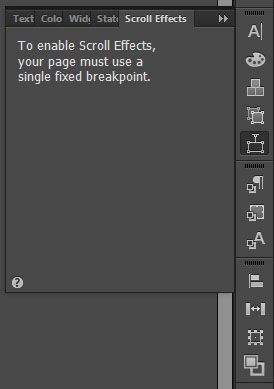
In addition to responsive sites requiring more time and a different design approach, we are also going to have to give up a design element we have grown to love. Responsive sites can't incorporate scroll effects at this time.

This situation may change down the road, but choose Fluid and gone are parallax and other scrolling wonders that Muse is so identified with.
In fairness, the most popular of scroll effects, parallax, may have seen its heyday come and go. The web is strewn with articles on how it's played out, doesn't play well with SEO and won't run on many tablets.
Steve Harris pointed out another important loss: "Many widgets are not yet responsive, and won't scale up or down appropriately across breakpoints. The best approach is to hide the widget entirely on that breakpoint and add a new instance of it."
An important workflow point to keep in mind is once a Fluid or Fixed format is chosen, you can't decide later to move to the other format. Nor would you want to, since the design process is so different. This forces us to choose our path early in development. But really, this is a good thing.
Links worth exploring
Start carefully
If we sound at all critical, we don't mean to be. There is no bad here, it's all good. Even a lot of great. Just so long as you realize that responsive is still new and largely uncharted territory in Muse.
Widgets will be updated, responsive templates will become more readily available, and users will start to learn where and when to opt for Fluid.
The best advice is to take this time to kick the tires and carefully start using it for your less-demanding sites first. And keep in mind that the fixed layout options are still a great way to go for many projects, and that it's still a viable option in Muse. Whichever format you use, just remember that a tool is always stronger in the hands of someone who knows where its weaknesses lie.
Adobe Muse (2016 release)

Thank you for reading 5 articles this month* Join now for unlimited access
Enjoy your first month for just £1 / $1 / €1
*Read 5 free articles per month without a subscription

Join now for unlimited access
Try first month for just £1 / $1 / €1
out of 10
The new responsive tools in Adobe Muse are an exciting prospect for designers. They bring with them new possibilities, workflows and a new approach to designing websites. There are some weaknesses to be aware of – responsive is still largely uncharted territory in Muse – but the benefits are promising when used carefully, with the right projects.
Lance Evans is creative director of Graphlink Media, a boutique creative marketing agency that specialises in building brands and has worked with such high-profile clients as Olive Garden, Miller Beer and AMEX. Lance was an early adopter of digital tools, and was on the original beta team for Photoshop. Lance has written for Creative Bloq on a wide range of topics, from technical photography tips to the ins and outs of branding.
