Our Verdict
First renditions of any application have it pretty rough. At best they are polished concepts that give an inkling to what may be to come. The proof of concept often takes waiting until version two or three rolls around. XD is no better or worse in that regard than many packages. It has what it needs to define the territory it is staking out for itself. But at this stage doesn’t go a whole lot further. Nothing bad in that, just growing pains. I wondered though, why not just add wireframing and export options to Photoshop? This would have quickly yielded a far more capable offering than XD. I'll assume this means they plan to add many features down the road that would not be a good fit for PS.
For
- Fills in a neglected niche
- Easy to use
- Nice enhancements to toolsets
Against
- Small toolsets
- No Layers Panel
- No collaboration support
Why you can trust Creative Bloq
Remember Charlie Chaplin in the Modern Times scene where the conveyer belt keeps getting faster and faster? Many of us working in fast-paced creative shops can relate. Thankfully, Adobe's devoted years to making us more efficient. And with their introduction of XD, short for Experience Design, they've addressed a new niche in their already wide line of tools.
- Exclusive offer: Save 15% on Adobe Creative Cloud now
Targeted at the User Interface Designer, XD attempts to define itself by finding a sweet spot somewhere between InDesign, Illustrator, and perhaps Photoshop. Add in some new wireframing capabilities.
If you're confused with XD, UI, UXD, UED and others, you are not alone. The short answer is they are all varying sides of the same coin, dealing with user interface. How we conceptualize it, design it and execute it. (For a longer answer head here: Wikipedia: User experience design; Wikipedia: User experience.)
Enter 1.0
If you've been doing UI/UX/XD work for a while, you will be familiar with some of the tools that are on the market. You will also be aware that as opposed to many coming from the graphics world, interface design tools are comparatively very simple. Adobe's XD, being a first release is notably simpler than some other market options.
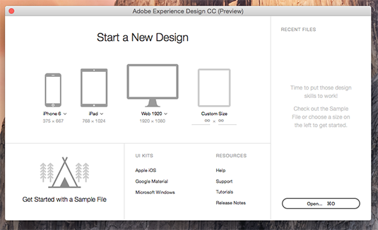
XD opens with a modified start page (above). Offering a choice of pre-sized blank work spaces for iPhone, iPad, HD web, custom, or a range of already populated options.
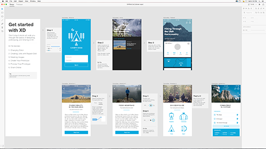
An option to learn how the tools all work together is given by providing a finished example file with instructions (above).

These quick and dirty visual tutorials came in rather handy. As in this example where I learned to do a step and repeat in a few seconds (above).
The start page also offers 'user interface kits' for iOS, Mac and Windows designs, which contain rather complex and detailed content.
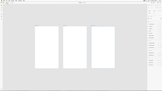
Once opened, you will find the interface itself is unusually understated (above). Especially for a modern Adobe application.
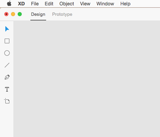
The left-side toolbar contains just seven tools: selection tool, box, ellipse, line, pen, text and artboard tools (above).
Above the workspace you will find a small sections of menu items (below).

Just below the menus is the option to choose between the two work modes, DESIGN or PROTOTYPE. Design mode offers your layout tools, and options to import items. This is your design interface. At a certain point you'll move on to the Prototype interface, where you rig the interface flow using wireframing tools.
Along the right side of the screen is the Property Inspector, who's options vary depending on what tools and objects are currently selected.
Both Design and Prototype modules have many refinements that are under the hood, and not obvious unless you know they exist. For example, the Box tool allows you to also round the corners by simply dragging on them. All the shape tools can be modified with Boolean tools found in the Property Inspector.
In the Prototype mode, it's all about user interaction and moving from one interface screen to the next using wireframes. By clicking and dragging from one screen element (usually a button), over to the destination screen.

Once the flow from one screen to another screen is made, you can refine the transition effects with many options.
The final bit of work is exporting the project. Interface design revolves a lot around testing your concepts. So XD offers output to movie files, or to an interactive format that can be played in a browser. You are also able to export the assets for actual development in Muse, Dreamweaver, and other programs.

What more is needed?
A number of things feel missing. I couldn't find a Layers window anywhere, which left me using 'Arrange' tools circa 1995. So there is certainly room to grow. That said, keep in mind that most of the software available in this category isn't designed for graphics geeks accustomed to complex programs. A large part of interface work has always been done with pencil and paper, rather than computer. And much of UI work is more hands on people, testing in the real world, than hands on computer.
For example, sophisticated projects often involve full-out test labs and focus groups, working to see how people react to and navigate through projects. Smaller projects may simply email prototypes out to friends and family with a note asking, 'whatcha think?'
So the XD specialist may not need software as capable and complex as many of us are used to. Still, as part of the Adobe ecosystem, it needs to both fit in, and rise above what similar programs offer.
Where then does XD need to grow? Optionally in a few areas. The first is in making that real world testing even easier. The current options of movie or web interactive are good, but we need to be able to export more real-feeling products for testing, ones that run on their destination platforms like apps instead of movies or in a browser.
Then there are the other toolsets used in this field which could be rolled in. A/B testing allows tracking of multiple interface options to see which solutions perform better. Then they collect the data to allow analysis and improvement. (A popular solution for this has been Google's Content Experiment tools). Some of these abilities could be very helpful in XD, either within the application, or as part of an exported testing application.
Another direction XD might be taken is towards being more production ready. While its tools have inventive additions to the standard box, circle and pen, there is a lot that can be added. But of course, both Adobe and the users have to ask, where do we draw the line? At what point should XD force the hand-off to a real production tool like Animate CC (formerly Flash), Muse or Dreamweaver?
XD is presumably going to be available to Creative Cloud subscribers, making it (sort of) free. If you aren't a subscriber, or need more sophistication, there are certainly other programs available. Sketch which is a far more evolved tool used for UI, is $99 (Mac only). JustinMind Prototyper is another well evolved tool (Mac and Windows), available by subscription or purchase, or a free version!
Adobe Experience Design CC

Thank you for reading 5 articles this month* Join now for unlimited access
Enjoy your first month for just £1 / $1 / €1
*Read 5 free articles per month without a subscription

Join now for unlimited access
Try first month for just £1 / $1 / €1
out of 10
First renditions of any application have it pretty rough. At best they are polished concepts that give an inkling to what may be to come. The proof of concept often takes waiting until version two or three rolls around. XD is no better or worse in that regard than many packages. It has what it needs to define the territory it is staking out for itself. But at this stage doesn’t go a whole lot further. Nothing bad in that, just growing pains. I wondered though, why not just add wireframing and export options to Photoshop? This would have quickly yielded a far more capable offering than XD. I'll assume this means they plan to add many features down the road that would not be a good fit for PS.

Lance Evans is creative director of Graphlink Media, a boutique creative marketing agency that specialises in building brands and has worked with such high-profile clients as Olive Garden, Miller Beer and AMEX. Lance was an early adopter of digital tools, and was on the original beta team for Photoshop. Lance has written for Creative Bloq on a wide range of topics, from technical photography tips to the ins and outs of branding.
