How to use symbols in Sketch
In this excerpt from Design Workflow with Sketch, Clark Wimberly demonstrates how to use symbols.
Symbols in Sketch are special elements you can use again and again throughout your document, across pages and artboards. It's basically a magical layer group, and it's denoted in the Layers List by a purple folder (instead of the usual blue).
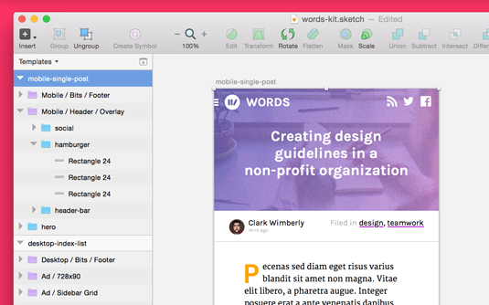
Symbols around your document automatically stay in sync, so when you change one, all the others instantly fall in line. It's a perfect tool for prototyping apps and views when elements are repeated over and over, like a social stream, inbox, or track listing.
From a developer standpoint, reusable modules are nothing new. When you code something, best practices (and common sense) say that your code should be flexible and reusable. It not only saves time in development when you get to reuse something, but it makes for a more consistent build.
Using symbols while designing will save time and help you arrive at the big picture faster and more realistically than you previously thought possible.
Which part(s) of my design should be a symbol?
The tricky part is deciding which bits of your layout should be converted into a symbol. They key is to look for pieces that repeat again and again, and aren't too different in each instance. Thankfully, Sketch gives you the power to adjust certain things within a single symbol:
- text content
- opacity
- shadow
- blending mode
If you need to change anything else from instance to instance, a symbol might not be the right choice (or, you might need a symbol plus a few other groups, which would be fine and dandy). One major thing you can't change within a single symbol instance is an image, so make special plans when laying out things like photo galleries and media objects.
Sign up to Creative Bloq's daily newsletter, which brings you the latest news and inspiration from the worlds of art, design and technology.
Thinking like a developer is a great way to decide what should be a symbol. Look for repeating styles and positions, something you'd write some utility CSS for. Things like:
- menus (and menu items)
- lists of messages
- widgets
- headers and footers
- cards
Symbols are the key to working smarter, faster. Changing the background color of the header on 56 pages shouldn't take 56 clicks. Once you get started, you'll never look back.
Creating a symbol in Sketch
Creating a symbol is simple. You can make them from existing layer groups or loose layers. If you select a bunch of loose layers, Sketch groups them for you when creating the symbol.
With the desired item(s) selected, click the Create Symbol icon in the toolbar, or select Layer>Create Symbol in the menu. If you've got a group selected, you can also right-click in the Layers List and select Create Symbol.
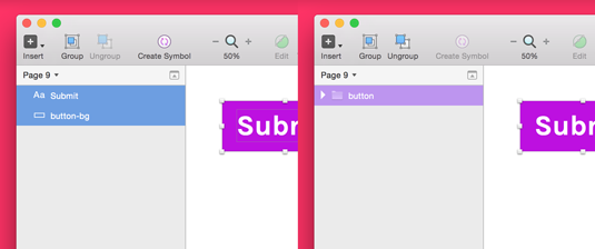
To use the symbol you've just created – or any symbol in the document – select Insert>Symbol in the toolbar. Just remember: any changes you make to your new symbol will be immediately reflected in the other instances. With great power comes great responsibility.
Organizing symbols in Sketch
Once you've got a bunch of symbols in play, using them efficiently requires a bit of organization. Select Insert>Symbol>Manage Symbols to see a complete list of all symbols contained in the document. You can also rename and delete symbols from this view.
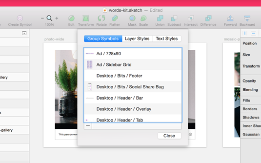
Creating groups of symbols in Sketch
You can also create nested groups of symbols, which is great for organizing even the largest design library. By adding a slash in the symbol name, like buttons/submit, you'll end up with a symbol named submit contained in a folder named buttons.
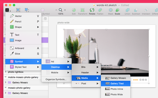
There are lots of ways to organize your symbols (just like code!), but I usually use them in the following three ways:
- Category: split my symbols up by context, like all the form items in one folder, all the gallery items in another
- Resolution: split my symbols up by breakpoint, with symbols in folders by device screen size
- Versioning: when making a new symbol with wildly different styling, sometimes I'll put it in a test or experimental folder to keep my production symbols clean
Swapping symbols in Sketch
Sketch also gives an easy way to swap one symbol for another, perfect for exchanging symbols that are similar to each other (like swapping a solid header for a modified transparent one).
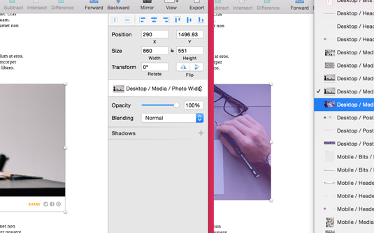
With the target symbol selected, find the symbol dropdown inside The Inspector (the panel on the right side of the screen).
Tweaking individual symbols in Sketch
While most everything about a symbol is kept in sync around your document, there are a handful of values you can change at an instance level, meaning they won't affect other copies of that same symbol.
Changing text content in Sketch symbols
One key to making a realistic prototype is using real (or real-looking) content in all your screens. An inbox full of blah blah blahsdsahs looks way less convincing than sample emails from a believable guy named Steve.
To make changes inside a single instance of a symbol, select the target text layer and check the Exclude Text Value from Symbol option in the Inspector. Now, any changes you make to this text layer will stay local to this instance of the symbol.
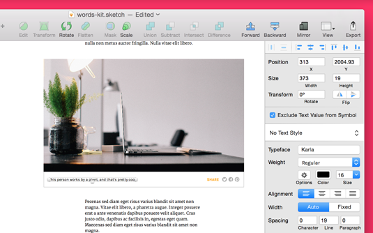
Filling a mockup with real content goes a long way to winning project approval (sorry, lorem ipsum!), so I always take the time to vary the text values from symbol to symbol.
Changing styles of Sketch symbols
Sketch lets you control a few key styles independently, which is helpful when creating various states (status, active/inactive, hover, etc.). Changes to any of the following will only affect the specific instance, not all symbols:
- Opacity: change the overall opacity level for the symbol and all contents
- Shadow: add a shadow (or shadows) to the symbol as a whole
- Blending mode: change the blending mode (overlay, screen, etc.) of the symbol
This is a pretty recent change, coming in Sketch 3.3, but I'm already finding it helpful in cutting down the sheer number of symbols I've got working at any given time. Sometimes an inactive or completed item just needs a simple opacity drop, not a completely separate symbol.
Creating a symbol from Scratch
Our example project is an editorial website called Words. We’d like the site to be able to nicely display an image, group of images, video, and more, any time an author needs them.
So in our Sketch document, these are all going to be symbols. To get started, we're going to make a mosaic gallery, something that lots of posts and layouts might need, and something we definitely don't want to build again and again.
I'm picking the mosaic gallery because it involves a neat treat using layer masks, which will definitely save time when working with random images from the internet.
01. Draw the grid
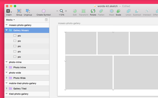
Using the Rectangle Tool (Insert>Shape>Rectangle), draw out the grid where you want your images to sit. Notice we're planning with rectangles, not actual image sizes. If you wanna get really specific – and I did – you can size things pixel-perfect using The Inspector.
02. Add shapes
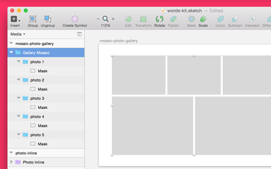
With the grid in place, add each shape to its own group (select the shape and press Cmd+G). Inside of each group, right-click on the shape and select Use as mask. Each rectangle is now ready to contain a single image from your gallery.
03. Paste images
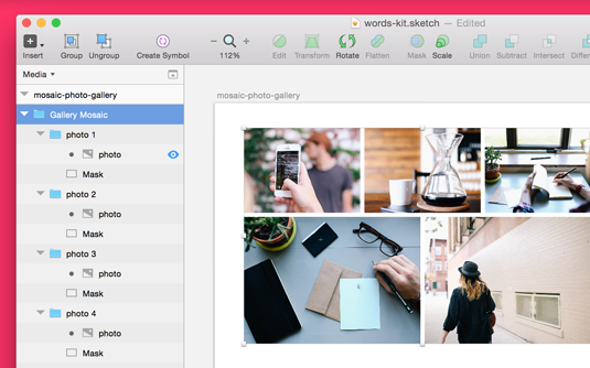
Paste an image into each group, making sure to keep it on top of the mask layer. Masks work by containing any elements sitting above itself in the same group (which is why I had you group everything first). Using shapes as masks cuts out the huge annoyance of having to size each random image specifically, since you already have a grid ready and waiting.
04. Convert to symbols

Select everything you've just created and convert it to a symbol, either by clicking the Create Symbol icon in the toolbar, or select Layer>Create Symbol from the menu. Your new Symbol is ready to insert all over your document (above, I've utilized nested folders to keep everything organized).
I'm not sure how else to say this: having a Sketch document with a library full of ready-made symbols is an absolute delight. It's like a drag-and-drop sticker sheet filled with your own high-fidelity design.
Words: Clark Wimberley
Want to learn more about designing with Sketch? Get Clark Wimberly’s 10-part InVision ecourse, Design Workflow with Sketch, delivered right to your inbox. Keep an eye on the InVision blog to be one of the first to know when you can sign up.
Liked this? Read these!

The Creative Bloq team is made up of a group of art and design enthusiasts, and has changed and evolved since Creative Bloq began back in 2012. The current website team consists of eight full-time members of staff: Editor Georgia Coggan, Deputy Editor Rosie Hilder, Ecommerce Editor Beren Neale, Senior News Editor Daniel Piper, Editor, Digital Art and 3D Ian Dean, Tech Reviews Editor Erlingur Einarsson, Ecommerce Writer Beth Nicholls and Staff Writer Natalie Fear, as well as a roster of freelancers from around the world. The ImagineFX magazine team also pitch in, ensuring that content from leading digital art publication ImagineFX is represented on Creative Bloq.
