New Talent: Sheffield Institute of Art's graduate shows 2016
Explore the best of the emerging talent coming out of Sheffield's Institute of Art.
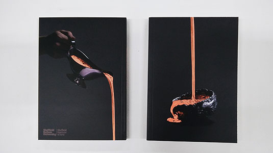
For the Sheffield Institute of Arts at Sheffield Hallam University, 2016 has been a landmark year. Over the last 12 months its first group of illustration students have graudated and the institue has moved into an iconic Sheffield building, the former Head Post Office.
To represent the course and its graduating students, the Sheffield Institute of Arts is running a new degree show called 'Forged'. The intention of the show is to demonstrate Yorkshire's unique tone of voice, hence a concept based around the image of a 'steel' cast Yorkshire pudding.
With plenty of excellent work on display, let's explore some of the projects that grabbed our attention.
01. Aliss Curtis
- Project: Biophilia
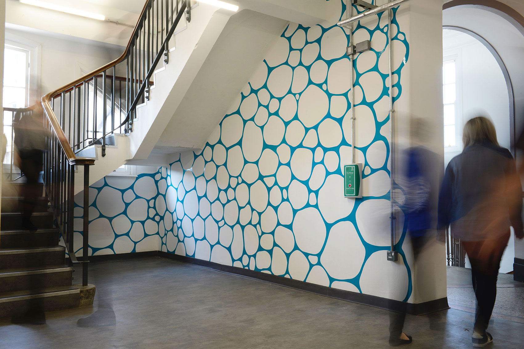
The aim of the research enquiry Biophilia was to improve the health and wellbeing of students. Aliss Curtis acheived this by researching the biophilia hypothesis, which is the idea that contact time with nature can be both physically and emotionally beneficial.
"Within my research I found that these positive effects can be evoked through synthetic forms," Aliss explains. This lead to the installation of a bio-inspired pattern that was influenced by rock formations, sea sponges and the cross section of plant cells.
"Using vinyl and a flatbed cutter I was able to cover around 27 metres of wall space to create this piece that has already begun to have a positive effect on it's surroundings," Aliss adds.
02. Lewis M Nolan
- Project: Play with your food
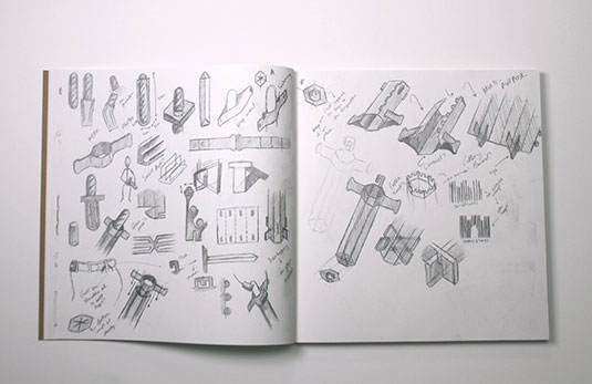
Lewis M Nolan's project goes agains the stern warnings of generations of parents urging their children not to play with their food. By using practical, recyclable materials, Play With Your Food takes something as mundane as a loaf of bread and turns it into something literally playful - in this case, a sword.
Get the Creative Bloq Newsletter
Daily design news, reviews, how-tos and more, as picked by the editors.
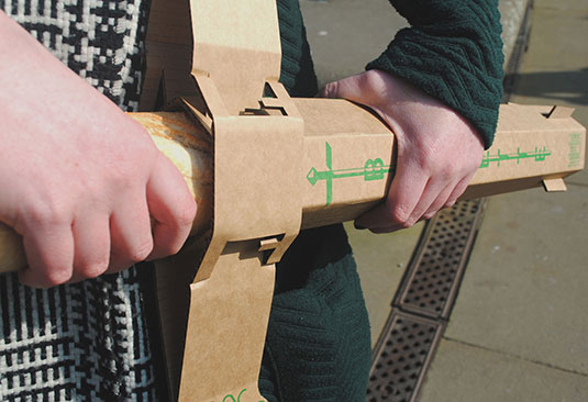
Lewis describes the project as "the love-child of my obscure eating habits and binge watching of Game of Thrones." When it comes to the inspiration, Lewis reveals that "I hated how the end of the baguette would hang out of my shopping bag, open to the elements. And I also wanted to propose a hands free way of taking it home."
03. Lucy Lee
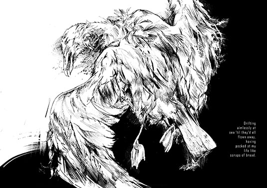
- Project: "The reason why I thought I'd die"
With a highly refined style, Lucy Lee's illustration work combines a passion for drawing with digital imaging processes to create a dynamic illustrative language.
The appropriately titled project, "The reason why I thoght I'd die" is described by Lucy as an illustration and motion project that explores the relationship between creativity and mental illness.
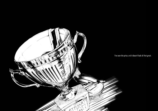
"The work illustrates the lyrics of the song '僕が死のうと思ったのは/ The Reason why i thought i’d die' by the Japanese band Amazarashi," Lucy explains. The images, collected together into a 32 page illustration book, accompany the song's lyrics which describe being depressed and overcoming it.
04. Ella Worthington
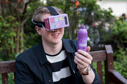
- Project: 'Zōkyō
'Zōkyō is a response to a rising problem with added sugar in foods that leads to bigger health problems, with a particular focus on fizzy drinks. Making the most of cardboard viewers, the project is both a drink and an augmented reality viewer.
"The viewer changes the taste by feeding a sweet smell to the back of the nose using an odorant. The viewer can also change how the product looks by reading the 'L Code' that's printed on the front of the bottle and in turn, the two things alter how the product tastes," Ella reveals.
05. Molly Jones
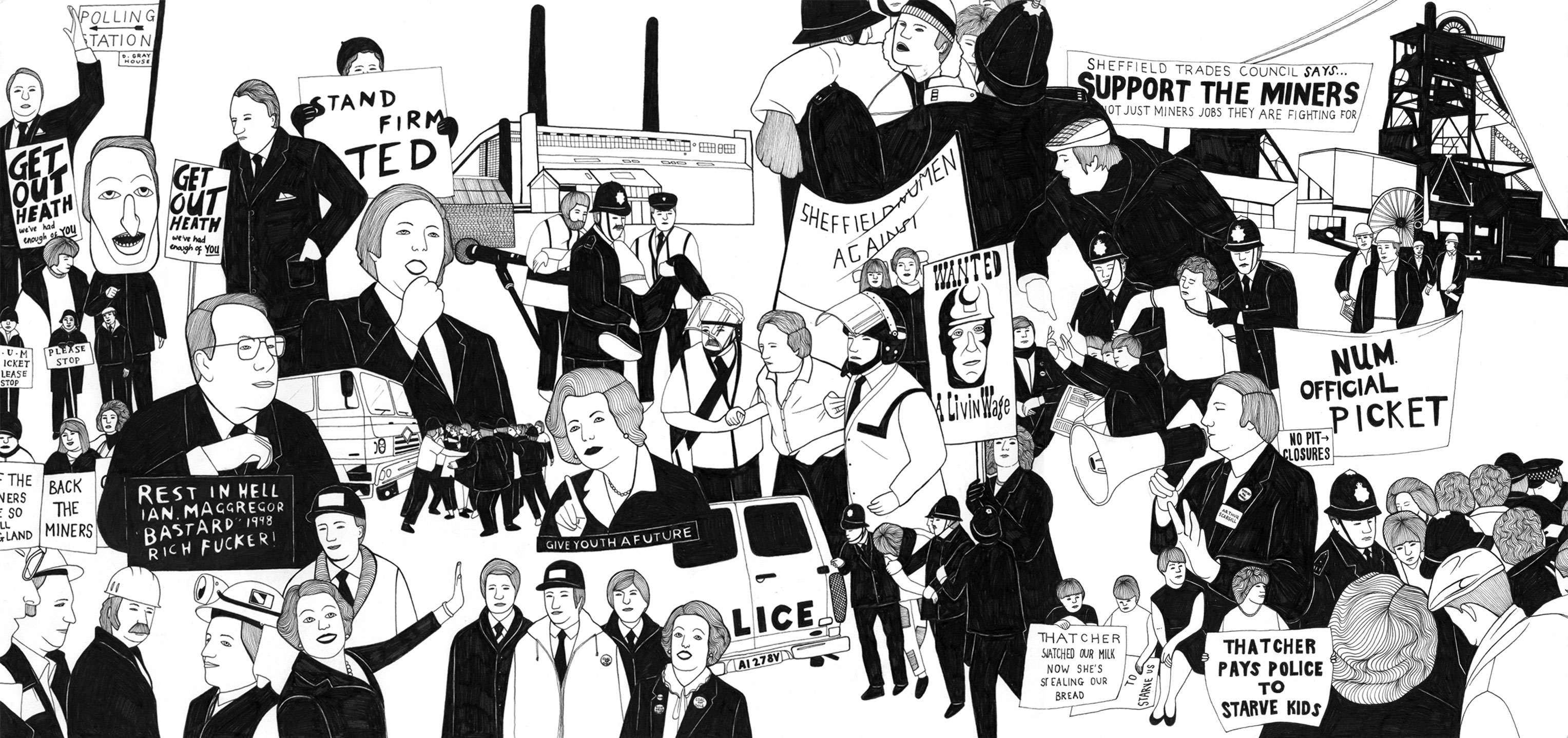
- Project: Sheffield miners' strike
Molly Jones' illustration project celebrates the community of Sheffield as it fought to save the mines.
"This project communicates the narrative of the miners' strike, which I captured in a visual time line, beginning with the first national industrial action in 1912," says Molly. "My figurative drawings have been developed by simplifying the facial features of my characters."
Molly's interests as an illustrator lie in telling a story. "I combined text with the imagery to reveal the main characters in each scene," Molly adds. "The Illustrations were designed in 3 parts, each of which were screen printed and made into placards. I wanted to make the outcome echo the original forms of protest."
We know it isn't always easy being a new graduate. So to celebrate 2016 degree show season, get an incredible 50 per cent off an annual subscription to Computer Arts magazine. For just £39 you'll receive an entire year of industry insight, opinion and inspiration, delivered to your door.

Thank you for reading 5 articles this month* Join now for unlimited access
Enjoy your first month for just £1 / $1 / €1
*Read 5 free articles per month without a subscription

Join now for unlimited access
Try first month for just £1 / $1 / €1

Dom Carter is a freelance writer who specialises in art and design. Formerly a staff writer for Creative Bloq, his work has also appeared on Creative Boom and in the pages of ImagineFX, Computer Arts, 3D World, and .net. He has been a D&AD New Blood judge, and has a particular interest in picture books.
