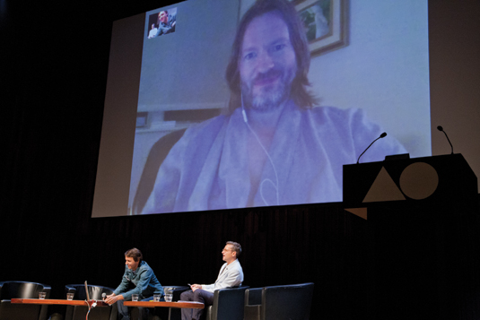
How to be a better speaker: presenting and pitching tips
The design industry's best speakers share 18 golden rules for presenting your work with style.

The thought of standing on stage and talking to a packed auditorium might make you want to dry-heave in the corner. But public speaking can be one of the most effective tools for self-promotion in a designer's armoury, instantly giving you credibility as an expert and supercharging word-of-mouth about your services.
However, the skills involved in public speaking are just as valuable off-stage. Being able to talk confidently about your work in any situation – while pitching, during an interview, over a beer – is a fundamental design skill that differentiates the good from the exceptional. It's a key part of how to network as a creative.
So what are the golden rules of presenting your work? How can you blow the minds of your audience – or at least keep them interested for 45 minutes? And what if it all goes wrong?
Read on to find out how some of the industry's finest creatives have tackled nerves and technology meltdowns to shine as speakers, both on and off the stage.
01. Have a story and an opinion

"There's no replacement for having a great story to tell – and telling it well," says Tony Brook, co-founder of top design studio Spin. A portfolio walkthrough, alone, simply doesn't cut it. Audiences increasingly expect a reward, or a trade-off – something 'extra' – for their time.
"The 'I did this' followed by 'then I did this' portfolio review, even for the best designers, is dull," adds Brook. "People want to be entertained and inspired. They want insights and to feel they've learned something. They want to know what your opinion is and why; what you're about – things that people can relate to and connect with."
02. Share the lows as well as the highs
"The worst talks I've seen are the ones that are just self-promotion," agrees New York City-based artist Jon Burgerman. He's been invited to speak at events around the world and has chalked up many hours as an attendee as well.
"If we, the audience, wanted to just see your portfolio we'd go on your website. I don't want to be marketed to. I want to learn what I don't already know about your work, life, process.
"Tell me about the failures, mistakes, and ups and downs. I guess the big rule is: don't be boring."
03. Put the audience first
This is perhaps the most basic golden rule – but it's often the easiest to forget. Who are your audience? What are their expectations? Are you delivering on these?
"There are differences in talking to graphic design students and seasoned professionals from a broader creative background," says Jan Wilker of progressive design studio Karlssonwilker. Make sure you talk is pitched at the right level for your listeners.
04. Put your talk into a cultural context

Remember also that humour can be tough to translate. "The biggest difference for me is the culture that I'll encounter in a specific part of the world. A lot of our work plays with culturally learned expectations, visually and logically, so there are certain projects I wouldn't present," says Wilker.
"When there are translators at the venue, I always check the references I want to make and the context I want to present a project in. Word-plays are often a no-no."
05. Identify the beginning and the end
"Something Michael Bierut told me once is: if you know where you're starting and where you're ending, you can draw the through line," Pentagram partner Emily Oberman explains. "I design a talk like that, and then thread stories in-between them."
06. Don't have more than five key points

Berlin-based illustrator and author Christoph Niemann suggests breaking down the storytelling element even further. "This comes from me suffering through a lot of design conferences," he laughs.
"Eventually I realised that even if it's the greatest, most insightful talk ever, I could remember a maximum of five images and three points. I was watching people I really admire and realised they're essentially delivering those points." The rest is down to storytelling – leading the audience to and from those points to keep them engaged.
07. Be brutal with your edits
Niemann advises fighting the urge to mention every single detail of every project you've been involved in. "You tend to think, 'Oh, I also did the letterhead and also the business card'."
"Of course it all matters to you as a designer, but for the attending audience it just drowns out everything you really want to say," he explains. "Once you know you have these three or four images, it makes it a lot easier to edit your presentation."
08. Never teach designers to design
"The best proposals are the ones where the speaker is going to show work, demonstrate or teach something. Proposals that say the session is going to talk about how to be a better designer but then show hardly any work – or bland slides – often fall flat," adds Niemann.
"Why? An attendee has paid to go to an event. I've seen the audience turn off when told how they should design. It's as if they're saying: 'What qualifies you, the speaker, to tell me I should do it a certain way?' But if the speaker has an impressive body of work, it immediately qualifies them."
09. Work on your delivery
Great content aside, the real power of a presentation – whether you're speaking to a 3,000-strong theatre crowd or a client across the table – lies in your delivery of the material. Sincerity and authenticity are crucial if you want to make a genuine connection with your audience.
"Does the speaker engage with the audience? Do they feel relaxed? Do they know what they're talking about and appear passionate? These are the things whizzing around my head whenever I'm watching presentations," says John Davey, founder of design and technology conference Reasons to.
10. Avoid reading a script word-for-word
Of course, engaging an audience is far easier said than done. There's debate as to the best way to deliver a presentation. Some design slides to outline the parameters and then speak off-the-cuff; others memorise a speech, practising until it flows naturally. Most agree that reading a script word-for-word usually sounds stilted and awkward.
To help work in a bit of spontaneity without losing the structure of your talk, Brook recommends using keywords as prompts, while Niemann tends to remember which points he wants to deliver with each image.
11. Don't rush it

For award-winning illustrator and regular lecturer Rod Hunt, the key is not to rush the delivery: "Face the audience, speak up and project yourself. Also, try to take natural pauses," he advises.
Also, fight the urge to hide behind the lectern. "I prefer to use a radio mic and progress the visuals with a remote so I can walk the stage," he adds.
Niemann agrees: "People have a tendency to talk too much when they're nervous. Public speaking helps you learn to say less, which makes for a stronger delivery."
12. Connect with your audience
Whatever your method, the ultimate aim is to connect with your audience – and this, in particular, is where all designers can learn from the best public speakers.
"When I do a presentation, I grossly over-prepare," says Niemann, who was first invited to talk by AGI after emigrating to New York from his native Germany, and was nervous about his English.
"Being comfortable with an audience, on stage, is really important in terms of speaking to a client," adds Oberman. "You have to understand and care about the content, be able to answer questions effectively, think about something differently and respond to what you're getting from your audience, whether they're sitting in the dark in a lecture theatre or on the other end of a table in a pitch situation or client meeting."
13. Overcome nerves with practice

Nerves and anxiety are two of the fastest ways to undermine any presentation – or destroy an interview – so what's the best way to overcome them? Again, there's simply no substitute for solid preparation and practice. "Practice is everything," admits Jessica Walsh, partner at New York design firm Sagmeister & Walsh.
"I started out speaking to smaller audiences before going to larger conferences and speaking in front of thousands of people. This helped me test out what people responded to and also helped me gain confidence."
14. Invest in the right tech
On the technical side, Niemann recommends the Presenter Display in Apple's Keynote software. This enables you to see your current slide as well as the next one, plus your notes and a timer. "I've never needed my notes, but knowing they're there is really fantastic," he says.
"Handwritten notes only work if you change them as you talk – but I'm focusing on what I say. And all it breaks down if you've forgotten to shuffle your cards. Then everything's lost."
15. Have mulitple backups

The best advice is to prepare for any situation that might go wrong. Always have at least one backup of your presentation; email your talk to the organisers in advance; do a practice run to test for potential projector or lighting problems; and double-check the quality of your images and videos.
If something isn't working, give yourself time to change it. "I bring everything," Niemann laughs. "Even if the people at the venue tell me they have every adaptor, I bring it nonetheless."
16. Approach it like a design problem
Finally, if it all goes wrong on the day, just stay calm. After all, the biggest secret – says Niemann – is that nobody was born talented at speaking. "It's just a lot of practice," he smiles.
"That, and seeing your presentation as a piece of design. Once you tackle it as a design problem, it's actually not that hard. It just takes time."
This advice first appeared in Computer Arts magazine. Subscribe here.
Read more:

Thank you for reading 5 articles this month* Join now for unlimited access
Enjoy your first month for just £1 / $1 / €1
*Read 5 free articles per month without a subscription

Join now for unlimited access
Try first month for just £1 / $1 / €1
Get the Creative Bloq Newsletter
Daily design news, reviews, how-tos and more, as picked by the editors.

Julia is editor-in-chief, retail at Future Ltd, where she works in e-commerce across a number of consumer lifestyle brands. A former editor of design website Creative Bloq, she’s also worked on a variety of print titles, and was part of the team that launched consumer tech website TechRadar. She's been writing about art, design and technology for over 15 years.
