How to paint a galactic princess in Photoshop
Zezhou Chen reveals how he gives his celestial warrior princess the romance and magic she deserves.
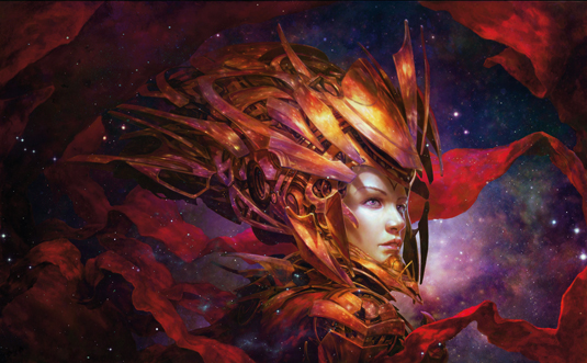
The concept of a star princess has been in my mind for a long time. I tried to paint it 14 months ago, but I wasn't satisfied with the result.
Initially, I was attempting to create a goddess with a sci-fi background. Not like Athene, Valkyrie or any of those ancient gods, but a god who lives in the future, or maybe even in the present. It's an attractive idea and back then it felt like a big challenge.
Pre-order your copy of The Art of Film: Star Wars now!
After such a long time thinking about this concept, I now have some very specific ideas for the image. There are two words to describe what I want to achieve: romantic and miraculous. I also want to make a comment on humanity and its reliance on technology – or its ever-deepening attraction for it.
01. Push the concept
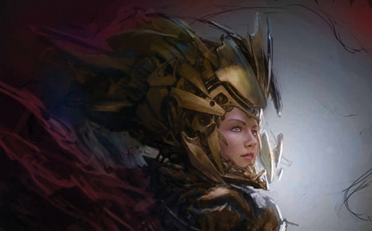
I start rendering her face, because it's the focal point of the image. The most important job here is to turn the vague concept into a reliable description. I didn't care about how the light would work in the scene or how to handle the reflections on the armour – instead, I focus on the form of the armour. I choose a standard Round brush for this part, because it provides a solid feel and is easy to control.
02. Quick reflections
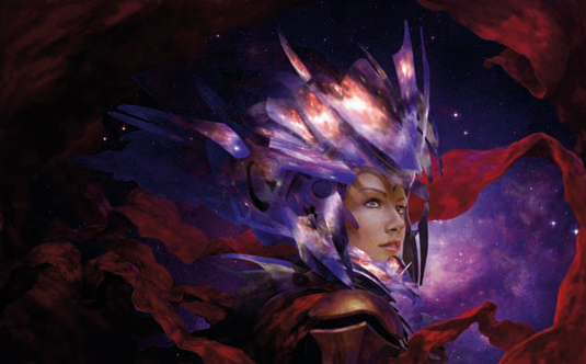
I use a stock image of stars on the armour. I cut and transform the image by following the undulation of its form – just like putting up a texture on a 3D model. Then I adjust its colour and make it more like gold. This is the basis for further progression. It gives me a general vision of what I'm doing. Then I paint over it and clarify the details. I'm not trying to make it super realistic; simulating the reality is enough for me.
03. Adding dust
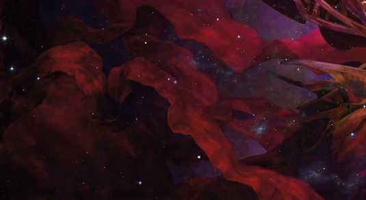
I introduce some effects of nebula and dust in the foreground. This really helps to bring the shadow part to life, and serves the theme well. I use some stock images of the cosmos and set the layer mode of the image to Lighten. By doing this, only the brighter part of the stock image will show, which would be the stars. Then I use the Curve tool to adjust the bright area until I'm happy with the results.
04. Adjusting brightness and contrast
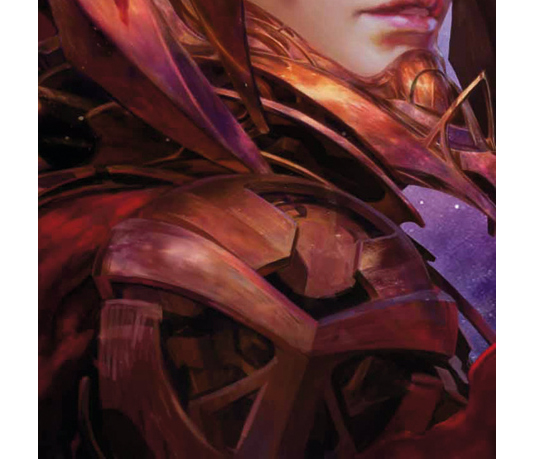
There are many ways in Photoshop to control the brightness and contrast. But most of the time I still need to adjust this by hand. I usually create a new layer and set it to Overlay. I paint it with white to make the image brighter, and black to make it darker. By using this method, I won't lose the details of my original work. And I can change the scene's brightness and hue later on by using the Hue/Saturation adjustment tool.
05. A soft touch

I usually see this kind of ribbon in Chinese religious art and it brings a spiritual feeling to the image. It's a soft, delicate and inscrutable element, and contrasts beautifully with the metal armour.
I use the Mixer Brush Tool to paint this kind of textile. It can easily bring out a subtle difference in the colours and it's useful for depicting soft materials.
06. Ornate protection
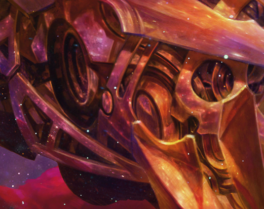
The armour design is the striking feature of the image, and also hints at the identity of the character. It must be beautiful, and it must be unique. I spend more than 60 per cent of the time on exploring the painting's design. And that's been worthwhile.
07. The value of works-in-progress
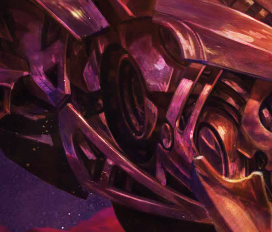
I usually create between 50 and 150 WIPs per image. I save these steps because it helps me to gain a clearer understanding of my direction.
Every time I make a change, I'll compare the altered version with the previous one. I'll keep the change if it's better. And if not, I'll start over from the previous for another variant. By repeating this process, I constantly improve my art.
This article originally appeared in ImagineFX magazine issue 102.
Like this? Read these!
- How to paint a science fiction style dress
- Free Photoshop brushes every creative must have
- How to promote your art online

Thank you for reading 5 articles this month* Join now for unlimited access
Enjoy your first month for just £1 / $1 / €1
*Read 5 free articles per month without a subscription

Join now for unlimited access
Try first month for just £1 / $1 / €1
Get the Creative Bloq Newsletter
Daily design news, reviews, how-tos and more, as picked by the editors.
