How to illustrate an Ironman-style holographic interface
Create futuristic screens like Tony Stark's with these tips.
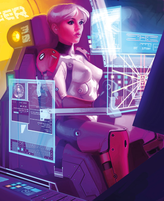
Painting holograms, or any other kind of translucent, luminous effect, is easy using Photoshop. The method I use is simply painting the hologram in a layer, then setting the layer mode to Screen.
Hone your illustrator skills with these brilliant tutorials
A Screen mode layer brightens everything on lower layers, based on its own luminance. That means if a Screen mode layer is completely white, you'll see everything white; if it's filled with black you won't see any change because it'll be like an invisible layer; and if it's filled with grey, you'll see the background but 50 per cent brighter.
It acts if you were painting with light instead of paint. So a Screen layer is perfect for painting something like a hologram, which is essentially light.
Remember that holograms are supposed to cast light. The light from the hologram should be visible on, and affect, the surrounding areas.
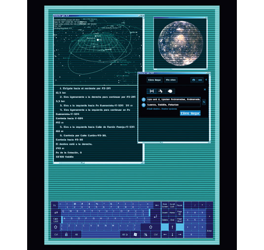
There are no rules on what a holographic interface should look like, so let your imagination run free – and try to get some fresh ideas. In this case I made the edges of the holograms slightly blurry, and also made a copy of the hologram in the background and pasted it over the original one, a bit displaced, to make it look like a failing, damaged device. But those are just ideas. Enjoy trying different effects!
01. Plan and research
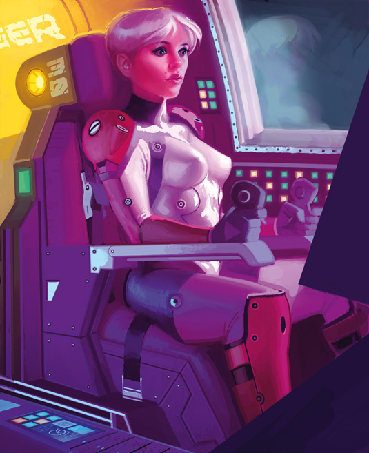
Even though I haven't painted the holograms yet, I have them in mind for a light source and colouring. If you don't make the light from the holograms affect the elements around them, they won't look natural. Once I have a decent image, I paint the holograms – flat and not in perspective – on separate layers.
02. Adjust perspective
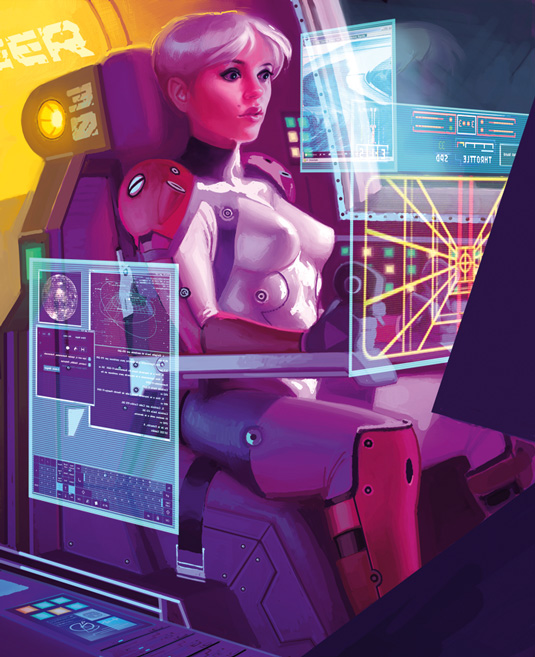
I flip the holograms horizontally, because the viewer will be viewing them from the rear. Then I adjust the perspective of the holograms using Transform in Photoshop (Edit>Transform). If you haven't tried that before, practise with the Skew or Distort commands in the Transform sub-menu.
03. Change opticity
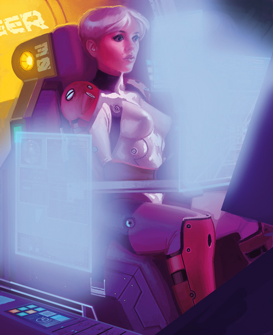
I adjust the opacity of the holograms and give them some extra light by adding two new layers over the top: one set to Soft Light with some blurred light blue brush strokes on it; the other set to Overlay mode with lighter blue, almost white, brush strokes. Both have Gaussian Blur applied to them and are at a low opacity.
Artist's secret: How to create scan lines
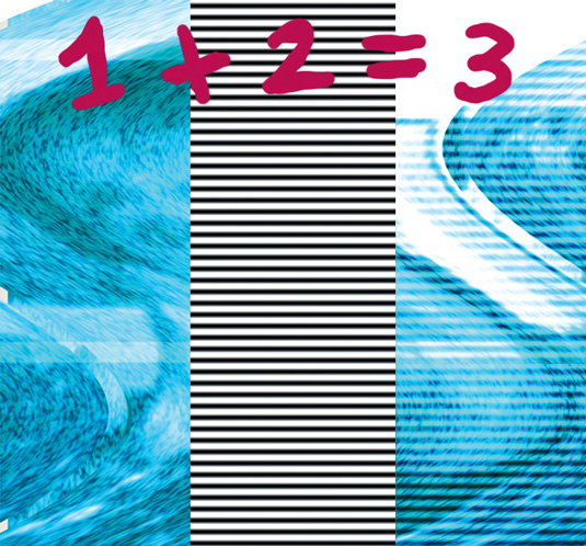
Scan lines can give your hologram a cool look. To make them just select the hologram, create a new layer, fill the selection with black and white stripes, then set the layer mode to Overlay. Adjust the opacity, and that's it!
Words: Paco Rico Torres
Paco Rico Torres is a freelance illustrator living in Spain who's produced art for several card games, magazines, books and role-playing games. This article originally appeared in ImagineFX magazine issue 83.
Like this? Read these...
- How to pain a TRON style sci-fi character
- Great examples of doodle art
- Free Photoshop brushes every creative must have

Thank you for reading 5 articles this month* Join now for unlimited access
Enjoy your first month for just £1 / $1 / €1
*Read 5 free articles per month without a subscription

Join now for unlimited access
Try first month for just £1 / $1 / €1
Get the Creative Bloq Newsletter
Daily design news, reviews, how-tos and more, as picked by the editors.

The Creative Bloq team is made up of a group of art and design enthusiasts, and has changed and evolved since Creative Bloq began back in 2012. The current website team consists of eight full-time members of staff: Editor Georgia Coggan, Deputy Editor Rosie Hilder, Ecommerce Editor Beren Neale, Senior News Editor Daniel Piper, Editor, Digital Art and 3D Ian Dean, Tech Reviews Editor Erlingur Einarsson, Ecommerce Writer Beth Nicholls and Staff Writer Natalie Fear, as well as a roster of freelancers from around the world. The ImagineFX magazine team also pitch in, ensuring that content from leading digital art publication ImagineFX is represented on Creative Bloq.
