Sagmeister & Walsh on their new partnership
As the nude portrait announcing their exciting new partnership attests, Stefan Sagmeister and Jessica Walsh would do anything for design. They reveal what the news means for their iconic New York studio
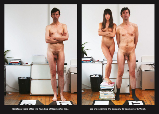
Whenever a message from hugely talented art director, designer and long-time Computer Arts collaborator Jessica Walsh pings into our inbox, it invariably attracts our attention. Rather more so than usual on 31 May 2012, when a full-frontal nude portrait of her greeted us, arms folded defiantly below her breasts as she perched atop a stack of books. Beside her was Stefan Sagmeister, also naked, save for a fetching pair of grey socks.
'Nineteen years after the founding of Sagmeister Inc., we are renaming the company to Sagmeister & Walsh,' announced the card, and Twitter promptly exploded in a frenzy of activity as designers spread the word. For one reason or another, it's fair to say that the method of announcing the phenomenal achievement of Walsh – at just 25 – becoming a partner at one of the world's most iconic studios became public knowledge pretty fast.
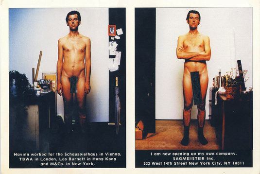
Of course, her new partner rarely shies away from nudity in his work, and the card was a direct homage to a similar concept from 19 years ago, when Sagmeister Inc. was first founded. That simple, cheeky concept juxtaposed two naked portraits of Sagmeister, with a crude black bar eclipsing his penis in both, but markedly larger in the second image.
Prudish commentators have debated the significance of a beautiful young woman naked beside a man twice her age, but Sagmeister and Walsh brush it off with a smile. "The original card was a joke; this was a joke of a joke," shrugs Walsh, now reunited with her clothes. "The goal was to let everyone know about the partnership, and the nudity clearly helped."
"I'd call it a proper piece of functional design," is Sagmeister's assessment. "As you can see in the photo, my ego is big. Jessica's is not so big."
Nevertheless, it was Walsh who insisted on seeing the concept through: Sagmeister had initially suggested her being dressed in an ultra-conservative manner. "It was an initial gut reaction that it fit better with the concept if we were both nude, and I'm not too shy about being naked," she continues. "In a lot of the campaigns I've been art directing for our client Aishti there's nudity on set, so I'm used to being around it."
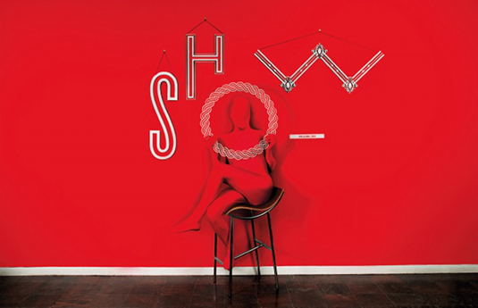
Walsh highlights the studio's ongoing work for this Middle East-based luxury store as a good example of how her approach can fuse with Sagmeister's own aesthetic to create something greater than the sum of their parts. "Aishti also has its Aizone store – with a younger target audience of 15-30 year olds – while Minis is the kids' store," she says. "We were asked to redesign the identity, packaging and advertising campaigns for all three stores." From slick, classy packaging design to body-painted models and intricate papercraft, the three-pronged project has reaped its share of creative rewards.

Walsh led the art direction for Aishti, and indeed has been closely involved with every stage of Sagmeister Inc.'s projects since she joined in February 2010. In early 2012 she and Sagmeister met to discuss how the studio could move forward, and look at the balance between commercial and self-authored projects. "This led to conversations about both our futures, and how we could move forward mutually beneficially," she explains.
"I also wanted some fancier studio space," smiles Sagmeister. "After having looked at about 60 offices and finally finding the right one, it occurred to me that I didn't want extra overheads that would force us to do more – high paying – commercial jobs, when my own desire was to create more self-generated work."
The solution was very simple: going forward, Walsh would lead on the commercial client projects that pay the bills, giving Sagmeister the freedom to pursue the more open-ended creative endeavours on which he's built much of his global reputation to-date. "We'll have plenty of advice for each other," he insists. "In a small studio, everybody does everything."
Having spent the early part of his career working for vast agencies like Leo Burnett, Sagmeister has been an advocate for staying small and nimble ever since striking out alone in 1993 – and both he and Walsh agree that this is one of the many factors that contributed to his new partner's rapid rise to success. "One of the benefits of being so small is that everyone's voice is heard and there aren't so many layers to go through," confirms Walsh. "If any of our designers or interns have a great idea, they will be heard and we can make it happen. A small studio can really allow for talent to flourish."

She'd been familiar with Sagmeister Inc. for a long time – an ex-boyfriend gave her a copy of his monograph Made You Look while she was studying at RISD – but was realistic about her options back then. "I knew the studio only had one designer and heard that Stefan only hired once every few years, so I didn't think it was possible to get a job there," she confesses.
After 18 months at Print magazine, she reached out to Sagmeister for advice. He spent five minutes flipping through her book and offered her a position on the spot. "I quit my job the next morning," she grins. Sagmeister confirms the attraction: "I immediately loved her sunny character and no-nonsense approach to work."
Two-and-a-half years later, this pragmatic attitude complements his own philosophy perfectly. Sagmeister has long been famous for his belief in the power of regular sabbaticals – splitting his working life into manageable seven-year chunks, separated by year-long periods of travel, reflection and personal experiments.
He's now safe in the knowledge that Walsh will be on hand to hold the fort when she needs to: "After a week's vacation, I start itching to get back to the studio," she chuckles. "Later in life I may want longer periods of time off to focus on personal work, but for now I'm just so happy with what I'm doing."
So now that the dust has had a chance to settle and they can begin the serious work of pushing the studio forward, how have they found the response to their announcement? "People loved it or hated it, which I expected," reflects Walsh. "The buzz was great – lots of funny reactions. We got a laugh out of the guy who swapped our body parts.
"I did read some of the negative comments online, but they just didn't bother me," she insists. "I don't regret it at all. We had a fun time on the shoot and it definitely made for an unusual workday."
The attention wasn't all on her, though: "I was surprised by the reaction against my non-circumcised penis," muses Sagmeister. "Foreskin rules."

Thank you for reading 5 articles this month* Join now for unlimited access
Enjoy your first month for just £1 / $1 / €1
*Read 5 free articles per month without a subscription

Join now for unlimited access
Try first month for just £1 / $1 / €1
Get the Creative Bloq Newsletter
Daily design news, reviews, how-tos and more, as picked by the editors.

The Creative Bloq team is made up of a group of design fans, and has changed and evolved since Creative Bloq began back in 2012. The current website team consists of eight full-time members of staff: Editor Georgia Coggan, Deputy Editor Rosie Hilder, Ecommerce Editor Beren Neale, Senior News Editor Daniel Piper, Editor, Digital Art and 3D Ian Dean, Tech Reviews Editor Erlingur Einarsson, Ecommerce Writer Beth Nicholls and Staff Writer Natalie Fear, as well as a roster of freelancers from around the world. The ImagineFX magazine team also pitch in, ensuring that content from leading digital art publication ImagineFX is represented on Creative Bloq.
