3 ways to roll out a responsive redesign
Making an existing site responsive is a tough challenge; these tips will help you tackle it.
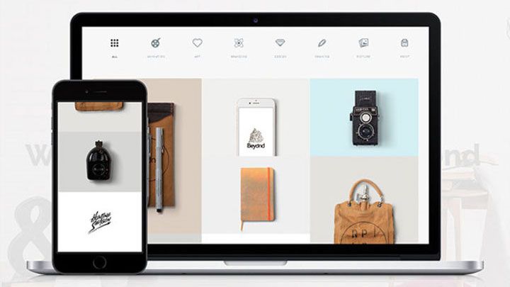
Arguably, it is easier in the long run to create a brand new responsive web design than to make an existing, unresponsive site responsive. However, it is not impossible – far from it – but there are better ways to go about it than others.
The following case studies outline the different methods that organisations have used when rolling out a responsive redesign, to give you some RWD web design inspiration.
01. Responsive retrofit

No magic wand automagically makes a site responsive, but Capital One found that with a componentised backend already in place, it could quickly retrofit its existing desktop site.
Head here for a full account of how Capital One pulled off a responsive redesign in just two months.
02. Parallel beta

Some companies want users to be able to test out a responsive design and then return to the 'classic' version of the site. Fidelity says its beta approach brought in lots of user feedback.
Listen to this podcast to hear how using a beta enabled financial services site Fidelity to test multiple iterations and learn from user feedback.
03. Mobile-only responsive

An existing m-dot site can be used as a sandbox for rolling out a responsive design in stages. The Guardian and the BBC delivered their responsive sites to smartphone and tablet users first, before the desktop site.
Go here to hear how the Guardian did it, and here for the BBC's story.
Words: Karen McGrane
Karen McGrane is the author of Going Responsive, a book on responsive web design. This is an edited excerpt from an article that appeared in issue 275 of net magazine.
Liked this? Read these!
- Top Chrome extensions for designers and devs
- Choose a website builder with these top tools
- Behold the very best in website templates
- Discover the best user testing software
- Read our step-by-step guide to user experience

Thank you for reading 5 articles this month* Join now for unlimited access
Enjoy your first month for just £1 / $1 / €1
*Read 5 free articles per month without a subscription

Join now for unlimited access
Try first month for just £1 / $1 / €1
Get the Creative Bloq Newsletter
Daily design news, reviews, how-tos and more, as picked by the editors.
The Creative Bloq team is made up of a group of design fans, and has changed and evolved since Creative Bloq began back in 2012. The current website team consists of eight full-time members of staff: Editor Georgia Coggan, Deputy Editor Rosie Hilder, Ecommerce Editor Beren Neale, Senior News Editor Daniel Piper, Editor, Digital Art and 3D Ian Dean, Tech Reviews Editor Erlingur Einarsson and Ecommerce Writer Beth Nicholls and Staff Writer Natalie Fear, as well as a roster of freelancers from around the world. The 3D World and ImagineFX magazine teams also pitch in, ensuring that content from 3D World and ImagineFX is represented on Creative Bloq.


