5 sites that have nailed responsive web design
Gene Crawford shares his rules for any responsive approach, and picks five sites that get it right.
Responsive web design is hands down the most effective way to get a company's website to the mobile market. There are a few ways to approach creating a responsive website. There's 'mobile first', 'content first', retrofitting a website to be responsive and, probably the most popular, 'just bulldozing through it all'.
Win clients & work smarter with our FREE ebook: get it now!
In a typical web design project that includes a responsive approach, you may lack sufficient budget to do it the ideal way. You may just be trying to fit in a mobile view by any means possible into the project. If you find yourself in this situation, there are a few rules of thumb you can apply to the mobile or smaller screen size aspect of your responsive design that can help the transition from desktop versions.
Simplify, simplify, simplify!
Having fewer features visible can help simplify the design elements and make it easier to scan or click by tapping. Focus on creating larger touch areas so users don't need to be so precise when navigating the website.
Since mobile experience is always considerably slower than on the desktop, having strong information scent is much more important in the smaller screen sizes for your website because users will want to get the link right the first time and not pogo-stick between pages. Achieve this by utilising full-length headlines or including stronger microcopy on navigation items or buttons.
If you collapse the website's navigation into a smaller area, or anchor link to a navigation area like the footer, clearly label the link or interaction as the navigation by using a proper icon that makes sense to your audience. These broad concepts can serve you well to employ on your next responsive design project.
Get the Creative Bloq Newsletter
Daily design news, reviews, how-tos and more, as picked by the editors.
Here are five examples of RWD sites, created some time ago, that get it right. Get your site right with the best web hosting around.
01. Pittsburgh Glass Center

For the Pittsburgh Glass Center Art Museum's responsive website, a navigation system collapses into a clearly identifiable icon link that then links to an anchored set of links near the footer on the smaller screen sizes.
02. Microsoft

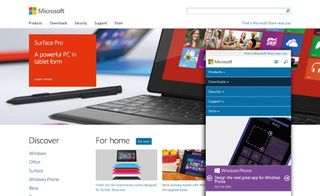
Microsoft's website essentially executes everything on the responsive checklist.
Next page: three more sites that have nailed RWD

Thank you for reading 5 articles this month* Join now for unlimited access
Enjoy your first month for just £1 / $1 / €1
*Read 5 free articles per month without a subscription

Join now for unlimited access
Try first month for just £1 / $1 / €1
The Creative Bloq team is made up of a group of design fans, and has changed and evolved since Creative Bloq began back in 2012. The current website team consists of eight full-time members of staff: Editor Georgia Coggan, Deputy Editor Rosie Hilder, Ecommerce Editor Beren Neale, Senior News Editor Daniel Piper, Editor, Digital Art and 3D Ian Dean, Tech Reviews Editor Erlingur Einarsson and Ecommerce Writer Beth Nicholls and Staff Writer Natalie Fear, as well as a roster of freelancers from around the world. The 3D World and ImagineFX magazine teams also pitch in, ensuring that content from 3D World and ImagineFX is represented on Creative Bloq.


