Responsive reorganisation
Kevin M Hoffman explores how organisations are throwing out the traditional structures in favour of something more flexible.
Responsive web design is not only changing how we design websites, it's also changing the way we design teams and work together. Design team structures and processes are evolving to support what good responsive design efforts need: small cross-disciplinary teams, more iterative conversations, and smaller loops into production to test ideas.
I believe this shift mirrors a larger trend in business: a move towards more organic ways of structuring people and processes. I think this is happening because responsive design is as much about designing for multiple contexts as it is about multiple screen sizes.
Pyramid structure
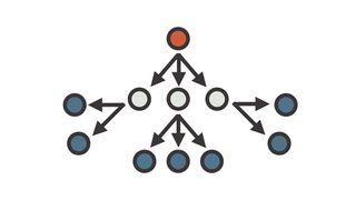
Historically, organisations follow a pyramid pattern. It's composed of leadership at the top, then discipline managers (vice presidents of marketing, CTOs and so on), followed by the various teams they oversee.
This approach has been around since the industrial revolution. It allowed manufacturers to scale and produce greater numbers of products without sacrificing quality. Want to ramp up production of the same widget? Break up the production process into smaller parts to increase the efficiency of each worker. You know this process already: you probably call it 'waterfall'.
Responsive design requires us to design different things at the same time. We may be designing two or three different experiences within the same code base, tweaking the hierarchy and presentation of content and functionality based on screen size or device capability.
This requires a team to be agile. One way of doing this is to mix disciplines within small teams organised around goals as opposed to disciplines. This is a more organic way of structuring how we work together. When it works well, there is a mix of expertise and management responsibility. It also facilitates easier, more rapid collaboration, and enables those involved to reach out for pieces of the puzzle such as content, approval, or domain expertise.
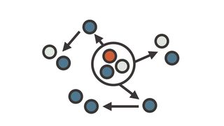
Because a responsive experience has the potential to reach audiences across different contexts, it also changes how organisations collaborate. Responsible parties in an organisation need to be more informed. Here's an example from a company that should warm any geek's heart: Nintendo.
Get the Creative Bloq Newsletter
Daily design news, reviews, how-tos and more, as picked by the editors.
Case study: Nintendo
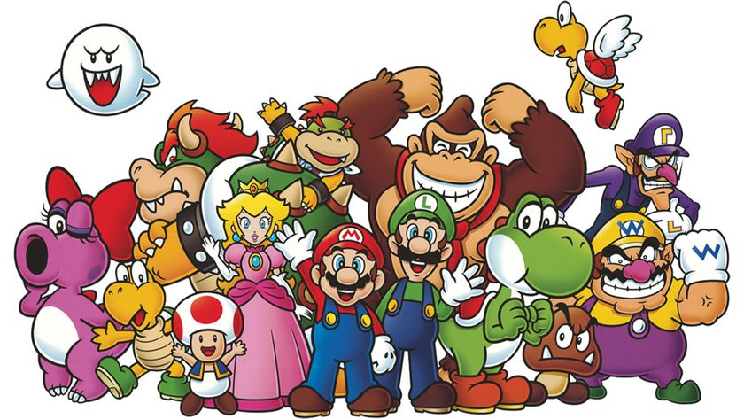
In the early 1980s (when I became a fan), Nintendo marketed the 8-bit Nintendo Entertainment System through a limited number of channels including comics and television commercials before Saturday morning cartoons. Now the number of advertising delivery channels has increased significantly.
The web in itself is a massive advertising platform, composed of static graphic ad units on websites and 'pre-roll' video (traditional video commercials played before online videos). That's not to mention all of the subtle (and not so subtle) ways advertising is sneaking into app experiences. Mind if Google reads your email, anyone?
Many are becoming comfortably numb to all of this messaging; perhaps dangerously so. To counter that numbness to some degree, content itself has also become a form of advertising.
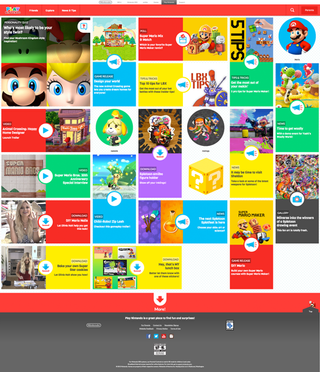
The website play.nintendo.com is a great example of this trend. It uses character stories, game tips and Buzzfeed-style quizzes to create a seemingly never-ending path of content around Nintendo's universe of content. The site is intended to build interest in (and ultimately sell) game systems and video games.
It also uses responsive design in an interesting way. On a smaller screen, it narrows focus onto individual characters, and creates a sequence of stories and tips around those characters: it might show Mario, then Mario's brother, Mario's best cart, Mario's relationship to the princess, and so on.
On a larger screen, however, it emphasises content types over characters, and surfaces more choices per screen. This design choice isn't just a benefit of more pixels. This is a deliberate attempt to adjust context based on likely usage scenarios.
This change in content experience suits how people might want to use the content in different situations. Zeroing in on a long trail of character traits on smaller screens creates a more linear, addictive flow. This mobile flow caters for its particular context – restless kids at a restaurant table, for example.
It draws the user in in a way that's still easy to abandon, creating an addictive flow to pass time. On desktop, they might learn 'how do I beat that level' , but on smaller screens they fall into a loop of 'tell me everything there is to know about one thing'.
Changing a design to suit what is going on in someone's life is a key strategic benefit of responsive design. We can use our knowledge about device capabilities and a visitor's context of use to create appropriate benefits that go beyond just progressive enhancement.
Why does this matter?
The Nintendo website is written for an audience young children. It includes intellectual property, game content and key messages. To be continually updated, the site's content has to be coordinated between product teams, marketing oversight, legal experts, and game designers. That's not to mention all of the design and development staff actually tasked with working on the website itself.
In order to do this efficiently, smaller, more iterative conversations have to take place between all these departments. This is a great example of the 'responsive reorganisation' I'm talking about: a situation where responsive design can be the impetus for better ways of building together.
You can find detailed examples of these changes, at companies from MTV Networks to Marriott International, on the responsive design podcast.
This evolution of how organisations structure themselves is not unique to the web design industry, and has been well documented in the business research by people like John Kotter. Take a look at his Harvard Business Review article 'Accelerate' for starters, and you may find something that will help your organisation approach responsive design collaboration in a whole new way.
Words: Kevin M Hoffman
Like this? Read these!
- This hairdressing site makes great use of sideways scrolling
- Brilliant Wordpress tutorial selection
- The ultimate guide to logo design

Thank you for reading 5 articles this month* Join now for unlimited access
Enjoy your first month for just £1 / $1 / €1
*Read 5 free articles per month without a subscription

Join now for unlimited access
Try first month for just £1 / $1 / €1
The Creative Bloq team is made up of a group of design fans, and has changed and evolved since Creative Bloq began back in 2012. The current website team consists of eight full-time members of staff: Editor Georgia Coggan, Deputy Editor Rosie Hilder, Ecommerce Editor Beren Neale, Senior News Editor Daniel Piper, Editor, Digital Art and 3D Ian Dean, Tech Reviews Editor Erlingur Einarsson and Ecommerce Writer Beth Nicholls and Staff Writer Natalie Fear, as well as a roster of freelancers from around the world. The 3D World and ImagineFX magazine teams also pitch in, ensuring that content from 3D World and ImagineFX is represented on Creative Bloq.


