4 tips for your Mobilegeddon-inspired responsive redesign
Whether you redesign or retrofit your site, here are some pro tips to help you stay mobile.
03. Understand what people want in a mobile site
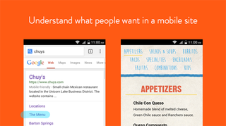
Search queries and results vary from mobile to desktop by up to 60 per cent. When making a mobile plan of attack, checking your keywords is a great way to see what your mobile users care about (you can view these in both Webmaster Tools and Google Analytics).
While a lot of people preach full feature parity, a quick build focused on 'on the go' features can be a great place to start. If you can create a useful mobile experience with only a quarter of your desktop content and functionality, go for it! It'll be much better than nothing.
Just don't rest on your laurels. After all, it's a multi-device world (opens PDF), with the majority of users frequently switching between devices, or using multiple devices simultaneously. And you can use your success with the limited mobile experience to inform a full-featured redesign.
04. Test your mobile experience
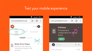
This may sound like a no-brainer, but before you launch your shiny new mobile flow, make sure to test it on a mobile device. While the numbers show that mobile devices are king, most of us still design and prototype in a desktop environment.
Emulators, inspectors, and artboard zoom levels all do a great job of making something feel mobile, but nothing beats actually experiencing mobile. You'd be surprised how often buttons and links turn out to be near-impossible targets on a mobile device. And that's just one example of how things change across devices.
Of course, you don't want to invest a ton of time coding up a mobile version of your site, just to find errors like that.
Enter InVision, which lets you easily prototype your mobile flows without a single line of code – and experience them right on your mobile device. Add a team armed with a random sampling of devices and varying experience levels and you've got some mighty heavy user testing ready to go.
Get the Creative Bloq Newsletter
Daily design news, reviews, how-tos and more, as picked by the editors.
The early results are in
Since announcing the change in February, Google has already seen a nearly five per cent increase in mobile-friendly sites. With the change live, and desktop-only sites starting to feel the crunch, that number will only rise.
While no one's sure how the change will affect desktop-only sites just yet, some are already wondering if Google's suddenly privileging design over content.
Have you made changes to your product in anticipation of Mobilegeddon? Or are you a 'perfect world' type, with a perfectly responsive site already a couple years old? What do you think about Google's vote for a more mobile-friendly world?
Words: Aaron Stump
Aaron Stump is brand director at InVision.
Like this? Read these!
- This hairdressing site makes great use of sideways scrolling
- Brilliant Wordpress tutorial selection
- The ultimate guide to logo design

Thank you for reading 5 articles this month* Join now for unlimited access
Enjoy your first month for just £1 / $1 / €1
*Read 5 free articles per month without a subscription

Join now for unlimited access
Try first month for just £1 / $1 / €1
The Creative Bloq team is made up of a group of design fans, and has changed and evolved since Creative Bloq began back in 2012. The current website team consists of eight full-time members of staff: Editor Georgia Coggan, Deputy Editor Rosie Hilder, Ecommerce Editor Beren Neale, Senior News Editor Daniel Piper, Editor, Digital Art and 3D Ian Dean, Tech Reviews Editor Erlingur Einarsson and Ecommerce Writer Beth Nicholls and Staff Writer Natalie Fear, as well as a roster of freelancers from around the world. The 3D World and ImagineFX magazine teams also pitch in, ensuring that content from 3D World and ImagineFX is represented on Creative Bloq.
