4 tips for your Mobilegeddon-inspired responsive redesign
Whether you redesign or retrofit your site, here are some pro tips to help you stay mobile.
As of April 21, Google searches from a mobile device are more likely to turn up relevant results that are also mobile-friendly results. The algorithm update dubbed Mobilegeddon doesn't affect desktop searches, or even tablets, but it's still a huge deal.
Has your website survived mobilegeddon?
Of course, all websites should be mobile-friendly. In a perfect world. But in the real world, there are legacy builds, business requirements, and development timelines to deal with.
For the unprepared, Mobilegeddon's a nightmare. But for the rest of us, it's a real opportunity.
Making the most of Mobilegeddon
If your site (and product, for that matter), isn't mobile-friendly, you've got two basic options:
- Mobile retrofit: All some desktop sites need is a new viewport meta tag and a handful of new of CSS rules. While it's not always that easy, a mobile retrofit can quickly (if only temporarily) make your brand mobile-friendly.
- Mobile-first build: The more labour-intensive but lasting option is to redesign your site, starting with the mobile experience and working your way up to larger screens. This can be a bit daunting, but with the right data and solid planning, a mobile-friendly build can be closer (and more rewarding) than you might think.
Both approaches offer real benefits, but only your team can decide which is best – and best for right now.
But whichever you choose, you'll want to do these four things.
Get the Creative Bloq Newsletter
Daily design news, reviews, how-tos and more, as picked by the editors.
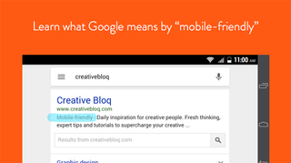
01. Learn what Google means by 'mobile-friendly'

A lot of features signal mobile-friendliness to Google, from viewport meta tags to touch features and device detection. While they won't share the exact science, you can see what it thinks of your site with their Mobile-Friendly Test tool.
In more good news, Google determines mobile-friendliness on a page-by-page basis. So check your analytics and start your retrofit/redesign with your heaviest-hitting pages. If the bulk of your search traffic hits your index or landing pages, optimize those first.
Since this is an update to their real-time algorithm, altered pages should be re-indexed quickly, in as little as a few days. Once Google decides that your destination page is mobile-friendly, it'll get the gray 'mobile-friendly' callout in search result pages and you should start seeing the reward in ranking that Google has claimed.
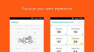
02. Focus on your users' experience

Of course, getting your content to load on a mobile device isn't enough. Experience matters, so cramming too much stuff onto a small screen (with potentially limited bandwidth) can cost you.
People hate waiting. Which means that, on mobile devices, every second lost to loading shaves valuable users from your bottom line.
When you're planning your responsive retrofit or redesign, pay close attention to your assets' file sizes. Designing with a file-size constraint in mind not only speeds loading, but also shifts focus onto more important things: simplicity, clarity, and conversion.
Aside from file size, make sure your site is easy to navigate and its text is easy to read. An uncomfortable or confused user isn't a repeat user.
Next page: two more mobilegeddon tips

Thank you for reading 5 articles this month* Join now for unlimited access
Enjoy your first month for just £1 / $1 / €1
*Read 5 free articles per month without a subscription

Join now for unlimited access
Try first month for just £1 / $1 / €1
The Creative Bloq team is made up of a group of design fans, and has changed and evolved since Creative Bloq began back in 2012. The current website team consists of eight full-time members of staff: Editor Georgia Coggan, Deputy Editor Rosie Hilder, Ecommerce Editor Beren Neale, Senior News Editor Daniel Piper, Editor, Digital Art and 3D Ian Dean, Tech Reviews Editor Erlingur Einarsson and Ecommerce Writer Beth Nicholls and Staff Writer Natalie Fear, as well as a roster of freelancers from around the world. The 3D World and ImagineFX magazine teams also pitch in, ensuring that content from 3D World and ImagineFX is represented on Creative Bloq.


