6 cutting edge insights into responsive design
Vitaly Friedman explores some clever design techniques and patterns at this year's TYPO Berlin.
Web designer and editor-in-chief of Smashing Magazine, Vitaly Friedman's opening message to TYPO attendees this year mirrored John Boulton's words: "The design process is weird and complicated because it involves people and organisations – which are often weird and complicated."
"Discovering patterns in this complexity is akin to discovering what is important in geographic maps," said Friedman, as he expressed his love of landmarks, topography and the focal points that make up the features of a landscape.
"The web designer's job is to identify the patterns of navigation that are disclosed in UX," he said. "This is often visualised in the abstract maps web designers draw in the initial stages of a project."
01. Clear navigation
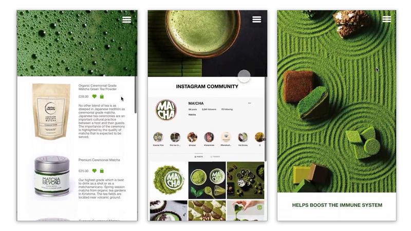
Because navigation is where the pattern begins, Friedman pressed home the importance of clearly signing navigational menus, using the example of an abstract menu icon consisting of three lines.
Research conducted on the Cancer Research website showed this design doesn't immediately indicate its function to all users, whereas framing the word 'menu' makes for an elegant and clearly indicative interface element.
Friedman added that menus should also be easily opened/closed and compact so as not to disturb the action of scrolling – a defining element of off-canvas navigation (OCN). Friedman broke OCN down into three important takeaways:
- It's the simplest way to keep navigation accessible and out of the way (quickly).
- It often includes a drawer that contains secondary items which are rarely used (or have low user engagement).
- When a search function is provided, it should focus on primary navigation.
02. Mobile devices
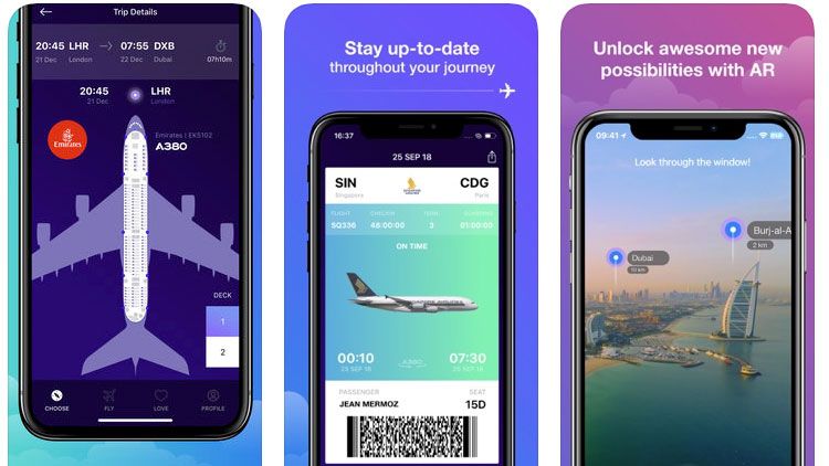
"Mobile devices bring another level of complexity to the UX," explained Friedman. "Mobiles typically have 4-5.5-inch high resolution screens and a mainly portrait orientation."
"Upper navigation controls work fine in desktop browsers, but they aren't optimised for thumbs – and research shows that 75 per cent of mobile users rely on their thumb."

"Also, 49 per cent of users rely on a one-handed grip," added Friedman – which means important navigational actions should be kept separate at the bottom of the screen.
03. Reducing complexity
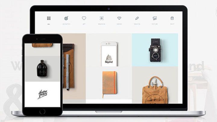
Friedman then went on to show how web designers often convert site content into blocks and include hover effects (www.typekit.com for instance) to simplify complexity or for more easily navigating on a smaller screen.

Friedman showed how it's often useful to include sliders which change the complexity of visual maps (www.seatgeek.com is a good example), while responsive icons can adapt their features based on available screen space (www.responsivelogos.com).
04. Scalability in layout and type
Designers should think about scaling and clarity, he explained, especially for responsive logos, otherwise slogans quickly become unreadable and identity can be lost.
Demonstrating some progressive solutions to scaling, Friedman highlighted the use of adaptive glyphs and dynamically adjusting web typography. "Screens haven’t just changed in size, but also in pixel density," said Friedman, so that websites benefit not just from dynamic layouts but also responsive typefaces which create an altogether better online reading experience.
05. Carousels are dead
Then Friedman unveiled his major designer bugbear: website carousels. This element doggedly persists, he said, but their earliest incarnations have become increasingly redundant. Carousel controls offer little if any incentive for users to click on them, explained Friedman, often because they have no idea what clicking them would reveal.
He then offered alternative solutions to displaying additional content, such as including vertically scrolling transitions with accompanying static frames that present additional undisclosed content (see Amazon's solution for example).
06. Emerging solutions in responsive design
Finally, Friedman noted how websites are demonstrating ever higher degrees of user awareness and becoming more adapted to dynamically enhance the user experience.
Typeform.com for example is designed to allow users to input text into a form without having to navigate using the mouse, making for less hassle and increased intuitive control.
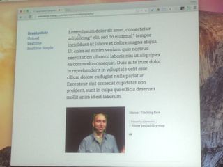
Friedman's highly illuminating talk finished by highlighting how experiments with adaptive typography are changing user interaction.
User-facing cameras can adjust the size of type based on the distance of the viewer from the screen, for example, making for less adjustment on the part of the reader and offering the promise of a more dynamic and effortless future for UX.
Exclusive TYPO offer: two-year Computer Arts subscription for the price of one
Computer Arts has teamed up with TYPO to bring you an exclusive offer that we'll be promoting throughout the conference.
Simply sign up to a two-year subscription to Computer Arts magazine and only pay for one!

Thank you for reading 5 articles this month* Join now for unlimited access
Enjoy your first month for just £1 / $1 / €1
*Read 5 free articles per month without a subscription

Join now for unlimited access
Try first month for just £1 / $1 / €1
Get the Creative Bloq Newsletter
Daily design news, reviews, how-tos and more, as picked by the editors.
The Creative Bloq team is made up of a group of design fans, and has changed and evolved since Creative Bloq began back in 2012. The current website team consists of eight full-time members of staff: Editor Georgia Coggan, Deputy Editor Rosie Hilder, Ecommerce Editor Beren Neale, Senior News Editor Daniel Piper, Editor, Digital Art and 3D Ian Dean, Tech Reviews Editor Erlingur Einarsson and Ecommerce Writer Beth Nicholls and Staff Writer Natalie Fear, as well as a roster of freelancers from around the world. The 3D World and ImagineFX magazine teams also pitch in, ensuring that content from 3D World and ImagineFX is represented on Creative Bloq.
