Create responsive forms and tables
Discover how to tackle two of the most challenging design elements in RWD: forms and tables.
Forms
It's likely tables have been a thorn in your side on projects before. But their persnickety nature is nothing compared to our other good high-maintenance HTML friend: forms.
Because forms are so browser and device-specific in terms of how they react to styling, they can be a real challenge to work with. To paraphrase Luke Wroblewski, forms drive one of the most essential aspects of the web: the ability to generate revenue. Yet filling out a form is the last thing anyone wants to do on a website. Thus, forms make for a fun set of design problems. Let's have a look, shall we?
Layout
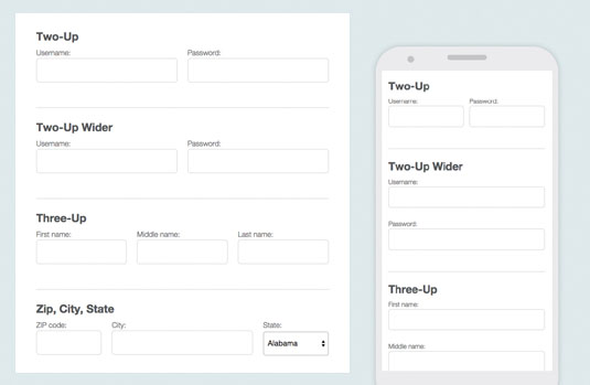
When it comes to laying out forms, there are a few recurring patterns we use. For consistently short pairs of inputs, we use a pattern that we call two-up. It's pretty straightforward.
No matter the size of the viewport, these inputs appear side-by-side. For inputs that need a little more space, but can be next to each other when they have enough room, we use the pattern two-up wider. There are rarely situations where three-up – three side-by-side inputs – always works. So by default, we have that work on the wider principle.

One special case for three-up is postal code, city and state. Because of the nature of these fields, custom unequal widths better serve their purpose. Their styling works on the same principals as before, but with a bit more customisation for the unequal widths we want to achieve with postal code, city and state combos.
You might have also noticed that we're starting the cluster with the postal code field. Both Luke Wroblewski and Brad Frost have shared a great approach where the postal code comes first, allowing us to autofill state and city, which is much more efficient for users.
Validation
No matter how good our forms are, sometimes users will have a tough time filling them out. This is where good validation comes into play. For input validations, we like to consider two components: messages inside the input and messages outside the input.
Get the Creative Bloq Newsletter
Daily design news, reviews, how-tos and more, as picked by the editors.
Inside the input
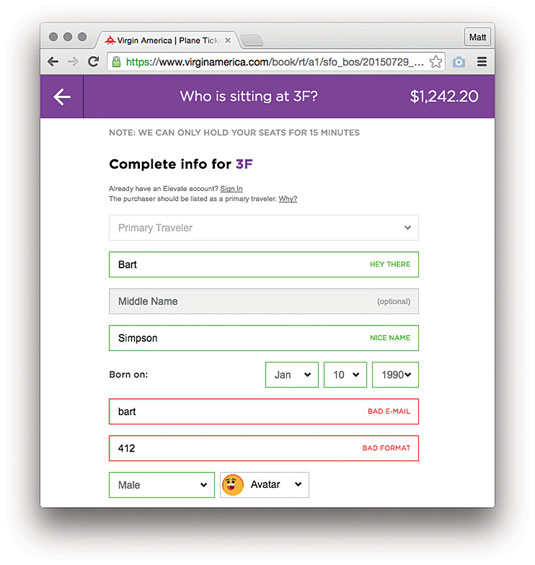
The thing to consider with messages inside the input is space. You can't, for instance, prompt a user with password requirements inside an input. But there is likely enough room for 'invalid' – and there is definitely enough room for a happy green checkmark when they get it right.
One of my favourite parts of Work & Co's Virgin America responsive redesign is how it deals with form validation. It's good at communicating a helpful validation message succinctly (e.g. 'bad email').

With responsive and small screens, brevity is important. The most brief response possible? Icons! And we designers do love our icons. The only problem is that most icons aren't universally understood. For success with a form field, that green checkmark is probably fine.
But how should we indicate failure? A red 'X'? But 'X' in an interface means close or collapse. The word 'invalid' is OK, but a whole lot longer than most icons. If the tone and personality allows it, a frowny face seems relatively clear. But many brands aren't as playful as Virgin America.
In our work at Bearded we've settled on an appropriation of the 'do not enter' sign. Its similarity to iOS's 'remove item' icon isn't ideal, but it's the best solution we've come up with so far.
One thing about responsive design and progressive enhancement, though: we can implement an icon where space is at a premium, and expand to an inline validation message like 'invalid' or 'bad email' when we can afford the extra width.
Outside the input
When we need to display feedback to a user beyond what we can cram inside an input (or when elements like selects are involved), it's time to start using messages outside the input.
In those circumstances, you can use both kinds of validation. For example, you can add an inline 'invalid' message, then below the input tell users the longer story. In this space, you even have the luxury of providing links to enable users to perform alternative actions (e.g. 'Sorry this email address is already used with an account. Try signing in').
Regardless of your approach, form interactions are a subtle art. I would encourage you to run usability testing on your prototypes as you go. Spending a week trying things out with five users can give you a wealth of information about how things are (or are not) working, before you go live.
Dates
One of our favourite input use cases? Date selection. Why? Because it's so hard to do well! Let's say users need to select a date to make an appointment in the near future. Some things to consider:
- Users must be able to input the date in a format the database on the other side will be happy with
- Users need to know which day of the week a date is as they consider their schedule
Sounds like a calendar picker is the way to go. But calendars on small viewport are the worst, right? Luckily pickadate.js does a good job of handling this problem. With a few UI customisations, your calendar picker is good to go.
That's great for near-future date selection. But what about selections in the distant past – for instance, birth date? You'd have to click your way back decades using the previous month button. How odious!
Thankfully, for this sort of interaction day of the week is irrelevant, so the only real challenge is formatting. So what to do? You could try to explain to users what to do using hint text. Except that, well, no one reads hint text.
OK, so we can force formatting choices with three select inputs – one each for month, day and year. That day select input with its 31 options is no picnic – but it's a dream compared to the year select going back to 1915.
Fear not, for natural date entry is a problem that's been solved. Date.js allows users to enter dates however they want. Slashes, dots, or hyphens; abbreviated or spelled out. What's more, it confirms the output with you using a handy validation message, and tells you day of the week, for kicks.
So ... dates? Feels good man. But let's roll back to selects for a second.
Selects
Even for form inputs, selects are kind of a bugbear. Styling those son of a guns consistently across browsers is nigh on impossible. Chris Coyier has put together a great write-up of the common pitfalls and limitations. At Bearded, our standard approach to selects is to match up their height to other inputs, but otherwise pretty much leave them alone.
It's worth noting that the Filament Group has made a heroic attempt at cross-browser select styling, available on GitHub. However, although I love the idea of gaining styling control over these little troublemakers, my personal feeling is that this kind of approach is a bit on the brittle side.
Long selects
The worst situation for selects? When they get long! The fine folks at Harvest were nice enough to release some of their custom select approaches to help you with this, in the form of jQuery plugin Chosen. One of these approaches provides a searchable select that helps users reduce the number of options in front of them. And thanks to Nathaniel Flick, they've been responsivised.
Chosen has some super-fun features, but it can, like any select-replacement approach, lead you down some rabbit holes. Be careful not to make things more complicated than you have to.
Complex selects

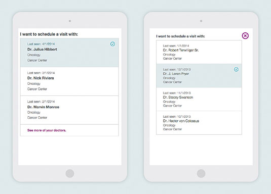
Recently we worked on a project for a healthcare provider in which users needed to select from complex groupings of information. There was a list of doctors, their names, the doctor's area of specialisation, their office location, and the date they last saw the patient.
Complex information like this will not fit into a standard select element, so we tried something else. The solution we came up with is something we called the prioritised selector. In it, we show the user the first few options, prioritised by some specific criteria (most recently visited, for example), as well as the option to view more.
When a user selects the 'view more' option, we open a full-screen modal interface that lets the user select from the full list. Though it adds an extra click when a user needs to access doctors they haven't seen in a while, this ultimately seemed like the best approach for the use cases we were accounting for.
Let's face it: these things are messy
Tables and forms are complex by nature. No matter how much we work on them, they might never be easy. And as the environment we deploy them into grows ever more complex, so will the design problems they represent.
But isn't that the fun of web design? As we solve the problems that are there to be solved (and thus the threat of boredom and complacency rears its ugly head), the web always seems ready to mix it up again, keeping us on our toes. And thank goodness for that.
Words: Matt Griffin, Patrick Fulton
Matt Griffin is a founder at Bearded. Patrick Fulton is a developer, also at Bearded. This article was originally published in issue 272 of net magazine.

See Bearded live in NYC on 27 and 28 April, when they will be giving their hands-on workshop Responsive Web Design for Non-Unicorns, helping teams learn how to work together better on complex RWD projects.

Thank you for reading 5 articles this month* Join now for unlimited access
Enjoy your first month for just £1 / $1 / €1
*Read 5 free articles per month without a subscription

Join now for unlimited access
Try first month for just £1 / $1 / €1
