Create responsive forms and tables
Discover how to tackle two of the most challenging design elements in RWD: forms and tables.

Don't miss the Bearded team at Generate New York on 27 and 28 April. Not only will they run a workshop on 'responsive web design for non-unicorns', founder Matt Griffin will also talk about what it means to be a web designer in 2017 and show additional footage that didn't make it into his documentary, What Comes Next Is The Future.
Get your ticket this Thursday 9 March, in our 24-hour flash sale and save 50%!
Some years ago we started a small web agency called Bearded. In 2010 responsive web design completely changed how we work. Ethan Marcotte's simple yet groundbreaking approach pointed the way towards a web that embraces the constantly expanding world of mobile devices, ensures content parity, and takes progressive enhancement to its next logical step.
Responsive web design directly responded to the problems many of us had already felt in web design: it had become too brittle, too precious and too pixel-specific. The web wants to be fluid, and it needed a fluid solution. And that's what we got.
We've made a whole bunch of responsive sites since 201. And you know what? It's still hard. Making the mental shift from a fixed-width world to a flexible one requires us to rethink many design patterns and user interface conventions.
Not surprisingly, the hardest parts of RWD are things that have always been kind of a pain: tables and forms. Let's have a look at why they are even more fun in a responsive environment.
Tables
The first rule of tables? Don't use tables! But seriously, let's think about this for a second. I like to think of tables as kind of a pre-standards-conscious proto-HTML. Tables, by their nature, attempt to do visual layout with HTML. Their rows and columns and endless table data cells break the cardinal rule of the post-web standards project world: the separation of style and content.
So before you start adding table tags to your markup, stop and ask yourself: is this tabular data? Tabular data derives its meaning from the comparison of similar facets of an information set. In other words, if the value in the information comes from comparing data across columns and rows. If this is the case, you may need a table.
Get the Creative Bloq Newsletter
Daily design news, reviews, how-tos and more, as picked by the editors.
Things that are not tables
If the data has significant value unto itself, maybe it doesn't need to be a table. Or at any rate, not always. Some other options to keep your content out of tables? Headings and paragraphs, or bulleted lists where each item begins with a bold inline heading.

Things that appear to be tables
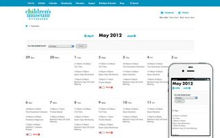
A good example of something that may initially look like a table, but is not actually tabular data? A calendar! A calendar seems tabular because the columns share a common set of designations: Monday, Tuesday, Wednesday, and so on. It is a convenience that we can identify all the Wednesdays at once. This is why people use calendars.
However, the data you put on calendars (say a bunch of Broadway musical performances) is not intrinsically tabular. Comparing one day's shows to another's does not necessarily improve users' understanding of the performances on individual days. A calendar is one way to display date-organised data, but there are others too.
So what does a calendar look like on a small screen? We're asking the wrong question. The right question is: what does a list of events look like on a small screen?

This is how we arrived at marking up our days and events using <divs> and <articles> rather than tables on the Children's Museum of Pittsburgh website. It's much easier (and more semantically appropriate) to make a bunch of articles and divs look like a table, than to make a table look like a list.
Things that must be tables
As much as I hate to admit it, some information is tabular. When designing the fundraising event registration process for the Leukemia Lymphoma Society, we used tables for event selection. Quickly scanning and sorting this list by location and date in order to choose the particular event you want to register for seems like a good use case for tables. But how to make them responsive?

Our investigations into responsive tables started with Chris Coyier's excellent April 2011 responsive data tables roundup. For several projects in the past few years we'd consult this article and inevitably, Coyier's first approach was the winner.
On wide screens, you get tables. On smaller screens, you get each entry with all of the header labels restated for context. You lose the comparative feature of tables on small screens, but you do get the essential information in an easily readable way. In other words, we treat the tabular layout as a progressive enhancement. This is our favourite UI pattern for responsive data tables, and it seems like our friends at Filament Group agree with us.
Tablesaw
In August 2013 the Filaments released Tablesaw on GitHub, which includes this pattern as one of its three options. Tablesaw is the starting point for the LLS example, and I highly recommend using it as a jumping-off point for creating your own responsive data tables.
So if Tablesaw works so well, why wouldn't you just use that all the time and forget about it? Though some major interface or display tables (like the event picker example, or maybe a SaaS pricing matrix) make sense as custom HTML, what about when a site content manager wants to toss a table onto a page using their CMS?
If site managers are entering tables in the CMS using a WYSIWYG editor, there are some issues to surmount. First of all, Tablesaw does its magic by looking at the <thead> and using what it finds there to label the information further down in the <td>s on smaller viewport widths. If the site manager isn't entering <thead> information properly, things won't work.
It's also important to note that Tablesaw only acts on tables with the right classes applied to them. You now need to decide if all tables are Tablesaw tables, or if that's an option in the CMS controlled by the site manager, then apply those rules in your CMS so it outputs the right markup.
Additionally, there are some display issues to consider. Repeating the column headers in every cell tends to add a fair bit of height to the table. It's not a very efficient way to display the data. A non-tabular approach using headings, lists and paragraphs could be an easier read on mobile, depending on the content.
This is why my first approach to tables is still 'don't use tables'. Tablesaw should be your safety net, not your go-to tool. But believe me, you'll be glad it's there when you need it.
Next page: discover how to master user-friendly forms...

Thank you for reading 5 articles this month* Join now for unlimited access
Enjoy your first month for just £1 / $1 / €1
*Read 5 free articles per month without a subscription

Join now for unlimited access
Try first month for just £1 / $1 / €1


