Our Verdict
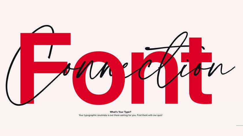
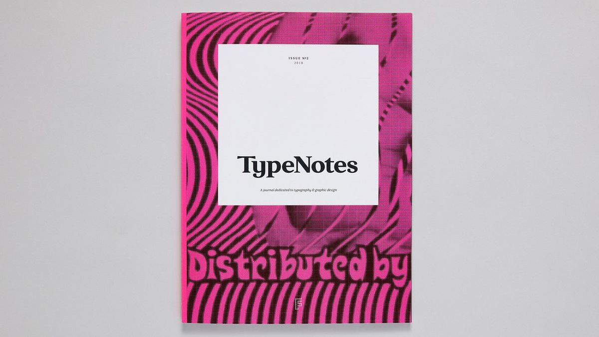
Fontsmith's new typography and design journal executes a thrilling sucker punch with its first two issues. TypeNotes proves it’s not just what you say, it’s the type you say it in.
For
- Beautifully designed
- Great variety of content
- Expert technical insights
Against
- Four a year isn’t enough!
Why you can trust Creative Bloq
Reeking of flouro inks and heavy with luxurious Fedrigoni paper, TypeNotes issue one arrived last year to a blaze of industry acclaim and promptly sold out. For a magazine largely devoted to the specialist art of typography, this immediate success was as surprising as it was gratifying for creative director Jason Smith.
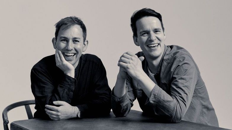
His London-based boutique type foundry, Fontsmith, has been creating unique fonts since 1997, providing typographical solutions for agencies such as The Partners, Dixon Baxi and ManvsMachine, and designing bespoke fonts for everyone from the BBC to Xerox.
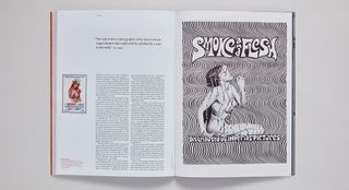
Fontsmith’s TypeNotes blog was already a popular resource for designers to check out new fonts, pick up expert advice and absorb a broad range of design commentary.
“I thought, why not open this up to a much wider audience, create new content and make an actual magazine, a genuine magazine,” Smith explains, fresh from the release of issue two earlier this year, which has won yet more industry plaudits. “We already had the concept, we just needed to rework it into a more traditional medium.”
Hardcore font fetishism
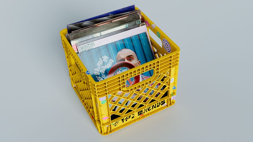
With little experience in magazine publishing, Smith recruited design studio and letterpress workshop The Counter Press to handle the look and feel of the magazine, and design industry stalwart Emily Gosling (senior editor at AIGA Eye on Design) to provide the editorial muscle and ensure the magazine was more than just a Fontsmith typography showcase.
“The fact it’s published by Fontsmith makes no difference,” Gosling explains. “There’s total freedom with what we publish, as long as it’s interesting and relevant for our audience: people who are into typography and graphic design, either professionally or otherwise”
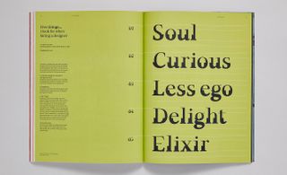
So as well as hardcore font-fetishist reports on tattooing, stone-carving and sign writing, there is also plenty of wider-reaching reporting ('Five things I look for when hiring a designer'), opinion pieces ('Has less is more gone too far?') plus profiles of industry talents.
A bound-in (tragi) comic by Babak Ganjei, exposing a freelance illustrator's day-to-day subsistence, is so funny it justifies the cover price alone.
And there are many welcome variations on well-worn tropes: an interview with 3D illustrator Jack Sachs discusses his creative process through his own sketchbooks, for example. Meanwhile, a bound-in (tragi) comic by Babak Ganjei, exposing a freelance illustrator's day-to-day subsistence is so funny it justifies the cover price alone.
Few magazine execute a sucker punch with their first issue, but thanks to Gosling’s experience and obvious passion for design, TypeNotes effortlessly skips straight past the awkward baby steps of a fledgling title to deliver an ambitious, satisfying design journal, brimming with confidence and possessing a clear editorial identity.
Type porn
Issue two’s showpiece article – Type Porn – is a vertiginous plunge into the history of X-rated movie posters of the 60s and 70s, Gosling herself investigating the psychology at work behind the lurid yet often beautiful posters (think Deep Throat).
A fascination with the slightly seamier side of design is also evident in an interview with Nigel Waymouth – a key figure in 60s psychedelic design – who looks back on the energy and romanticism (and drugs) that shaped the design of the sexual revolution, a font-themed entry point burrowing down into a much wider discussion of design culture.
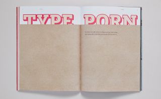
And when TypeNotes does hit hardcore full-geek mode ('To The Point' is a celebration of unusual punctuation marks) the beautiful layouts (courtesy of The Counter Press’ David Marshall and Elizabeth Ellis) are delivered so elegantly that even those with only a casual interest in the complex alchemy of typography will be intrigued.
The magazine stands as testament to the passion of all involved. “Once we had the magazine in our hands, it smelt and felt great,” Smith remembers, “and the indie mag shops loved it too”.
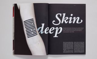
His desire to “make a physical thing… something beautiful and engaging,” has been matched by Gosling’s determination to escape a “depressingly screen-based life” and make something readers could savour instead of frantically thumbing through “on a little cracked phone screen”.
Just two issues down, TypeNotes already feels like an old favourite. We’re intrigued to see how this beautiful magazine continues to develop when the third issue arrives later this year.
Issue two of TypeNotes magazine, £10, is available from the Fontsmith shop.
Also read: 30 books every graphic designer should read

Thank you for reading 5 articles this month* Join now for unlimited access
Enjoy your first month for just £1 / $1 / €1
*Read 5 free articles per month without a subscription

Join now for unlimited access
Try first month for just £1 / $1 / €1
out of 10
Fontsmith's new typography and design journal executes a thrilling sucker punch with its first two issues. TypeNotes proves it’s not just what you say, it’s the type you say it in.
Mark Wynne is an art director and designer with more than 20 years' experience in the publishing industry. He's been responsible for art directing and rebranding several popular magazine titles, including Official PlayStation Magazine and cult videogame title EDGE, and he was also Art Editor for Computer Arts magazine. Mark is one of Creative Bloq's go-to experts for all things related to design and branding.
