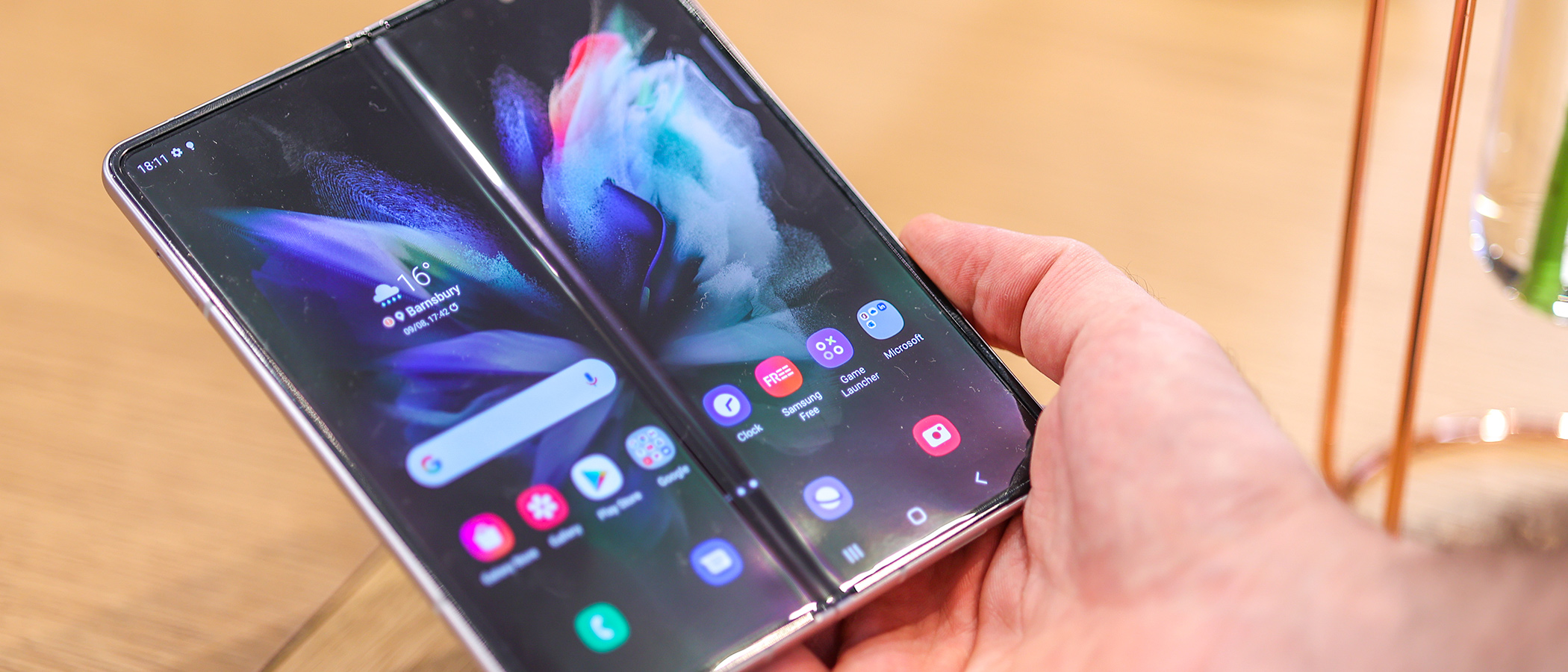
Our Verdict
For anyone who wants a foldable in the West, Samsung really is the only option right now. While the Z Fold 3’s camera pales in comparison to that of the Galaxy S22 Ultra, the extra screen size is a serious treat for reading and watching content, and the pen input is good, even if there is a groove along the crease line.
For
- Two-in-one design
- IPX8 water-resistant
- Pen input work feels natural
Against
- Pen only works on the inner screen
- Cameras aren't best-in-class
- Prominent Fold line in display
Why you can trust Creative Bloq
Samsung has finally done it – it’s made a folding phone that offers the assurance of water resistance and the creative potential of its S Pen-packing Galaxy Note and Tab devices. Meet the Galaxy Z Fold 3.
With its latest flagship foldable, Samsung flips the script on the folding phone category, adding a Wacom digitizer and 4,096 levels of pressure sensitivity to the inner screen – just like on a Wacom tablet. Unlike the Galaxy S22 Ultra, which also supports S Pen input, you get a much bigger canvas – 7.6 inches, and it folds up into a pocketable glass and metal slab.
While creatives usually opt for iPads versus Android tablets given the rich array of apps available for Apple’s tablets, iPhones are lagging behind in one key area – pen input. In turn, with smartphone apps like Autodesk Sketchbook and ClipStudio available for the Z Fold 3, in addition to a host of Adobe apps including Lightroom – it could be one of the best smartphones for digital doodlers and note-takers.
Samsung Galaxy Z Fold 3 review: design
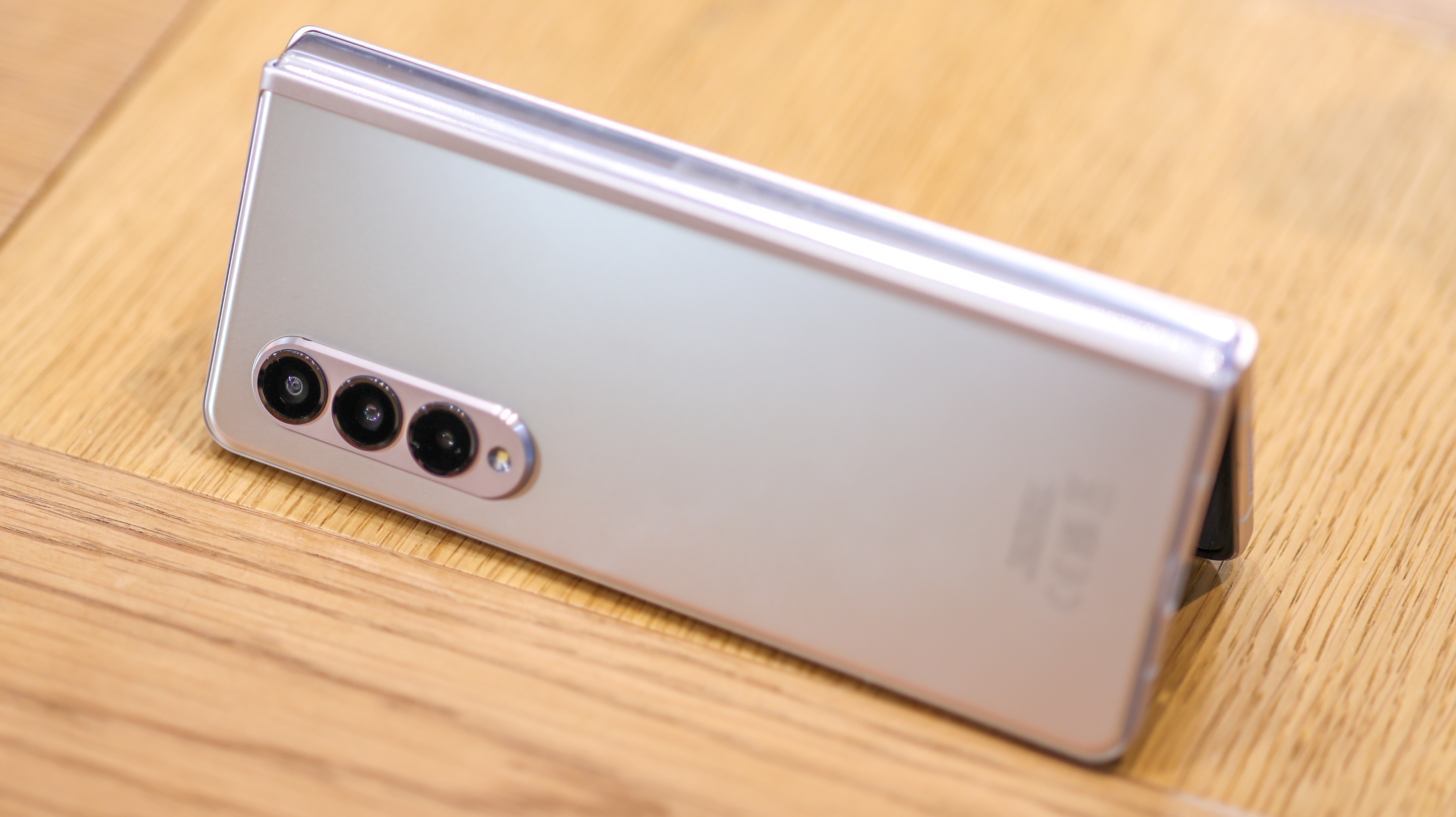
If you haven’t seen a Samsung Z Fold smartphone, the front is a cover screen that can be used when the phone’s closed just like a traditional smartphone, but the phone can be unfolded to reveal a bigger screen for reading, gaming and watching.
While the Z Fold 3 doesn’t unfold to quite an iPad size display, at 7.6-inches, it isn’t much smaller than a 7.9-inch iPad Mini. I found its extra screen is definitely very handy, whether you are split-screen multi-tasking, sketching, or just enjoying one app across the whole inner display.
Pick up the Galaxy Z Fold 3, and for a phone with moving parts, you’ll be delighted with how solid it feels. When closed, the front of the phone has a tall smartphone screen with a 25:9 aspect ratio. As a point of comparison, the iPhone 13 Pro clocks in with a 19.5:9 aspect ratio, so the front screen here is much longer than any other mainstream smartphone. It's narrow in portrait orientation, so it can definitely be a bit awkward for big thumbs to type on when handling it as the keyboard feels a tad squished. That said, it’s a beauty to watch wide-screen content on because its ultra-wide cinematic aspect ratio produces minimal letter-boxing in movies.
Size: Folded: 67.1 x 158.2 x 16mm (hinge side); Unfolded: 128.1 x 158.2 x 6.4 | Weight: 271g
Pen: Wacom Digitizer with 4,096 levels
Cover screen: 6.2-inch Dynamic AMOLED 2X (2268 x 832) Main screen: 7.6-inch Dynamic AMOLED 2X (2208 x 1768)
Storage: 256GB or 512GB
Battery: 4400mAh
Connectivity: 5G; Bluetooth; WiFi
Now, by its nature, the Z Fold 3 is a thick phone – it’s effectively a sandwich with two slices of screen, one atop another. Measuring 16mm at its thickest point, it’s over double as thick as an iPhone 13 Pro on the hinge side, so it definitely isn’t one for fans of skinny jeans. That said, it's manageable in most trouser pockets and all bags and jackets.
The phone’s narrowness when closed also helps make the whole thing more hand-holdable, and when you open it, the Z Fold 3 feels elegant, slender and special. As for the back of the phone, there’s a gorgeous, matte finish that repels fingerprints fantastically well, with colour options including black, silver and a rich dark green.
Samsung Galaxy Z Fold 3 review: screens
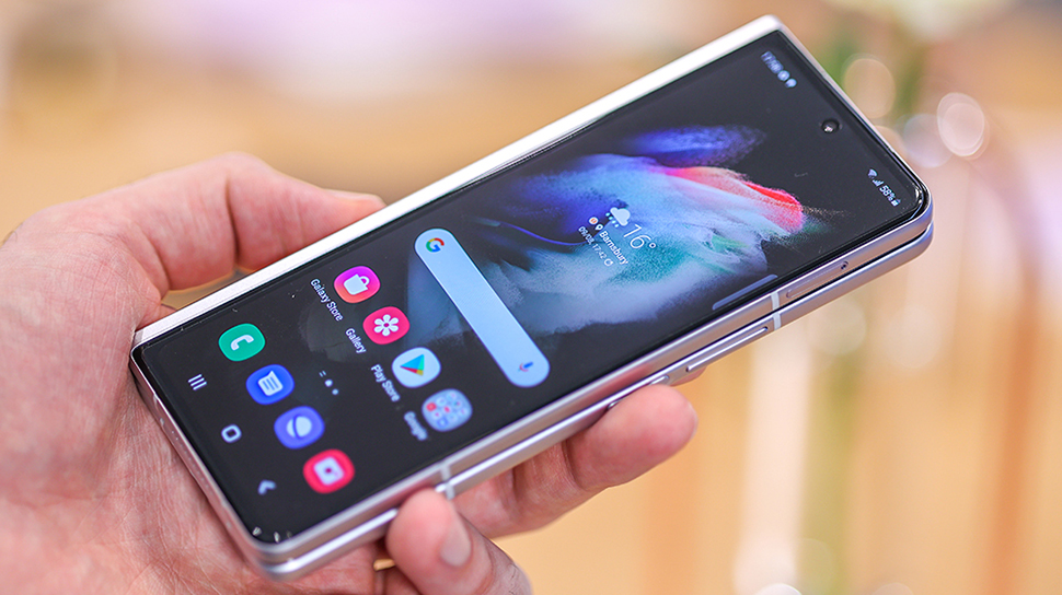
Both of the Samsung Galaxy Z Fold 3 screens are high-quality. That said, the foldable screen feels a bit less color-accurate off-angle than the main display. Head-on, it’s striking and brilliantly bright, but to the side, blue tones can creep in, as does image warping around the crease line.
The screens display menus, feeds, and apps as smoothly as a knife cuts butter, with an iPhone 12 Pro-beating 120Hz refresh rate across both. That means menus glide, and the phone feels super responsive.
With a sharpness of around 380 pixels in every inch of screen (PPI), neither display is the sharpest on the block (the iPhone sports a PPI of 460), but both still hit that ‘Retina Display’ mark, so you can’t make out any pixels with a naked eye, even when you peer right up to the front or inner display.
Also of note, the Galaxy Z Fold 3 is the first phone to feature an under-display selfie camera on the inner screen, removing the need for a notch or punch hole. While you can make out where the camera lives – there’s a moire effect when certain colours are displayed atop it, it’s very cool we’re finally seeing this tech see the light of day. One day, a smartphone’s design could be all-screen. It’s a shame this impacts selfie quality from the foldable’s inner camera, but nevertheless, it’s a novel inclusion.
Samsung Galaxy Z Fold 3 review: pen integration
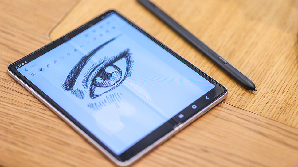
Samsung has a long history of integrating its own brand of stylus, the S Pen, into its tablets and smartphones. Both its 2021 and 2022 Galaxy flagships, the S21 Ultra and S22 Ultra also support the tech, which had been reserved for the Note line of smartphones in the past.
The S22 Ultra and Galaxy Tab series offer traditional digital pen canvases – they're firm and for the most part, flat. The Z Fold 3’s pen supporting display, however, isn't. Vertically, down the centre of the inner display is a crease, which creates a slight bump for a pen gliding over it. As we sketched, we noticed ourselves having to account for this, and that bump made its way into our finished doodle unless we avoided it.
While the experience of writing on the bigger inner display is significantly more enjoyable than doing so on a more traditional smartphone, for anyone planning to pen their next masterpiece on a Z Fold 3, you will want to try it in a shop if you get a chance before you put down £1,599 on it to see if that crease is workable for you.
Warnings aside, for casual note-taking, I found the Galaxy Z Fold 3 a dream to use. The new S Pen Pro (sold separately) is bigger than past iterations and easier to hold. If you have a Galaxy Tab with S Pen support, the S Pen Pro also supports switching between the two devices, as well as Air Commands across both. This means you can do some handy stuff with the pen at a distance, like using it as a remote camera button, pausing and playing music with it and more.
Samsung Galaxy Z Fold 3 review: cameras
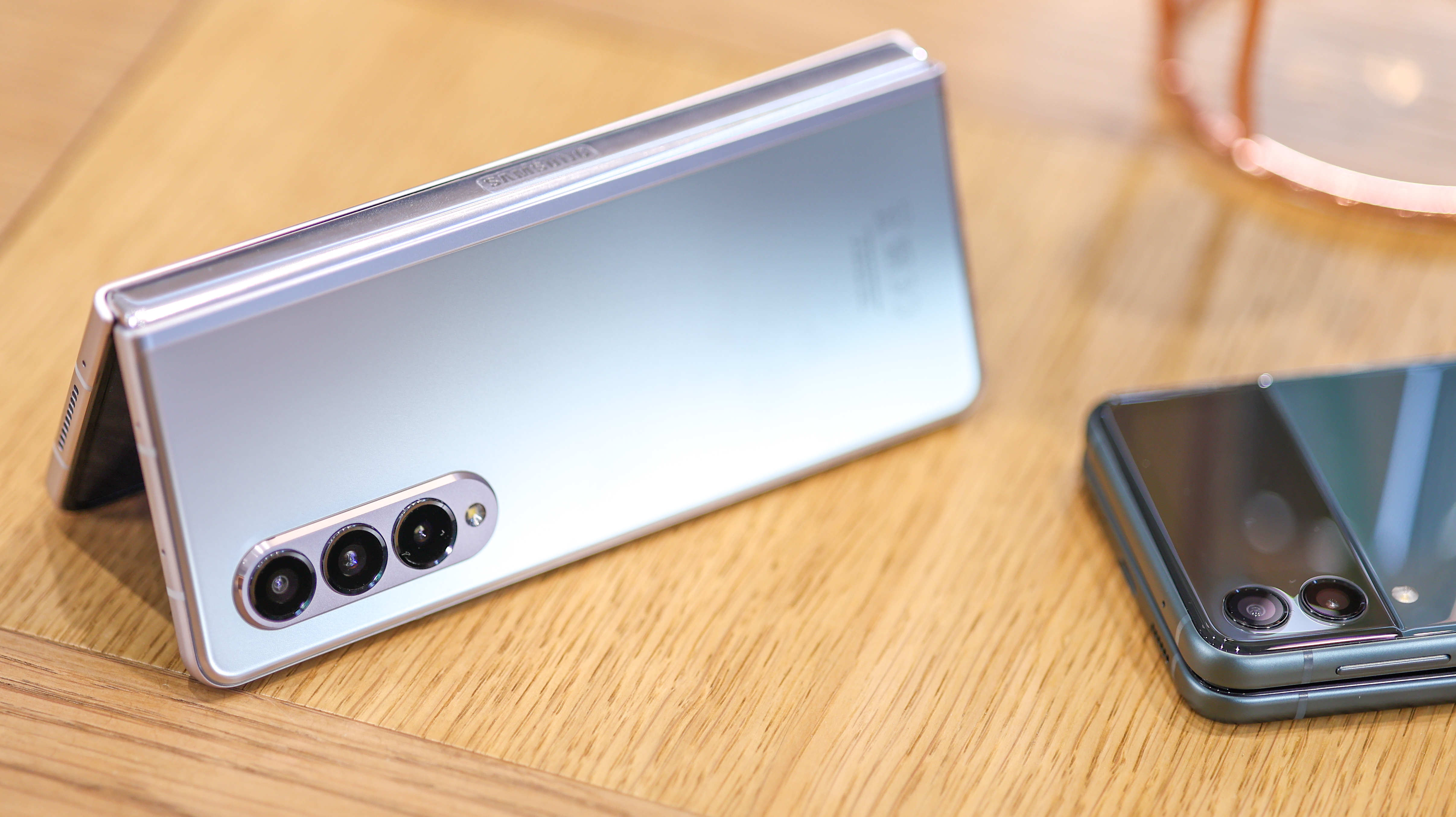
With three 12MP cameras around the back, one wide, one ultra-wide, and one telephoto (with roughly 2x optical zoom), the camera set up on the Galaxy Z Fold 3 is similar to that of the iPhone 13 Pro Max on paper, and there’s a 10MP selfie camera on the front, and a 4MP under-display selfie camera inside.
While the specs of the new Samsung Galaxy Z Fold 3’s cameras are nothing new, the phone does sport a few party tricks to help you get the best from them. Half-open the phone, rest it on a surface so it’s perfectly still, position the cameras at your subject and you can enjoy a blur-free long exposure shot. That means everything from light trails to great pictures are a reality without needing additional support and even in the dead of night if you’re prepared to dip into the phone’s Pro Mode.
The phone also packs fun modes that take advantage of both screens when filming or photographing – you see what you’re shooting while your subject sees themselves in the cover display. In addition, the phone captures video at up to 4K resolution at 60fps.
As far as picture quality goes, it’s about on-par with the standard Galaxy S21 – not the Ultra line. This might sound damning given that the phone costs more than the S21 Ultra or S22 Ultra, but with more screen, there’s less room for camera lenses and sensors, so this doesn't really surprise me. Samsung nevertheless includes lots of photo and video software, so you can capture manual photography and portrait mode video without needing to install third-party apps.
The Z Fold 3’s photos pack ample punch and pop, in true Samsung style, and results hold up even in dim lighting. When the lights drop right down, you’ll want to prop the phone up to get the best results.
Samsung Galaxy Z Fold 3 review: everything else
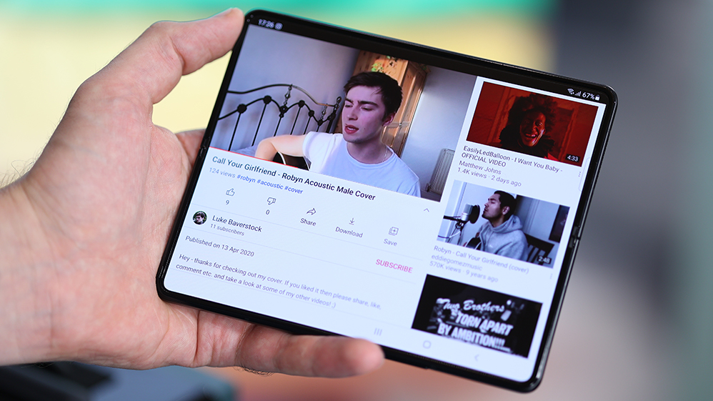
There’s flagship power inside the Z Fold 3, with a Snapdragon 888 processor, as well as stacks of storage for all your files, apps and photos – either 256GB or 512GB. That’s in addition to an ample 12GB RAM. In my time with the phone, it’s unsurprising multitasking performance never waned. Running Android, app support is excellent, with most of Adobe’s mobile solutions available for iPhone also available on the Fold 3. That includes the excellent Lightroom and Photoshop Camera.
Samsung has also customised the interface to take full advantage of the phone’s inner display, with split-screen working being easy to fire up, and a handy floating window feature, so you can work across as many as three apps at a time. The phone also supports DeX, which is Samsung’s desktop interface. This activates when you hook the phone up to a monitor or TV via the USB-C port, and it adds a second layer of productivity potential. Hook up a keyboard and mouse – Bluetooth or via a USB-C hub – and DeX unlocks floating windows, computer-like document editing and full-sized web pages. It's an excellent value-add.
With its 4400mAh battery, the Samsung Galaxy Z Fold 3 lasts a full day if you mostly use the front display, and dive into the main foldable display every now and then. I used the inner screen on the train to read (magazines look great using the Readly app), and to watch and browse on mainly. The rest of the time, I was happy using the outer screen. If you exclusively use the inner display, then you’ll likely need a recharge towards the end of the day, but that should be easy with the phone’s fast charging and wireless charging.
Samsung Galaxy Z Fold 3: price
Available to buy now, the Galaxy Z Fold 3 costs the same as its predecessor, the Galaxy Z Fold 2, starting at $1,899 / £1,599 / €1,799. That means it remains Samsung's most expensive phone by some way. It's significantly more expensive than the starting price of the Galaxy S22 Ultra, which starts at $1,199 / £1,149, but that does include only 128GB rather than 256GB of storage. The 512GB configuration of the Z Fold 3 retailed at $1,899 / £1,699 / €1,799 on launch.
Samsung Galaxy Z Fold 3: should you buy it?
There’s no getting around the fact: the Galaxy Z Fold 3 is expensive at £1,599, but it’s not a huge amount more than a 512GB iPhone 12 Pro Max, which costs £1,399, and it delivers a much more avant-garde design, as well as a richer feature set. Samsung does make some sacrifices, specifically with the Z Fold 3's camera, which is good, but not best-in-class – and naturally, the phone is thick when closed. Additionally, exacting illustrators may not get on with the crease in the middle of the screen, as it definitely does affect drawing.
After a month with the phone though, I love how comfortable it makes reading – from books in the Kindle app to magazines. The S Pen Pro is also good for note-taking and sketching, and web pages come into their own on the phone’s ample inner screen. If you’re not put off by the price and want to try the best foldable money can buy, then the Z Fold 3 is it. The fact it’s also that bit more tailored to creatives with its Wacom pen integration only sweetens the deal. If, however, you want a phone with a great camera, see our guide to the best camera phones.
- Read more: Samsung Galaxy Tab S4 review

Thank you for reading 5 articles this month* Join now for unlimited access
Enjoy your first month for just £1 / $1 / €1
*Read 5 free articles per month without a subscription

Join now for unlimited access
Try first month for just £1 / $1 / €1
out of 10
For anyone who wants a foldable in the West, Samsung really is the only option right now. While the Z Fold 3’s camera pales in comparison to that of the Galaxy S22 Ultra, the extra screen size is a serious treat for reading and watching content, and the pen input is good, even if there is a groove along the crease line.

Basil is a trained graphic designer and photography expert who geeks out over anything to do with digital imaging and sketching. Now a tech journalist and content director at a creative comms agency, he covers tech through a real-world lens, contributing to titles including Creative Bloq, Digital Camera World, Metro, T3, TechRadar and WIRED.
